Tuesday, 28 July 2026

Withdrawals from the 2026 Tour de France

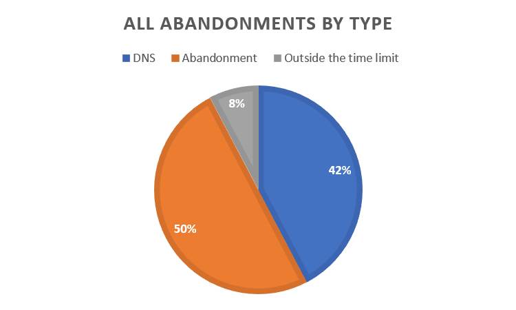
Unlike 2025, this year, riders were cut due to being over the time limit. Pie chart of Tour de France withdrawals by type.  In blue, we have did not start the stage withdrawals, which were 42% of all withdrawals.  In orange is mid-stage abandonments which were 50% of all withdrawals, while over the time limit withdrawals are in grey and make up 8% of the total. 

The two unfortunate riders were Kellen O'Brien and Anthon Charmig. 

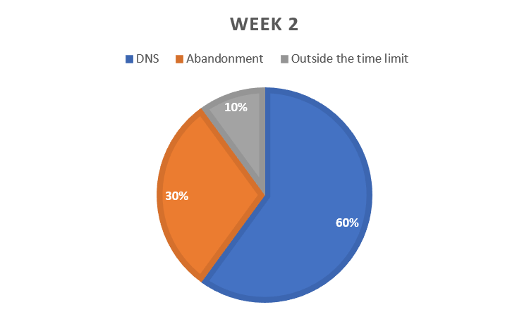
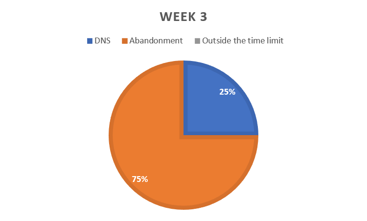
It's interesting to see how the pattern of withdrawals changes over the 3 "weeks" (weeks being used loosely here as always). Pie chart of withdrawals in week 1.  Did Not Start is still in blue and is 37% of all withdrawals.  Abandonments in orange are 50% and over the time limit in grey is 13%. Pie chart of withdrawals in week 2.  Did Not Start is still in blue and is 60% of all withdrawals.  Abandonments in orange are 30% and over the time limit in grey is 10%. Pie chart of withdrawals in week 3.  There are no over the time limit withdrawals.  Did Not Start is still in blue and is 25% of all withdrawals.  Abandonments in orange are 75%. 
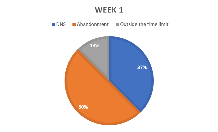
In week 1, mid-stage abandonments are the most common, with 50% of all week 1 withdrawals being abandonments. 

In week 2, this switches to being a majority of "did not start" type withdrawals, possibly as the race caught up with people. 

Then, in week 3, it swings back to being mostly mid-stage abandonments, possibly because people have reached the "I'll be damned if I don't get to Paris after all this" mind-set. 

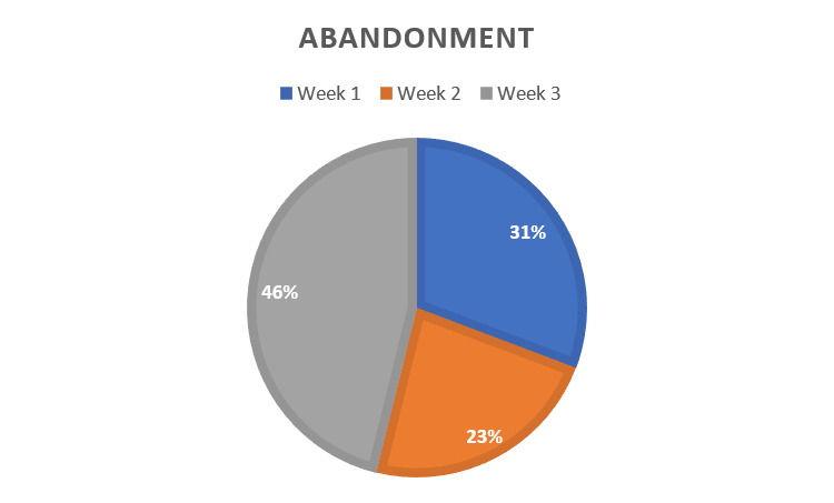
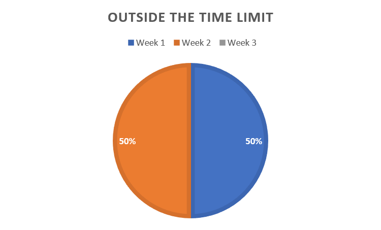
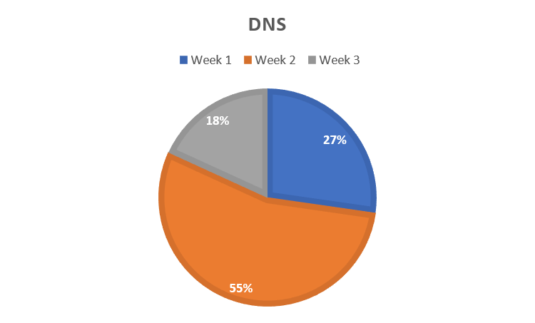
This pattern is repeated if you look at it as "withdrawal type by week". Pie chart of Did not start withdrawals by week.  Week 1 in blue was 27% of all DNS withdrawals, week 2 in orange was 55% and week 3 in grey was 18%. Pie chart of mid-stage abandonments by week.  Week 1 in blue was 31% of all abandonment withdrawals, week 2 in orange was 23% and week 3 in grey was 46%. Pie chart of over the time limit withdrawals by week.  Week 1 in blue was 50% of all of them, week 2 in orange was the other 50% and there were none in week 3. Which stages did the withdrawals happen on? 
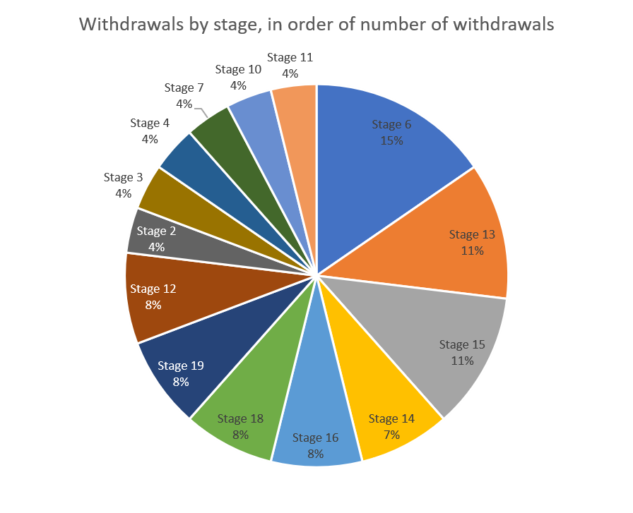
This year, while a couple of the stages did have a few more withdrawals they're reasonably evenly spaced. Pie chart of withdrawals by stage.  Stage 6 had the most with 4, stage 13 and 15 had 3 each. Stage 6, the one with the most withdrawals, unsurprisingly, was the Tourmalet. Stage 15 was the one with Vingegaard's crash, while stage 13 was the one with Gaviria's horrible crash. Bar chart of withdrawals by team.  Each withdrawal is a different colour depending on stage.  Those left in are coloured yellow.  Lotto-Intermarche, Caja Rural-Seguros RGA and Soudal Quick-Step were all down to 5 riders.  Lidl-Trek, Bahrain Victorious, Cofidis, Decathlon, EF Education Easy Post, Ineos, Total Energies and Astana all retained all their riders. 
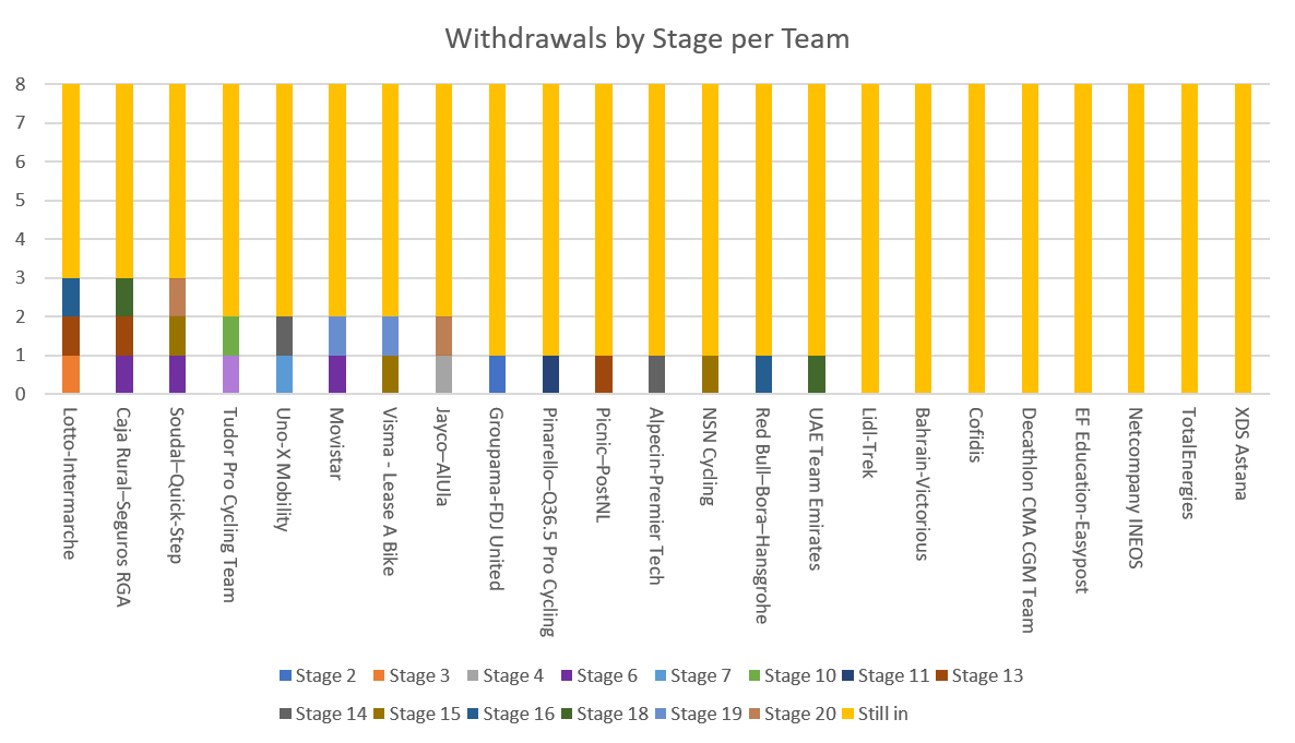
You are looking at someone smug that she had figured out how to recolour charts in Excel. Because the "still ins" were a drab grey. I prefer a thematic yellow. 

Lotto-Intermarche, Caja Rural-Seguros RGA and Soudal Quick-Step were all down to 5 riders. Lidl-Trek, Bahrain Victorious, Cofidis, Decathlon, EF Education Easy Post, Ineos, Total Energies and Astana all retained all their riders. 

There's no real patterns, to this or in the Kaplan-Meier survival curve split by team. Kaplan-Meier Survival curves by team.  The curves are flowing and none look that steep because no team lost more than one rider per stage. 
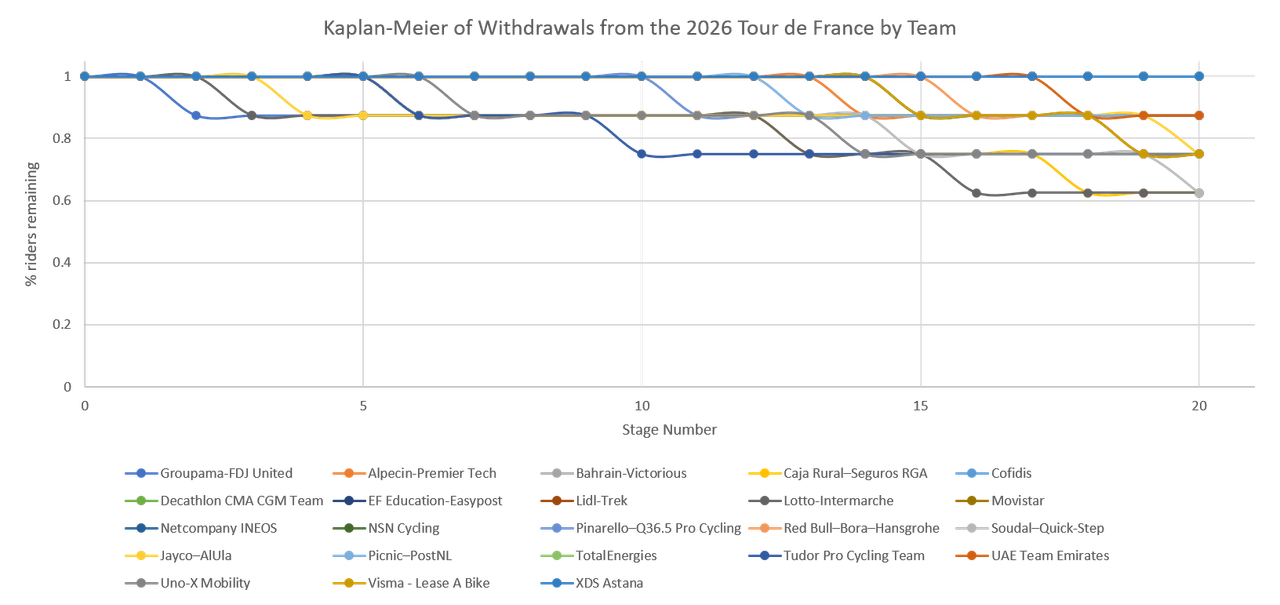
If the team names and colours stick for more than 5 minutes, I may recolour this to match team colours, but 23 teams is a lot of colours to keep track of. 

For the Tour as a whole, the Kaplan-Meier looks like this. Kaplan-Meier survival curve of riders in the Tour de France.  The blue line starts at 1 on day 1, has barely dropped by day 5, is down to about 0.95 by day 10, 0.9 by day 15, and finishes at 0.85 on day 20, staying there for day 21. 
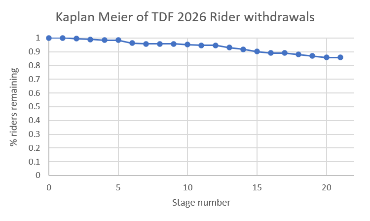
My takeaway is that this time there was a long, slow decline, with no sudden drops, not even on the Tourmalet. 

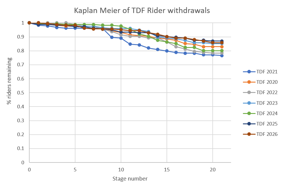
I have been doing this for far too long and so can compare this year's Kaplan-Meier to those of the preceding 6 years. The above Kaplan-Meier compared to those of the previous 6 years.  2021 stands out because while most have a similar shape, it had a huge drop between days 10 and 15. 2026 fits into the same pattern as the others, with only 2021 standing out.
No comments:

Post a Comment