This has been written in a hurry between me waking up after the last round of group stage games played overnight and the first of the second round matches this evening.
Truly, this turn around time is too tight for data visualisations. I worry how this short turnaround time will affect the preparation of the teams.
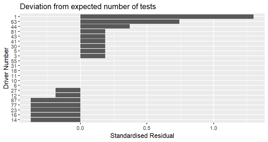
Group stage results:
I am not surprised that two teams from Group A went out, all the teams in that group were on the outside of chart. I am surprised that South Korea were one of the two. (From distance on the diagram, I presumed it would be Czechia and South Africa to go out from that group)
The diagram didn't have Scotland going out, but I was also not surprised that Haiti weren't the roll over some people thought they would be.
The weakness of Türkiye and Tunisia was unexpected given how central they were. I don't think anything explains Uruguay's performance other than sometimes, everything goes wrong.
In terms of my predictions, this is how I did (blue is right, red is wrong):
Qatar, Jordan, Iraq, Egypt, Uzbekistan, Iran, Cape Verde (never have I been so happy to be wrong), South Africa, Panama, New Zealand, Curacao, Australia, Czechia, Bosnia and Herzegovina and Saudi Arabia
15 guesses (because none of group C were obviously sticking out) - 10/15 correct.
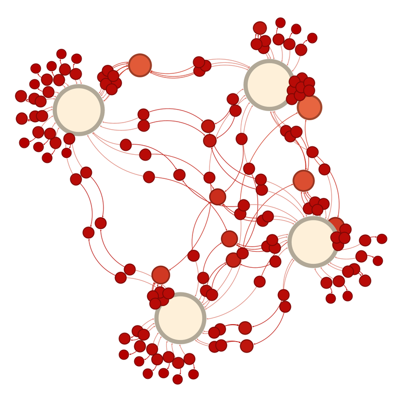
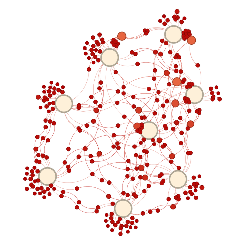
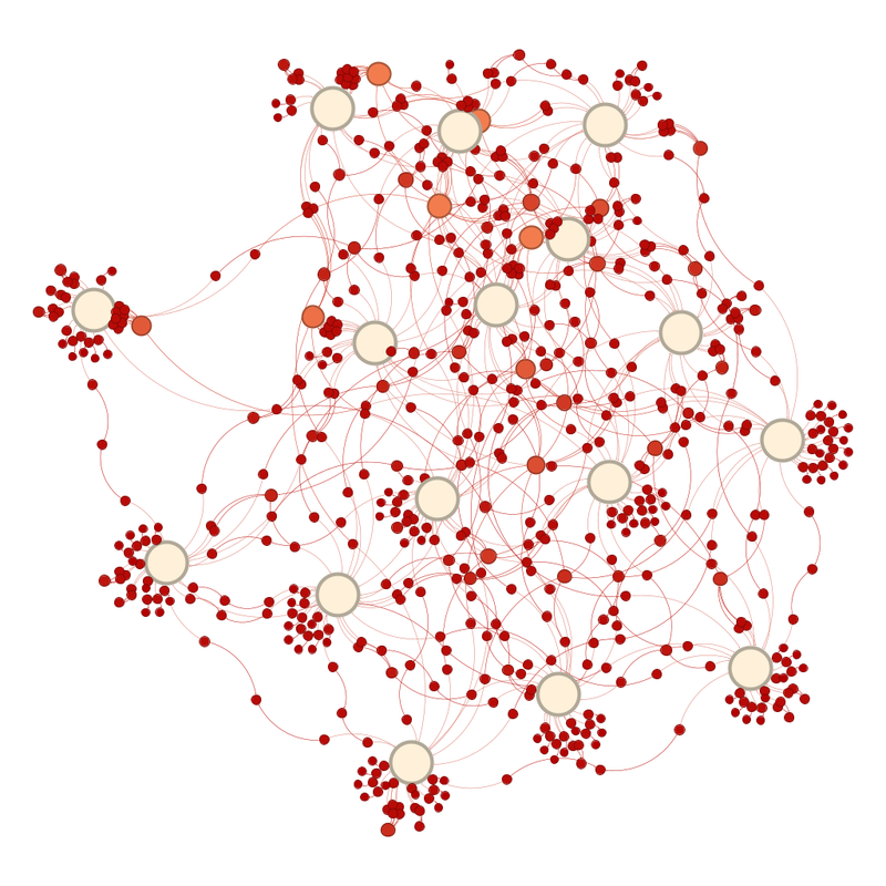
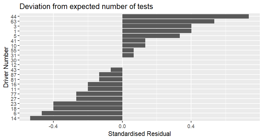
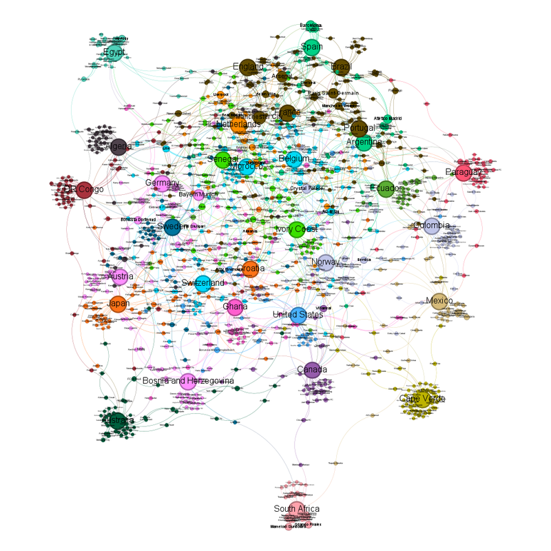
Following the removal of the teams that have gone out, the network diagram now looks like this:
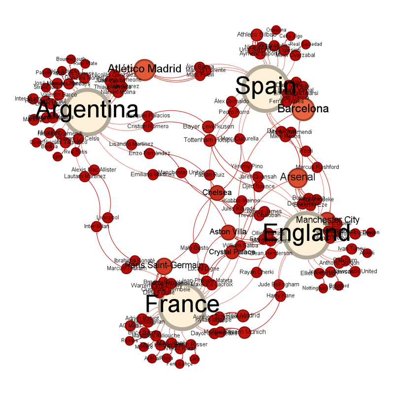
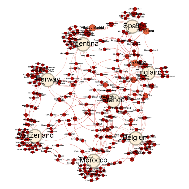
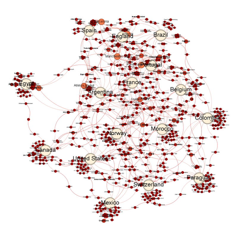
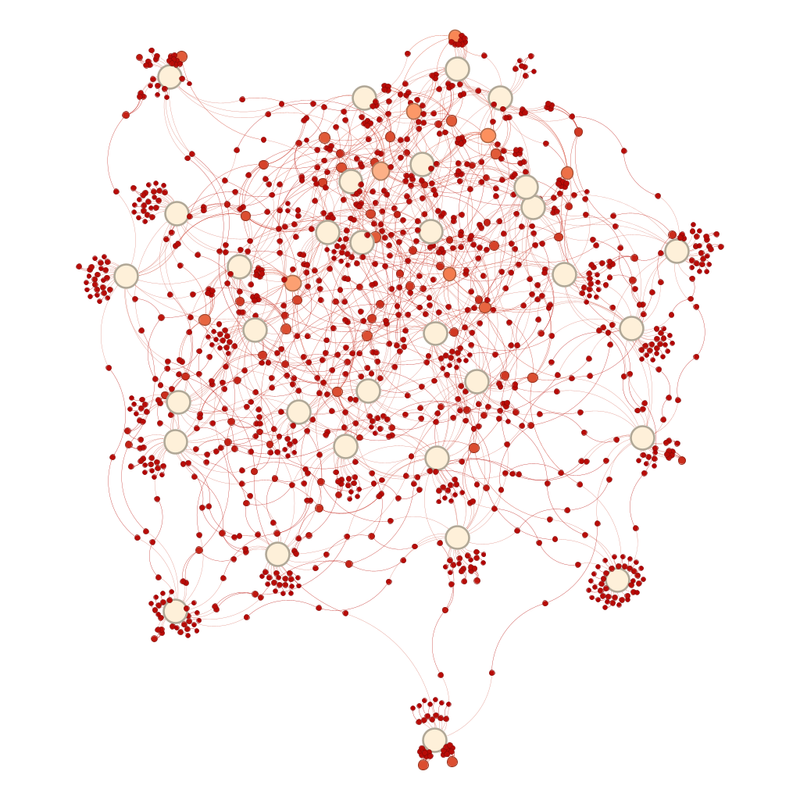 Labelled, it looks like this:

Average degree (number of links between circles) has gone down slightly from 1.427 to 1.416.
The team closest to the centre are Croatia - although exactly where the centre is has been thrown off by South Africa sticking out by that much. I would guess the centre is actually Cote D'Ivoire.
The "weight" of the diagram is also thrown off by a lot of teams clustering at the top.
Union Saint-Gilloise are the club team closest to the centre.
The club teams with the most representatives still in are Manchester City with 18 players left in, Bayern Munich with 16 and Arsenal with 15.
A couple of other teams have enough players left in to be seen as large(ish) orange circles. They are Paris Saint-Germain (14 players still in), Barcelona (13) and Crystal Palace (12).
One of these teams is not like the others.
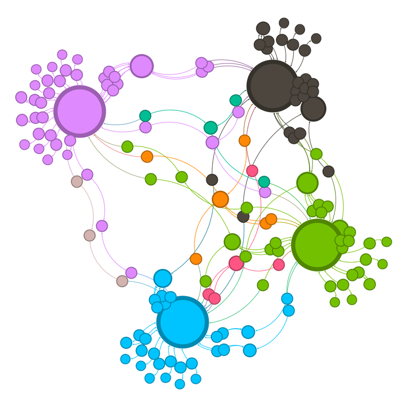
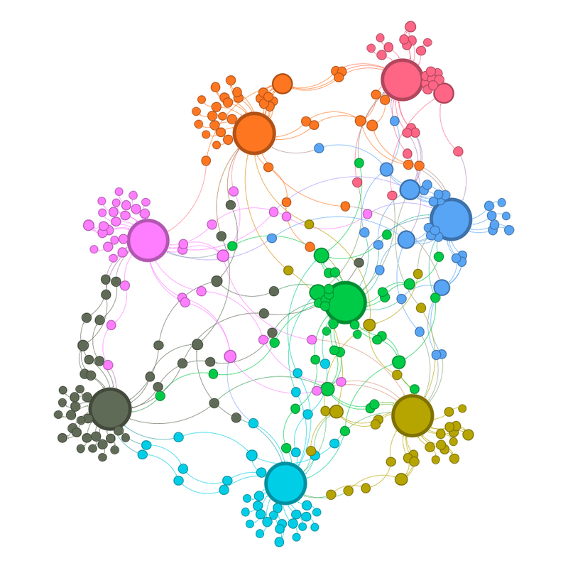
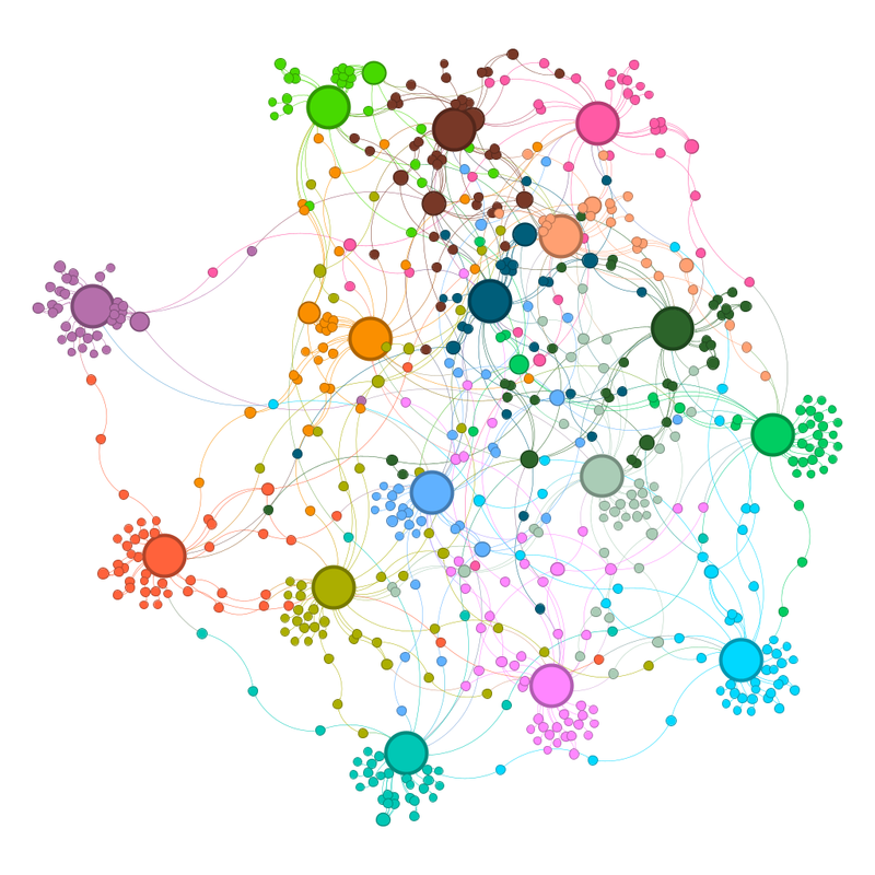
What does the community view look like:
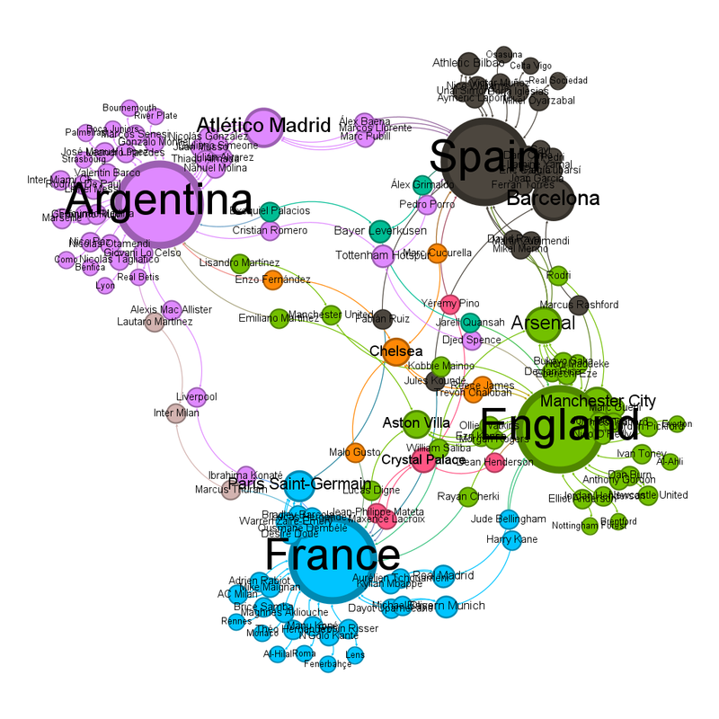
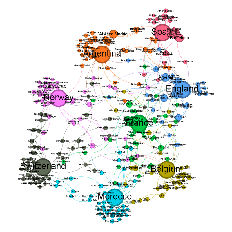
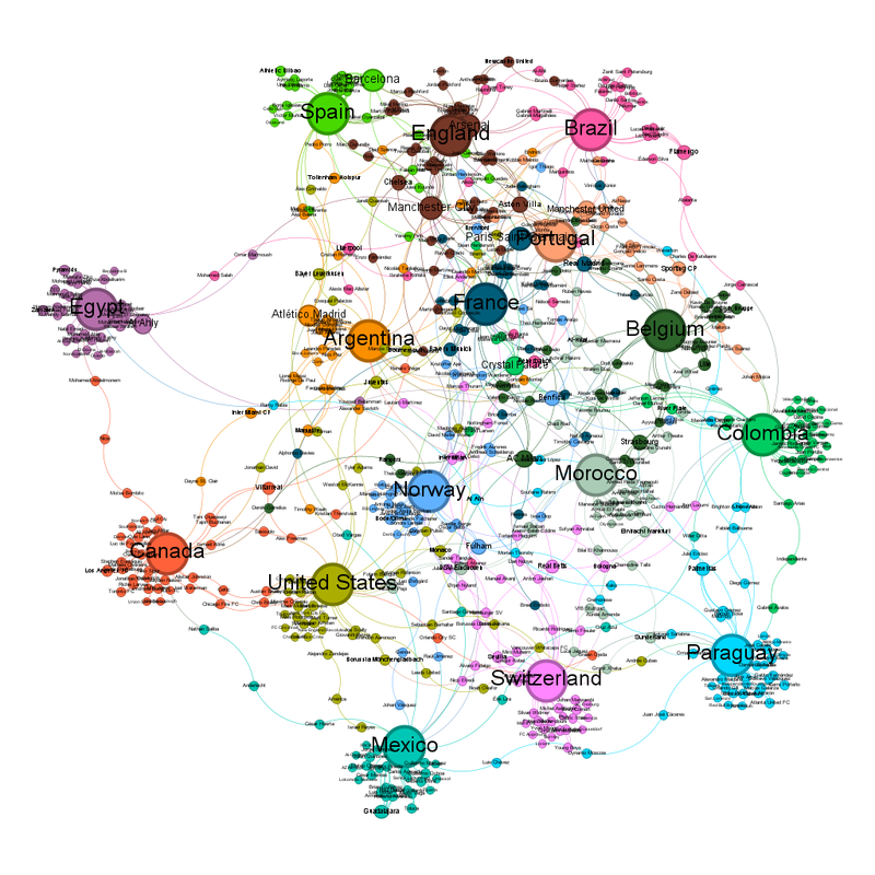
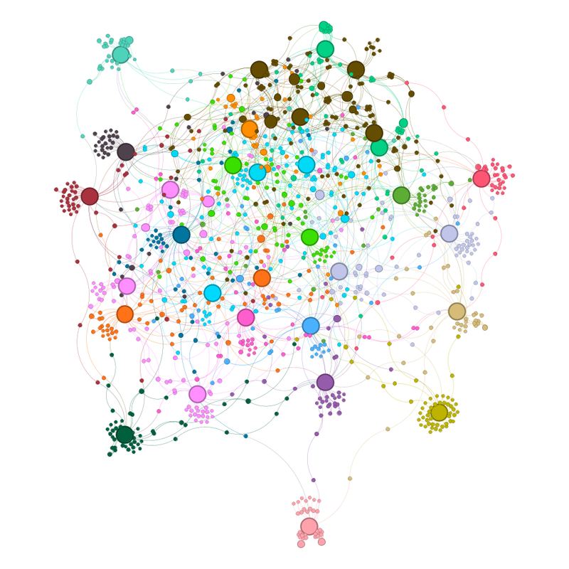 Labelled it looks like this:
There are 32 teams left, but only 22 communities.
The communities are as follows:
Group 1 - Teams that are individual communities:
1) South Africa - Light pink
2) Australia - dark green
3) Cape Verde - olive green
4) Canada - pale(ish) purple
5) Switzerland - electric bubblegum blue
6) United States - mid blue
7) Mexico - pale sandy brown
8) Ecuador - grass green
9) Ghana - Pink
10) DR Congo - red-brown
11) Algeria - dark grey
12) Egypt - mint green
13) Netherlands - serendipitously orange
14) Paraguay - red-pink
15) Sweden - sort of pale RAF blue
Group 2 - two team clusters:
16) Japan and Croatia - also orange, because I can't figure out how to change colours
17) Norway and Colombia - pale grey-blue
18) Ivory Coast and Senegal - bright green
19) Morocco and Belgium - bright blue, like I said, I don't know how to change colours.
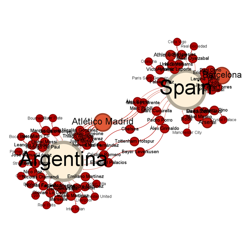
20) Spain and Argentina - mid green
Group 3 - large multi-team clusters:
21) Bosnia and Herzogovina and Austria and Germany - paler pink
22) Portugal, Brazil, France, England - dark brown. These are being pulled together by club teams that have a lot of representatives (Paris Saint-Germain, Manchester City, Arsenal)
What does the updated network graph suggest about the second round matches?
A complication for this round is that South Africa protrudes so far from the main cluster that the geometric centre and the "gravitational" centre no longer match. Several predictions depend on which definition you prefer.
Germany vs Paraguay - Germany
France vs Sweden - One of the problems with the tight "Manchester City, Arsenal, Paris Saint-Germain" group that includes France, Portugal, England and Brazil is that it pulls those teams out of the centre of the diagram. That means that going off absolute centre of the diagram, the prediction is Sweden wins but going off the "gravitational" centre of the diagram, it'd be France to win.
South Africa vs Canada - Canada
Netherlands vs Morocco - Diagram says Morocco
Portugal vs Croatia - another split decision: diagram says Croatia, weighted centre says Portugal. Experience says Croatian witchcraft.
Spain vs Austria - The rewards for finishing second in a group are getting a match vs Spain rather than a match vs Switzerland for 3rd. Truly, Austria have been stuffed by the draw.
United States vs Bosnia and Herzegovina - Diagram says US
Belgium vs Senegal - Diagram says this should be close. Having watched both teams (yeah, not sure why the team whose matches I've seen the most of are Belgium), experience also says this could be a cracker.
Brazil vs Japan - another one affected by absolute centre vs gravitational centre.
Ivory Coast vs Norway - Diagram suggests Norway just, but another match that could be a cracker.
Mexico vs Ecuador - Diagram unclear
England vs DR Congo - another one affected by absolute centre vs gravitational centre.
Argentina vs Cape Verde - Oddly, another one affected by the centre issue.
Most "any given Sunday" of ifs. But if Cape Verde could do it ...
Australia vs Egypt - Diagram says close
Switzerland vs Algeria - Diagram says Switzerland
Colombia vs Ghana - Diagram says Ghana. Another one with the potential to be a cracker.
Because so many teams are still in, the diagram is still very busy.
I am looking forward to several of those matches.