Second round results:
I said Senegal vs Belgium would be a cracker.
The whole centre of diagram gravity vs centre of diagram really did come into play in the second round - if you were a team on the left hand side of the diagram you went out. Except Egypt, and they were playing another team from the left hand side.
Of the matches where there was a clear prediction, gravitational centre ended up being more important, which is useful learning.
The diagram for the last 16 teams isn't as tightly packed any more, which means that should be less of a thing going forward.
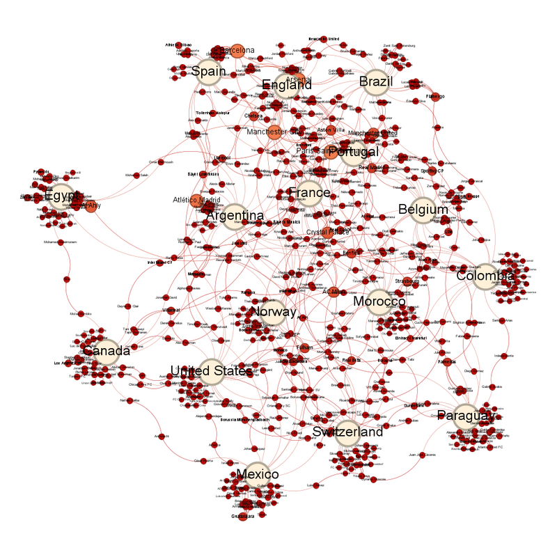
The list of club teams with the most representatives has changed - especially Bayern Munich given Germany are out.
What we've got instead are a small clump of teams with 12 players left in (and yes, these are the teams that were causing the cluster in blue in the first round and in the top right of the diagram in the second). They are Paris Saint-Germain, Arsenal, Barcelona and Manchester City. Atlético Madrid is the next on 11.
Norway are the national team closest to the centre, while Inter Milan are the club team closest.
The average number of degrees each circle is linked to has gone down to 1.377.
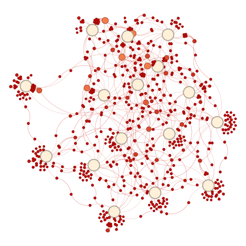
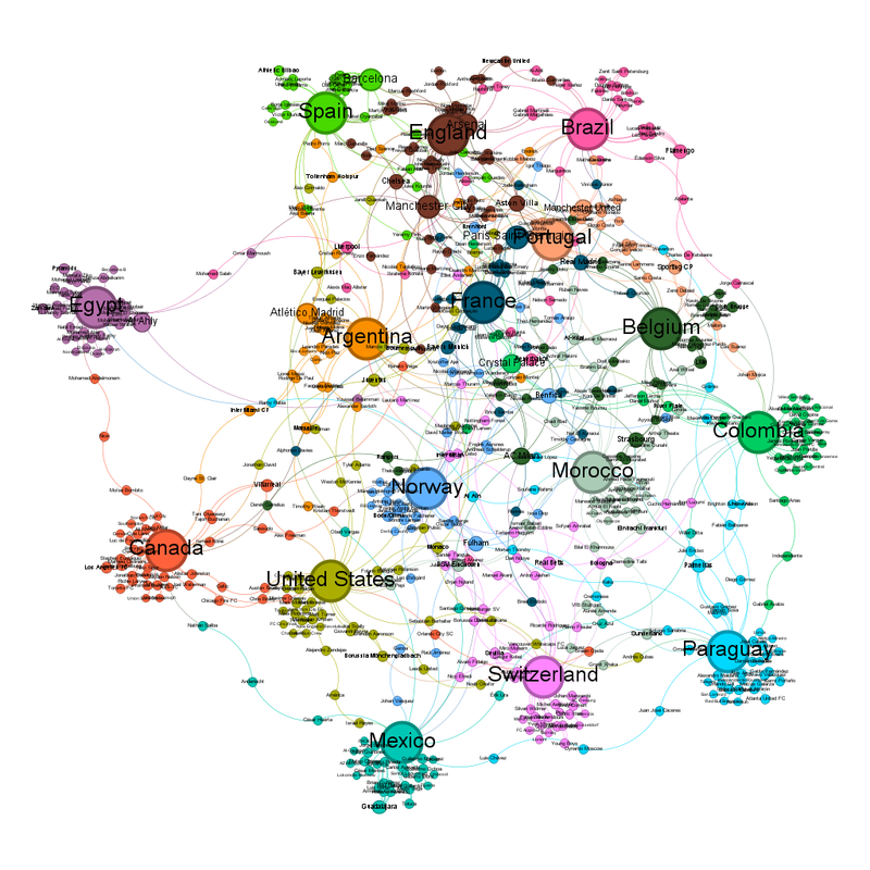
The number of communities in the communities view is now 16, so one per team.
Labelled it looks like this:
As to my predictions (which I don't mind making late because you can see the diagrams I'm basing them on):
France vs Paraguay - France
Canada vs Morocco - Morocco
Portugal vs Spain - Diagram says Portugal, reason says Spain; all those Barcelona players pull Spain out of the centre, the same thing that happens to their women's team and always skews the women's diagrams.
United States vs Belgium - Diagram is not clear, this may be closer than people expect.
Brazil vs Norway - Diagram says Norway, I don't think that's impossible.
Mexico vs England - Diagram is also not clear
Argentina vs Egypt - Argentina
Switzerland vs Colombia - Diagram says Colombia but could be close!
No comments:
Post a Comment