Okay, last's round's predictions were not as good as they could have been. I got Brazil vs Norway right, and was right to suspect England vs Mexico would be close, got France, Argentina and Morocco's results correct, but was way out on Belgium vs United States and got Switzerland vs Colombia wrong (although I said it would be close). I was right that Spain being pulled out of the centre of the diagram by all their Barcelona players made it hard to predict their result from the diagram.
Also, I didn't predict how close Egypt got to beating Argentina.
What do the quarterfinal diagrams look like?
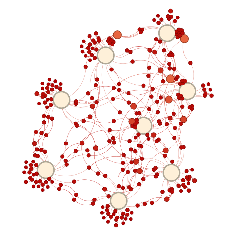
The unlabelled diagram looks like this:
Labelled it looks like this:
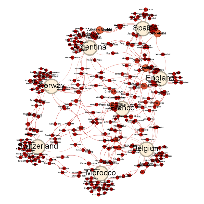
France are the national team closest to the centre, with Paris Saint-Germain the club team closest.
The club teams with the most representatives left in are Atlético Madrid, Barcelona and Arsenal with 10.
The average number of degrees of contact each circle has is 1.364.
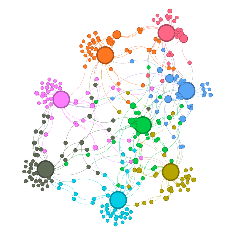
The number of communities is still one per team, so 8.
The unlabelled community view looks like this:
Labelled, it looks like this:
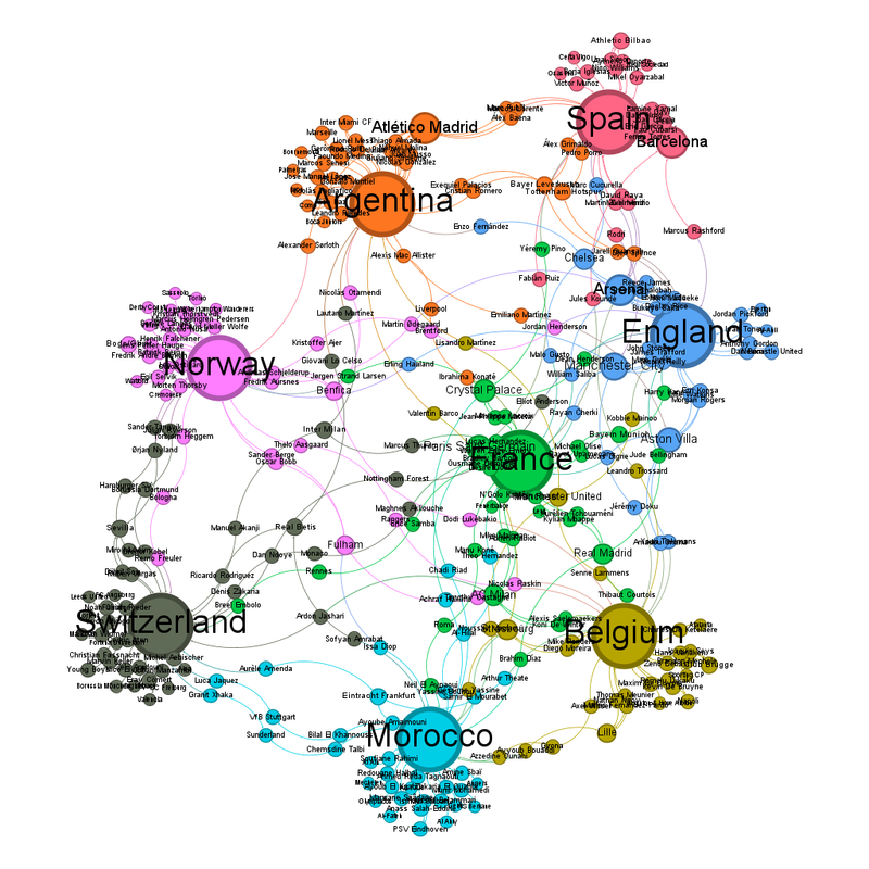
It's much harder at this point, with the teams other than France pretty much equidistant from the centre, and no "gravitational" clump.
France vs Morocco - Diagram says France
Spain vs Belgium - Diagram says Belgium, although I think that's because Spain are still pulled out of the centre by all those Barcelona players. On the other hand, anything can happen in knock out football.
Norway vs England - Norway just (that sound you can hear is L cursing me)
Argentina vs Switzerland - Diagram says Switzerland. I think that's the Atlético Madrid players pulling Argentina out. Also [Legal team have redacted a paragraph-long rant about exactly how many World Cups the referees are going to give this Argentina team.] Switzerland could do it ... (I feel I need to add a conflict of interest statement, I drew Switzerland in a sweepstake at work.)

No comments:
Post a Comment