Showing posts with label gephi. Show all posts

Thursday, 14 August 2025

How I make those Gephi diagrams

Written for @shauna@social.coop on Mastodon 

Please don't read any further if you want to maintain the belief I know what I'm doing 

I was original entranced by this post - https://gephi.org/users/quick-start/ 

So I downloaded Gephi and then looked for some data to interrogate. Initially, I wanted to look at how the players at Euro 2012 were interconnected - https://fulltimesportsfan.wordpress.com/2012/06/08/finalised-diagram/ 

It's pretty much been the same process ever since, with some learnings that have been incorporated in the oh my goodness 13 years! 

Information source - I use the Wikipedia squad pages. 

This is why you'll occasionally see notes about "delayed because of" and a warning that the data is taken from Wikipedia so may not be accurate. The club team a player plays for is the one most likely to be wrong, especially for competitions that are between seasons. (The strange places I've ended up at on Wikipedia because of edit wars about which club someone plays for.) 

It is, to an extent, worse for the rugby union ones because players move at the end of the season, not the start of the next. 

Because I do the input (and the removals when teams are out) by hand, I go through the national teams starting with group A and move downwards. This is why, if there is a delay in the teams in group A naming their squads, it causes a huge knock on effect. (The time Italy delayed their squad announcement till ~ 7 pm on the night of the deadline for a game show caused significant cursing because they were the first team in group A and I couldn't start till they did.) 

The larger the event and the bigger the squads obviously, the longer it takes. If you can python (I can't, one day I will learn etc), James Ashford wrote a really nice post on how to do all of this with Python - https://james.ashford.phd/2023/08/25/analysing-the-2023-fifa-womens-world-cup-with-graph-theory/ 

Me, I manually add things into Gephi. Sometimes this means I notice things (like the number of Zambian players playing in the Kazakh Women's League, or that there is a Saudi Women's League - https://fulltimesportsfan.wordpress.com/2023/07/22/womens-world-cup-2023-group-stage-network-diagrams/

I use the player as the source and the national or club team as the target. I've experimented with using both directed and undirected links, and it doesn't make much of a difference. 

There are other layouts, but I like the way force atlas looks. (Force atlas works okay with this size data set. For significantly larger ones, Yifan Hu is easier) 

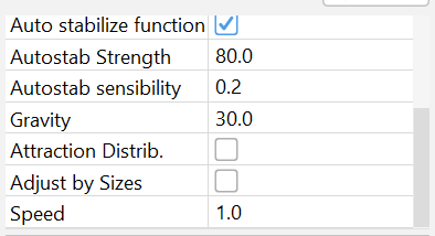
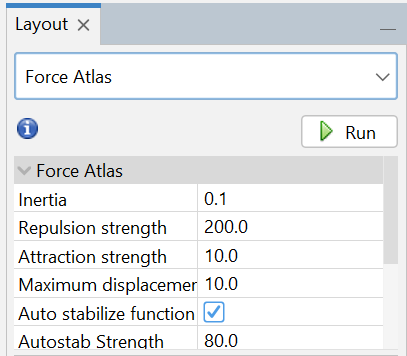
I start with the pre-set values, increasing the repulsion strength if the teams crash into each other. Screenshot of Gephi settings.  It starts with Force Atlas, with inertia set at 0.1, repulsion strength at 200, attraction strength at 10, maximum displacement at 10, the auto stabilise function ticket, and autostabilisation strength at 80. Screenshot of the bottom half of the Gephi settings, autostability sensibility is set at 0.2, gravity at 30, attraction distribution is not ticked, nor is adjust by size, and speed is at 1. 
I like to add each player individually, because one of the things I enjoy is seeing the shape and positions change with each addition, but I'm sure making more links at the same time would make it go quicker. 

For the colour and the size of the circles, I keep it really simple and stick to number of degrees. For size, I set minimum at 10 and maximum at 50. I find it's large enough to see the small changes with each player and clear enough when I've made a mistake and not attached a player to the right national team. Or the Wiki page is wrong and hasn't taken off the players that didn't make it to the final squad. Or France have decided to only pick 25 players when they could have picked 26 for who knows what reason. 

I also like it for the rugby union one (where there is unlimited replacements for squad injuries) because it creates a subtle gradation for each injured player. 

Colour is slightly more complicated. I like to try and use either the tournament colours or the colours of the host country flag but it's not possible to change the Gephi pre-sets (or at least not as far as I can find out) so sometimes I have to go with nearest to those. I know to not complain about free software but it's the reason I keep looking to see if there's a way to do something similar in R. 

I keep link width at 1. 

For closest to the centre, I use the zoom function, and the degree function to get the number of players. 

When teams get knocked out, I remove the players manually, hence why I try to keep the teams in order when I add them. Again, you get some fun shape and pattern changes that way.

Saturday, 26 July 2025

Euro 2025 - Network Graph for the Final

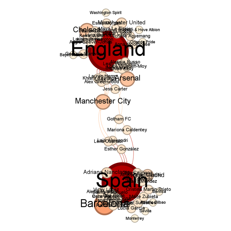
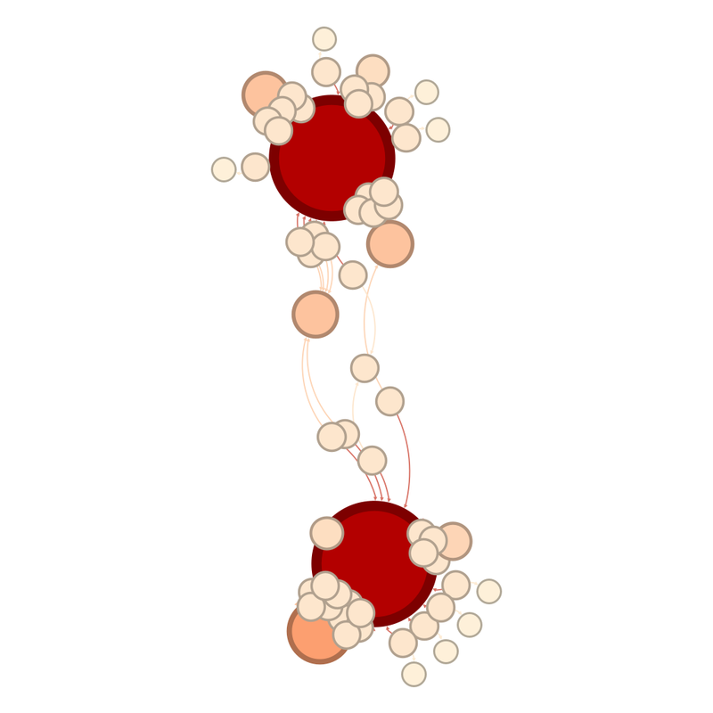
The figures are obviously very simple now that there are only two teams. Network graph of the two teams in the final.  There are two large red circles representing England and Spain.  Of the smaller paler circles, there is one very large one next to the bottom of the two large red circles.  There are two more smaller, paler circles closer to the top of the two large red circles. 

The same graph, but labelled: Network graph of the two teams in the final, labelled.  There are two large red circles representing England and Spain.  England is the circle at the top of the diagram, Spain the circle at the bottom.  Of the smaller paler circles, there is one very large one next to the bottom of Spain.  It is Barcelona.  There are two more smaller, paler circles closer to England.  They are Arsenal and Manchester City. 
Gotham FC are the club team closest to the middle. 

Barcelona, unsurprisingly, have the most players left, with 10. The teams with the next most players remaining are Chelsea, Arsenal and Manchester City with 6. 

Manchester City, Arsenal and Gotham FC are guaranteed to have a player on the winning side. 

The community view gives less information when we're down to two teams so I haven't shared that. 

It's a final to look forward to.

Monday, 21 July 2025

Euro 2025 - Semifinals Network Graphs

As suggested (https://fulltimesportsfan.wordpress.com/2025/07/14/euro-2025-quarterfinal-network-diagrams/), the sheer number of Spanish and Italian players playing for Barcelona and Italy respectively did distort the graph. 

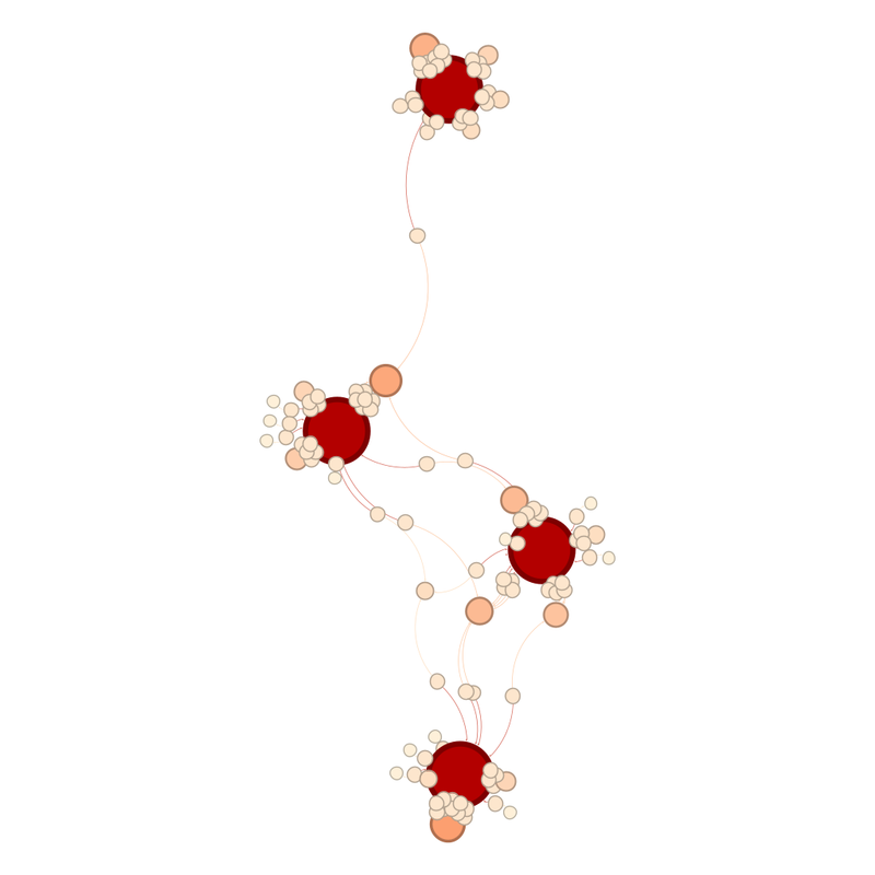
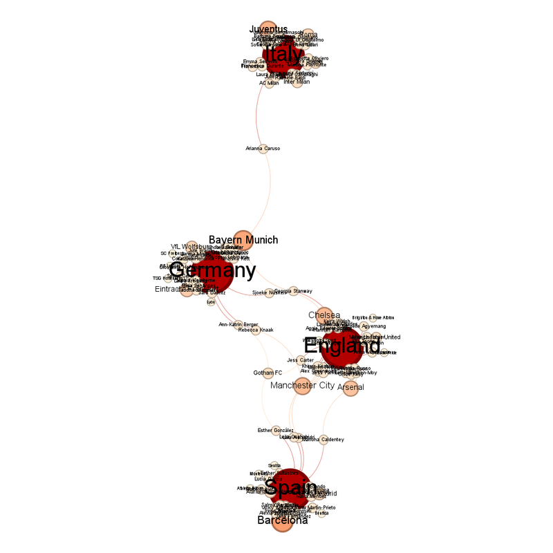
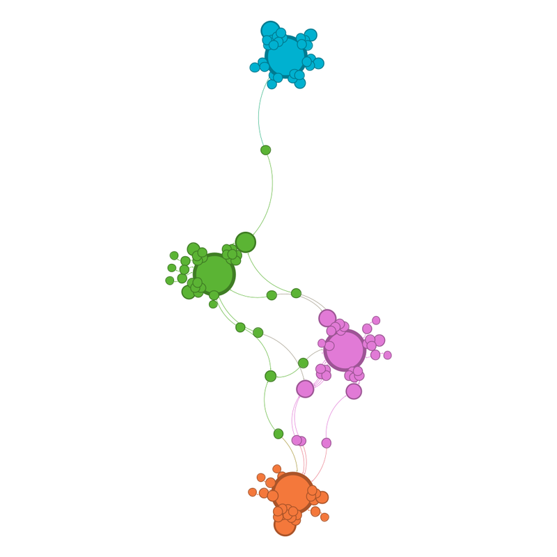
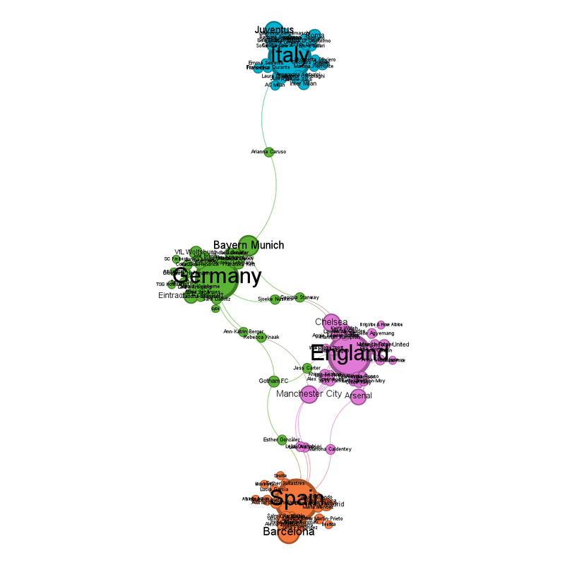
It's also distorting the semifinal graphs which are much narrower and elongated than usual. Non-labelled version of the network graph.  The large red circles stand for each national team.  One of them is separated at the top, with very few connections to the other three.  Two more are in the middle and then the fourth team is at the bottom.  The shape is an elongated diamond with curved edges.  The team at the top has a pale red circle at its top left, a club team.  There is another pale red circle at the top right of the leftmost one of the two national teams in the middle.  There is one link from it to the national team at the top.  Similarly, the national team at the bottom has one of the larger pale red circles coming off it, bottom middle. The same graph as before, but labelled.   The large red circles stand for each national team.  One of them, Italy, is separated at the top, with very few connections to the other three.  Two more are in the middle (Germany left and England right) and then the fourth team, Spain, is at the bottom.  The shape is an elongated diamond with curved edges.  The team at the top, Italy, has a pale red circle at its top left, a club team.  It is Juventus.  There is another pale red circle at the top right of Germany, it is Bayern Munich.  There is one link from it to the national team at the top, as one Italian player plays for Bayern.  Similarly, Spain have a large pale red circles coming off it, bottom middle.  It is Barcelona. There is a pleasing simplicity to the community view, with each country being its own community. Non-labelled version of the community view network graph.  The larger circles stand for each national team.  One of them, in mid-blue, is separated at the top, with very few connections to the other three.  Two more are in the middle (green and pink) and then the fourth team is at the bottom and orange.  The shape is an elongated diamond with curved edges.  The team at the top has a smaller circle at its top left, a club team.  There is another smaller circle at the top right of the leftmost one of the two national teams in the middle.  There is one link from it to the national team at the top.  Similarly, the national team at the bottom has one of the larger circles coming off it, bottom middle. The same graph as before, but labelled.   The large circles stand for each national team.  One of them, Italy, is separated at the top, with very few connections to the other three and is in blue.  Italy being blue is a complete and happy coincidence.  Two more are in the middle (Germany, left, are green and England, right, are pink) and then the fourth team, Spain, is at the bottom and in orange.  The shape is an elongated diamond with curved edges.  Italy have a smaller circle at their top left, a club team.  It is Juventus.  There is another smaller circle at the top right of the leftmost of Germany, it is Bayern Munich.  There is one link from it to Italy, as one Italian player plays for Bayern.  Similarly, Spain have a smaller circle coming off them, bottom middle.  It is Barcelona. Unsurprisingly, the largest of the paler red circles reflects the club teams with the most representatives left, Barcelona with 10, Bayern Munich with 9 and Juventus with 8. 

Germany are the national team closest to the centre, because of Italy pulling them up. For the same reason, Bayern Munich are the club team closest to the centre. 

I have seen all of the semi-finalists except England play (and I am banned from watching them lest I be an ill omen).  I am guessing that Spain will beat Germany but that German team have a certain admirable determination about them.

Monday, 14 July 2025

Euro 2025 - Quarterfinal network diagrams

The group stage diagrams and predictions based on them can be found here - https://fulltimesportsfan.wordpress.com/2025/06/29/euro-2025-group-stage-network-diagrams/

How did the group stage predictions go? 

From group A, I predicted Norway and Switzerland would qualify for the quarterfinals, and I was right, even if it involved extra time goals in the decider. 

Group B, I predicted Spain and AN other, which I am aware is a bit of a "the sky is blue" sort of prediction. 

Group C, I predicted Germany and Sweden 

Group D, I predicted Netherlands and one of England and France, which was oh so wrong. 

Out of 8, I am willing to call that about equivalent to 5/8. 

With that in mind, here are the quarterfinal network diagrams 

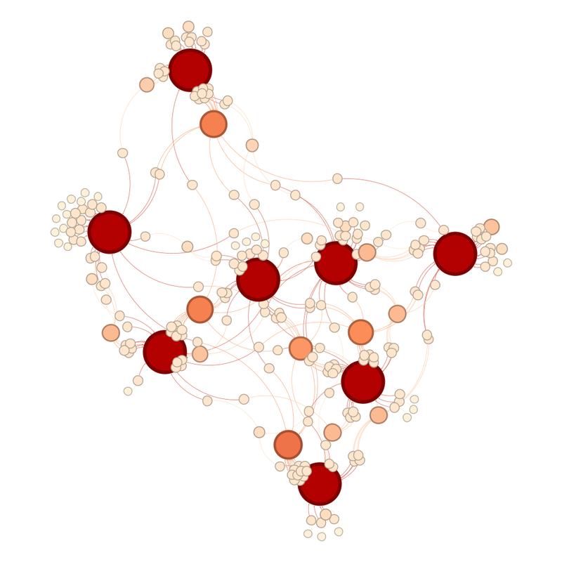
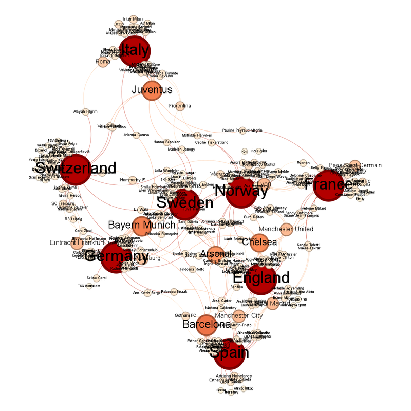
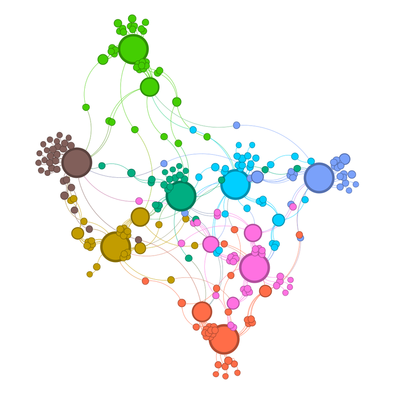
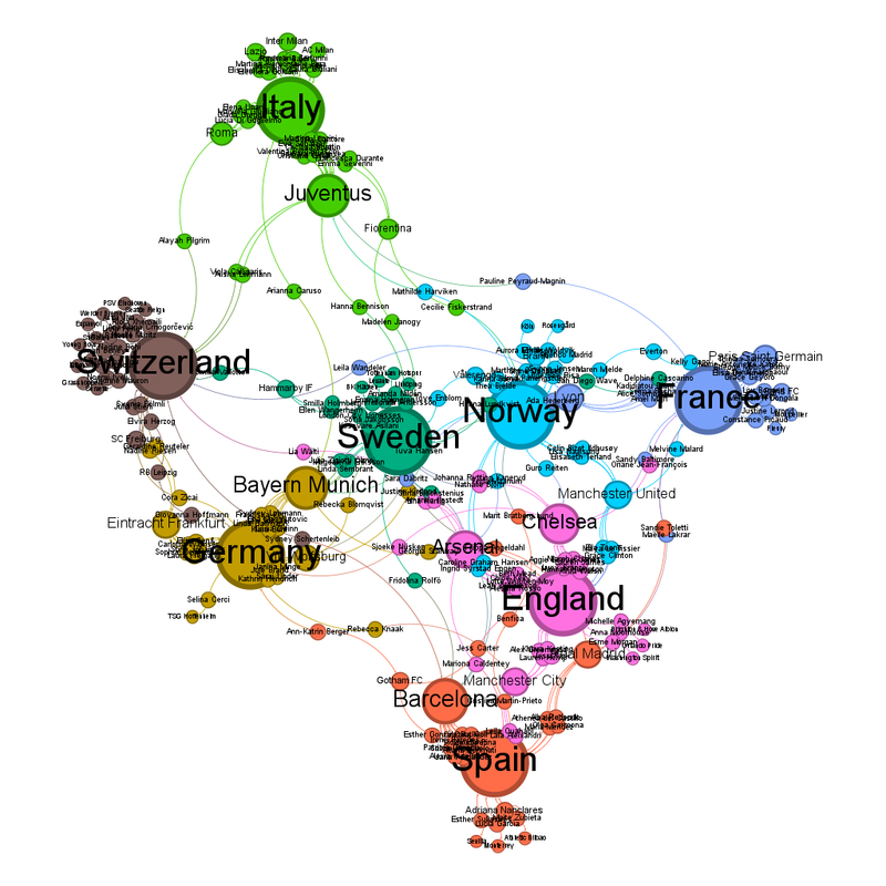
Unlabelled: Network diagram of the 8 remaining teams.  The remaining national teams are the large red circles.  Four line up across the middle horizontally.  Two are above this line in the top left, in a 45 degree diagonal line from each other.  The remaining two are below that line at a much more acute angle to each other.  The other circles are the club teams.  It is noticeable that some club teams have lots of representatives left because their circles are relatively large and orange. Labelled: Same diagram as previous but with the teams labelled.  The four teams across the middle horizontally are, from left to right, Germany, Sweden, Norway and France.  The two above the horizontal line are, going from nearest to middle to furthest, are Switzerland and Italy.  The two below the line, going nearest to furthest are England and Spain.  The club teams with noticeably large circles are Juventus, Bayern Munich, Arsenal, Chelsea and Barcelona. 

In the communities view, each nation is its own separate colour. The unlabelled view, this time coloured in by community.  The four nations along the middle are olive yellow, mid-green, bright blue and a darker more purply blue, respectively.  Above the horizontal are a team in brown and a team in bright green.  Below the horizontal, the two teams are orange and pink. Labelled version of the community diagram.  The four teams across the middle horizontally are, from left to right, Germany (olive yellow), Sweden (mid-green), Norway (bright blue) and France (darker blue).  The two above the horizontal line are, going from nearest to middle to furthest, are Switzerland (brown) and Italy (bright blue).  The two below the line, going nearest to furthest are England (pink) and Spain (orange).  The club teams with noticeably large circles are Juventus (bright green), Bayern Munich (olive yellow), Arsenal (pink), Chelsea (pink) and Barcelona (orange). Sweden are the national team closest to the centre (just, vs. Norway). 

Either Lyon or Bayern Munich are the club team closest to the centre. 

Barcelona are the team with the most representatives left in with 14, then comes Bayern Munich and Juventus with 13 then Chelsea with 12. 

Predictions for the quarterfinals: 

These are quite difficult because Italy and Spain are pulled out by how many of their players play for Juventus and Barcelona respectively, while Bayern Munich, and the players that play for them, are pulling together Sweden and Germany, and Arsenal and Chelsea are holding together England, Sweden and Norway. 

Sweden vs England - Diagram says Sweden 

Norway vs Italy - Diagram says Norway, plus every single women's football pundit keeps bewailing how often Italy somehow manage to screw up. On the other hand, Norway trip over their own feet also. 

France vs Germany - Diagram says Germany just. Football fan says "ooooh". 

Spain vs Switzerland - Remember how I said Barcelona pulled Spain out of the diagram. This really reflects that. Switzerland are far closer to the centre. On the other hand, there is no way I can see Switzerland beating this Spanish team.