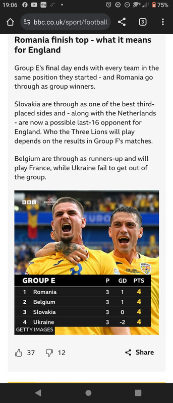
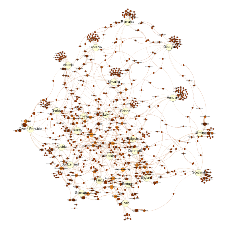
Showing posts with label football. Show all posts

Thursday, 2 January 2025

Copa America 2024

Doing my usual network graphs for the Copa America. It being the same year as the Euros acts as a nice compare and contrast (for the Euro 2024 group stage diagram, please see here - https://fulltimesportsfan.wordpress.com/2024/06/15/euro-2024-network-diagram-only-a-day-late/).

Group Stage: The Copa America network graph at the group stage is less tightly packed and inter-connected than the equivalent Euros graph Network diagram.  The blue circles are the national teams.  Size and colour relate to number of links to each item.  Eleven of the blue national team dots are reasonably evenly spaced.  Five stick out, four at the bottom, one out to the left. Same graph as before, but this time labelled.  The twelve evenly-spaced teams are Ecuador, Chile, Argentina (Argentina are the team at the top), Paraguay, Uruguay, Brazil, Colombia, United States, Venezuela, Mexico and Canada.  The four teams sticking out at the bottom are Panama, Costa Rica, Peru and Jamaica (left to right).  The team sticking out at the left are Bolivia. 
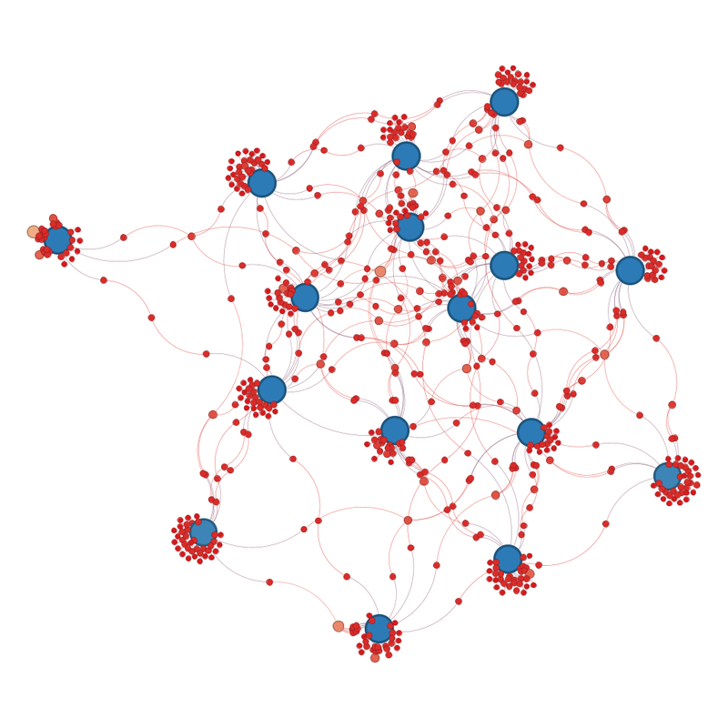
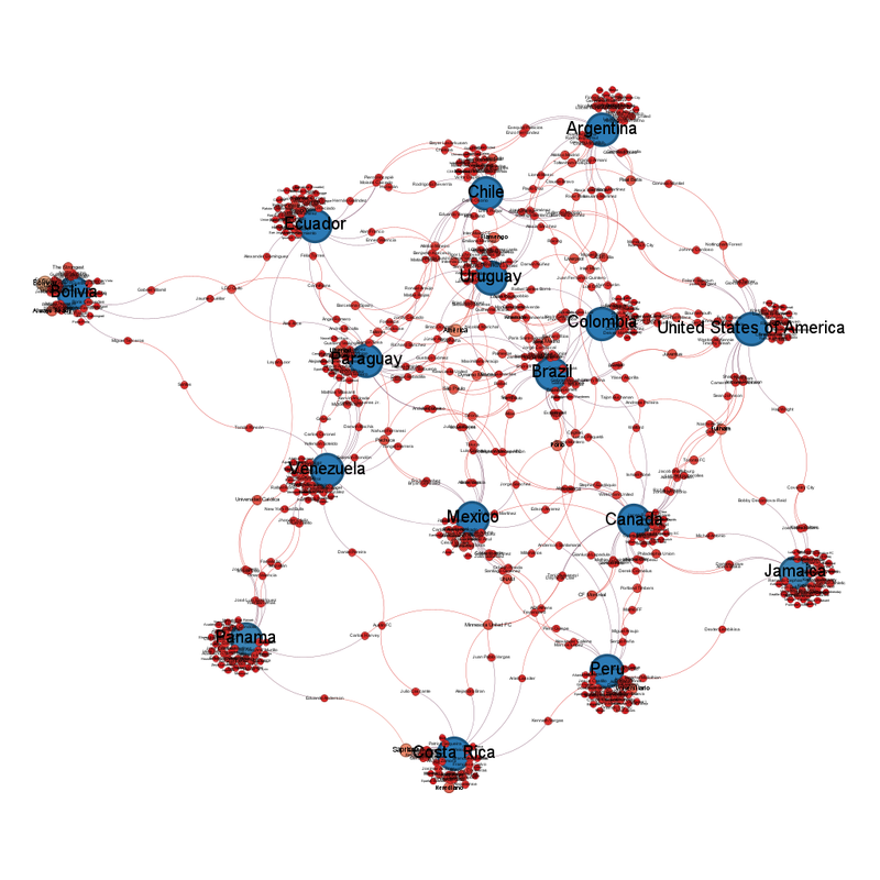
Argentina are not as central as I would have expected, and the US is more central than I would have expected. Toluca are the club team closest to the centre. 

Venezuela are probably the national team closest to the centre, but that's very "ish". 
The club team with the most representatives are Bolivar with 9. They are followed by America and Saprissa with 7, then Universitario, Flamengo, Fulham, Porto, Always Ready, Libertad and Herediano with 5. 

Jamaica are the odd team out because they only have a squad of 25, compared to everyone else's squad of 26. 

All national teams have at least one player playing in their home league. 

If the outlying teams predict the teams that are going out, I would expect Bolivia, Panama, Costa Rica, Peru and Jamaica to be among the teams that went out after the group stages, with the others being USA, Argentina and Chile. And I don't think Argentina will be out. 
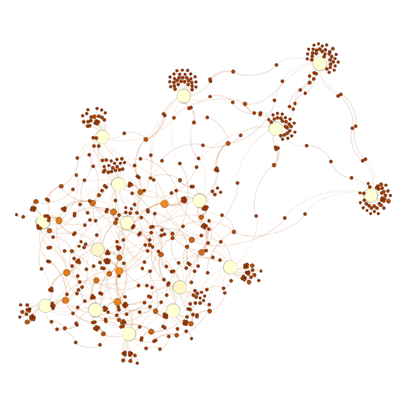
Quarterfinals: The teams that went out were Chile, Peru, Mexico, Jamaica, United States, Bolivia, Costa Rica and Paraguay. The graph predicted 6/8 teams that went out. It included 2/3 of the hosts of the next World Cup which does not bode well. 

Canada were not the one of the three that I was expecting to survive (are Canada better than we think?). 

Because most of the outliers have gone, the remaining 8 teams are more evenly spread. Unlabelled network graph.  The 8 remaining national teams are the blue circles.  The remaining teams are in a very messy rhomboid shape, with 6 at the lines, 3 along one side, 2 along the other and one at the top, and two inside the shape. This is the same picture as before, but labelled this time.  The teams that make up the rhomboid are Argentina at the top, then Colombia along the right hand side, with Canada at the bottom of that side.  The next corner is Panama.  Up the left hand side is Venezuela, then Ecuador.  The two in the middle are Uruguay and Brazil. 

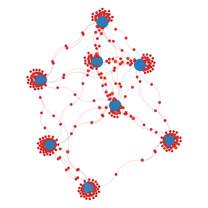
The club teams with the most players left in are: 
4 = Liverpool, Flamengo, Porto, Universidad Catolica, Real Madrid 
3 = Atletico Madrid, Tottenham Hotspur, Aston Villa, Minnesota United FC, CF Montreal, Independiente del Valle, Internacional, Sao Paulo, Girona, Paris Saint-Germain and Krasnodar 

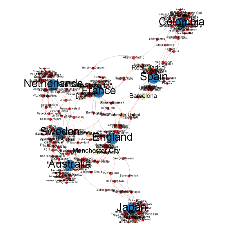
Brazil are the national team closest the centre and Sao Paulo are the club team closest. Guessing from which team are the furthest from the centre, Panama are likely to go out. With the others it's less easy to tell, but I would expect Uruguay and Brazil to get through. 
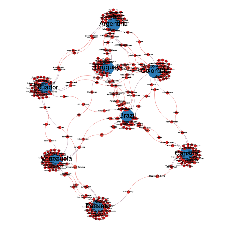
Semifinals: I know Uruguay are good, so I don't think Brazil losing to them is time to declare the end of the world but ... Brazilian football in crisis? 

Canada getting through to the semifinals was also unexpected. 

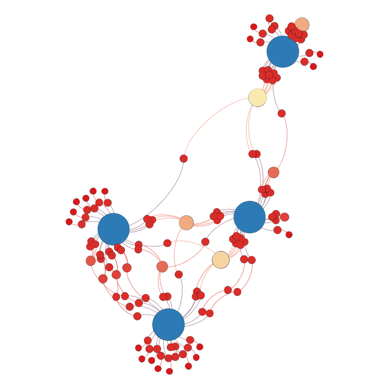
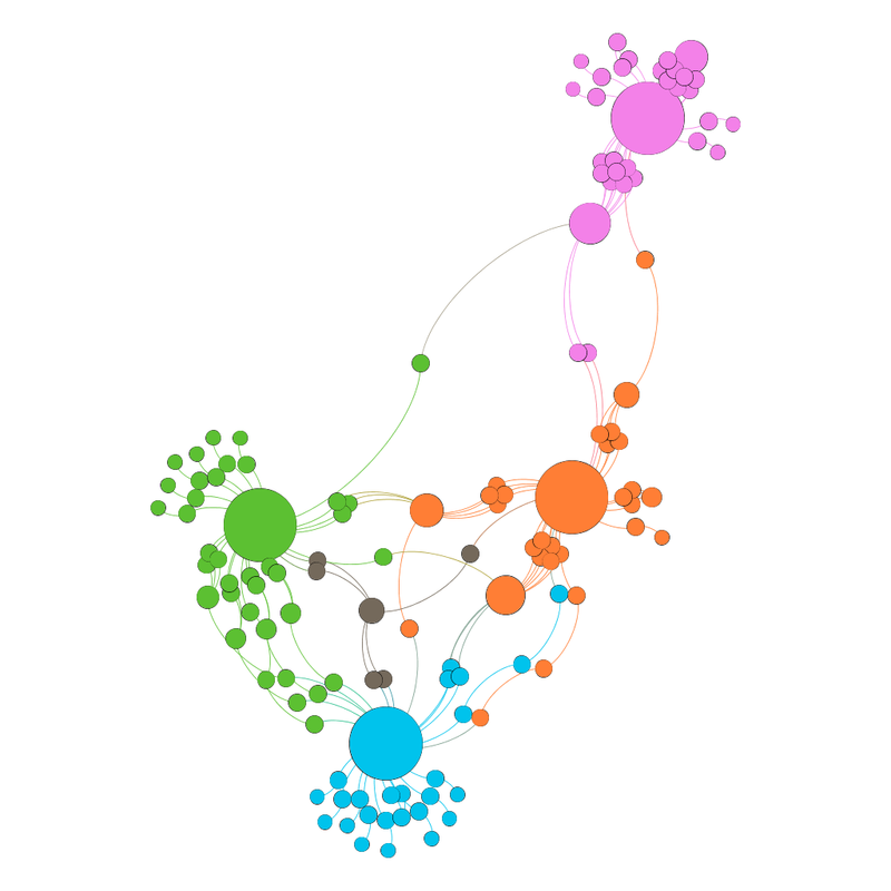
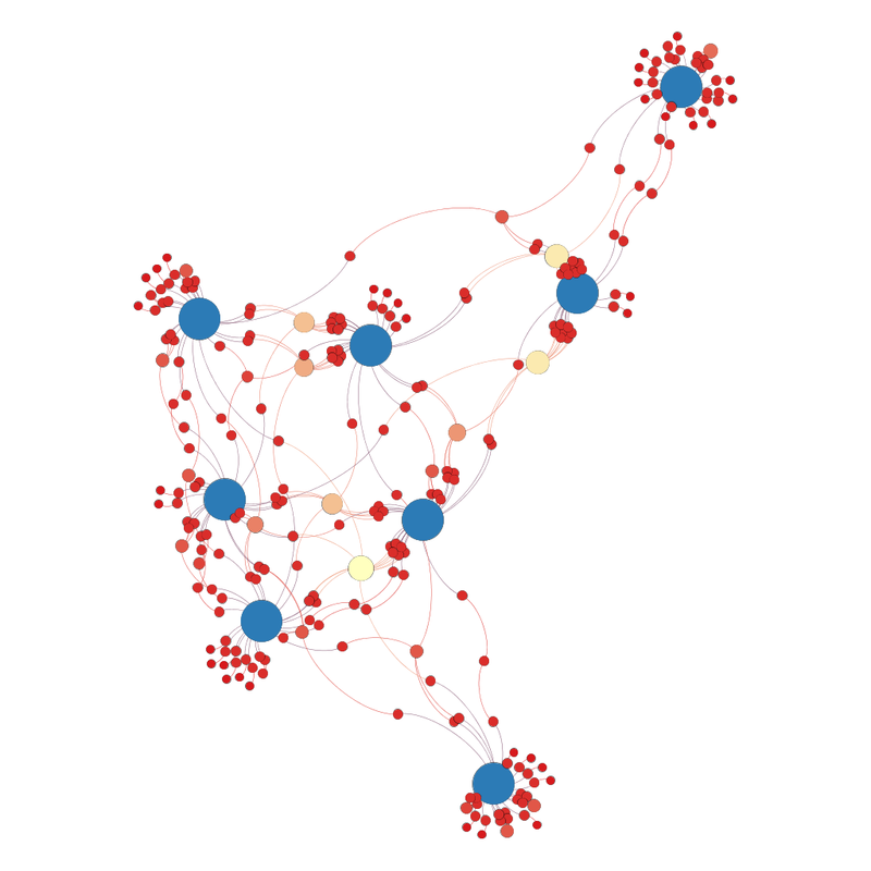
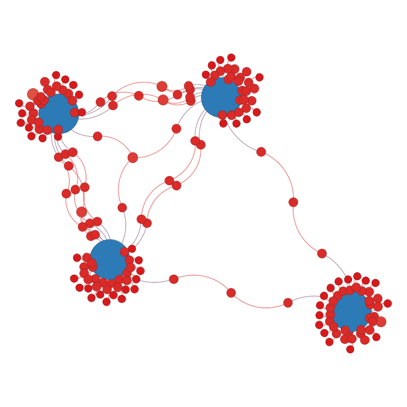
What do the semifinal diagrams look like? The four blue circles representing the national teams form a diamond, but the three teams at the top, bottom and left hand side of the diamond have more connections between them than the fourth one which is the one at the right of the diamond. The same diagram as above, but now labelled.  The three teams with more connections between them are Uruguay (left), Argentina (top) and Colombia (bottom).  Canada are the team sticking out. 
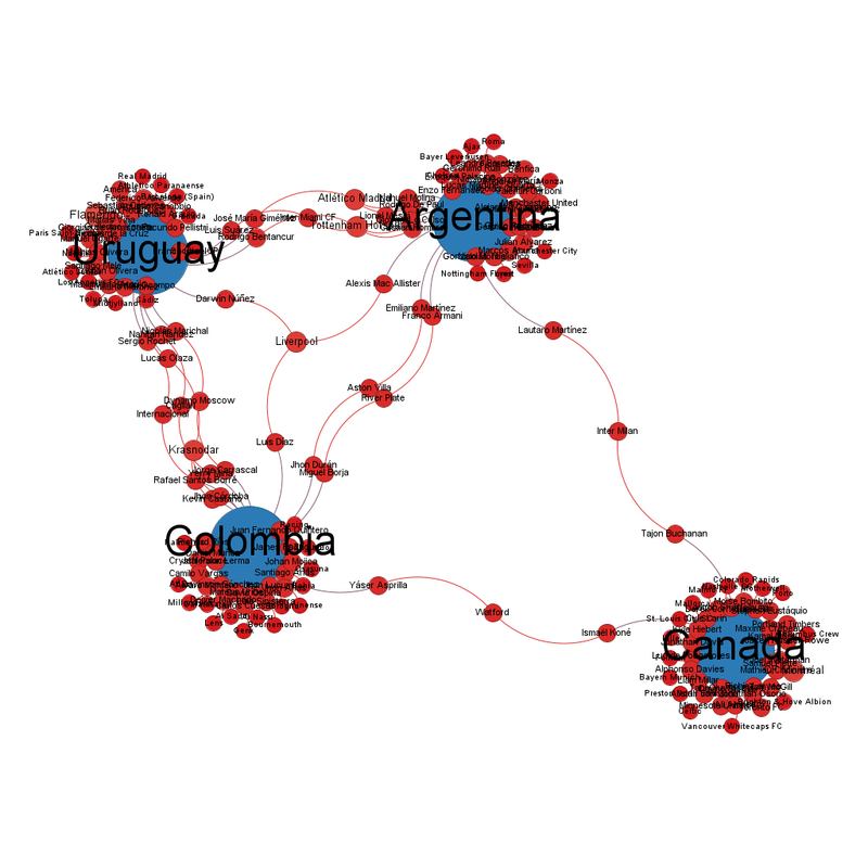
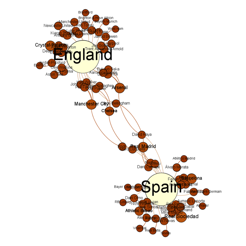
Colombia are the team closest to the centre, with River Plate the club closest to the centre. The diagram is not positive for Canada's chances in the semifinals. 
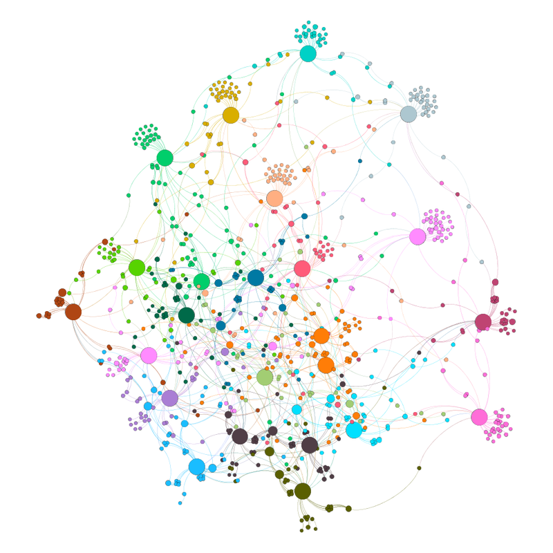
Finals: After a semifinal that nearly ended in a riot - https://www.infobae.com/colombia/deportes/2024/07/11/con-pelea-en-la-tribuna-y-lagrimas-de-james-y-luis-diaz-asi-termino-la-semifinal-entre-colombia-y-uruguay/ (I am not sure how it is Suarez's fault but ...), the final had Argentina winning. 

I won't say it looked like yet another tournament when it felt like the organisers were bending over backwards to help Argentina to win but ... (I will never forgive FIFA for making me agree with the Croatian football federation). 

It also featured poor organisation and celebrations that people had to apologise for - https://en.wikipedia.org/wiki/2024_Copa_Am%C3%A9rica#Argentine_celebrations 

Hopefully neither of these will be repeated at World Cup 2026. 
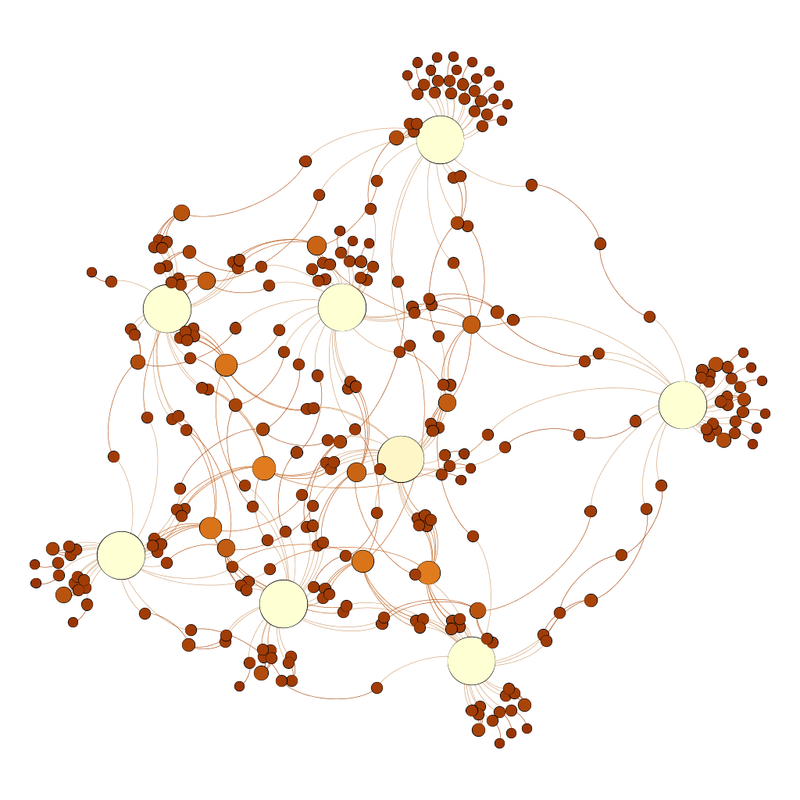
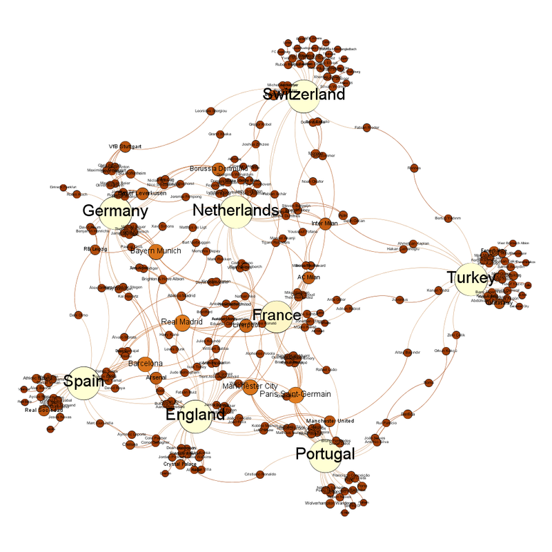
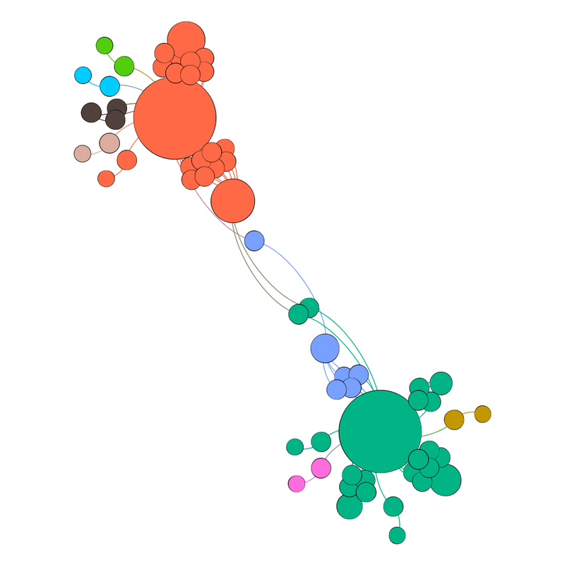
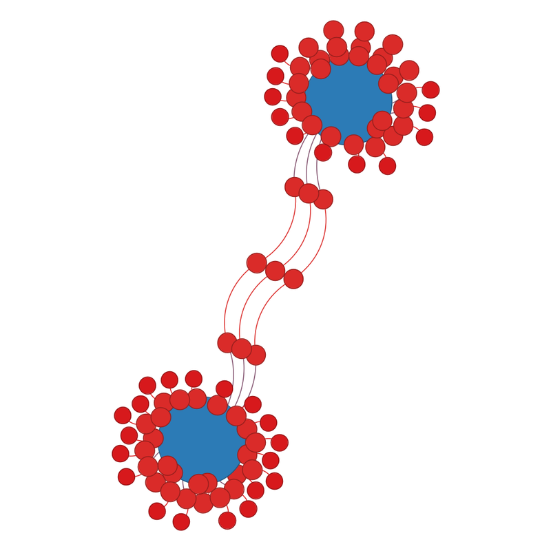
The diagram before the final looked like this. Two blue circles remain.  While they have lots of smaller red circles around them, they are linked by three lines. Same diagram as before, but labelled.  The blue circle at the top is Argentina, and the one at the bottom is Colombia, the three lines that join them because there are players playing for that club playing for each country and Liverpool, Aston Villa and River Plate. 
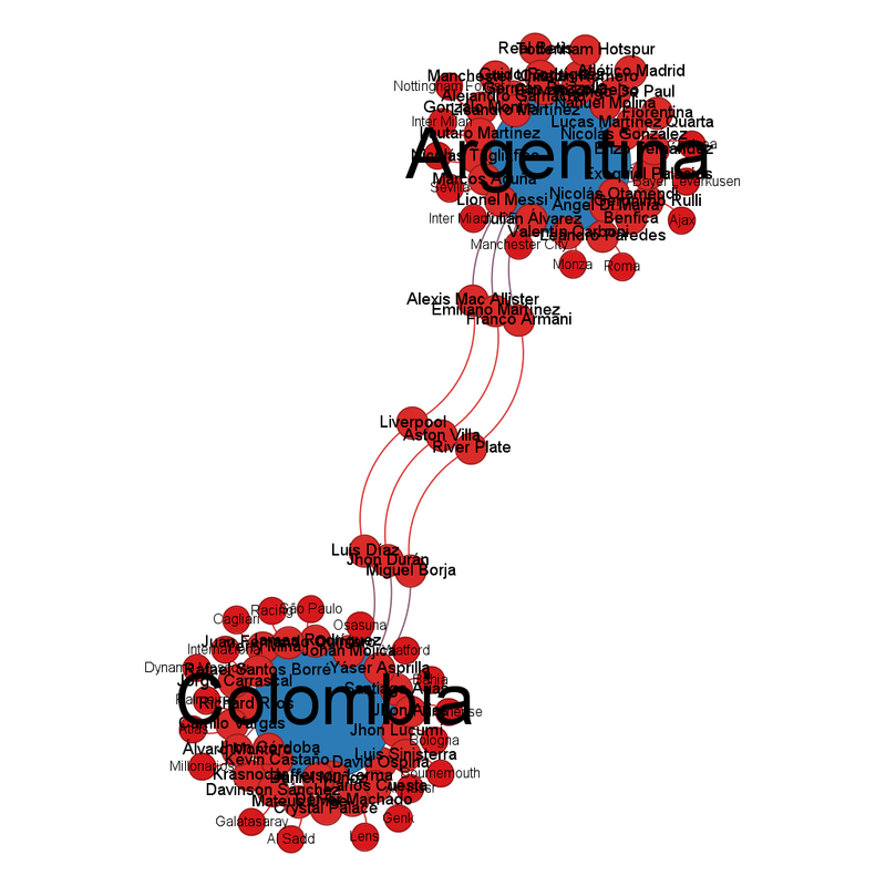
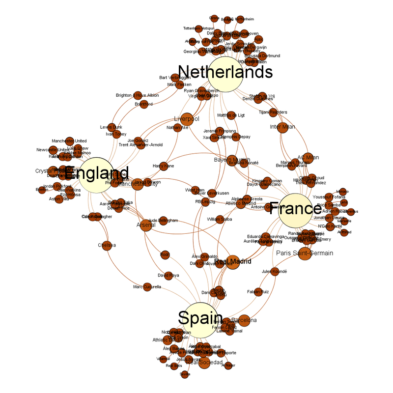
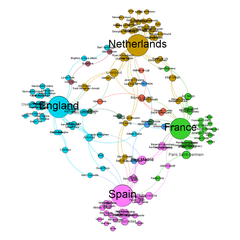
While the Copa America group stages were less interconnected than the Euros, the finals are not much less interconnected. The Euro 2024 final had 4 club teams with players on both national teams (https://fulltimesportsfan.wordpress.com/2024/07/12/euro-2024-final-network-diagram/), the Copa America final had 3. 

The three are River Plate, Liverpool and Aston Villa, which I think says a lot about Aston Villa's return to prominence. (There is a small local bias. Only half my colleagues hate everything about this, the other half are enjoying a season where they have beaten Bayern Munich.) 

What have we discovered: 

1) The "closest to the centre" theory work for European Men's Football, Men's rugby union and men's rugby league. It works less well for European Women's Football and CONCAF/COMEBOL competitions. 

2) Argentina and Brazil see my attempts at prediction and mock them.

Friday, 12 July 2024

Euro 2024 Final Network Diagram

Looks like this: Two evenly spaced white circles, surrounded by smaller brown circles.  Some brown circles join them in the middle. The labelled version looks like this: Labelled version of the above figure.  England are the white circle at the top and Spain are the white circle at the bottom.  All the other info is below. The thing that really leaps out at me, having done this since Euro 2012 is how much more interconnected the final two teams are. 

In 2012, only one club team, Manchester City, would have had someone on the winning team no matter what. 
In 2024, four teams can say that, Manchester City again, along with Real Madrid, Chelsea and Arsenal. 

Chelsea are the club team closest to the centre. 

Five club teams share the position of "most players left in", Real Madrid, Arsenal, Barcelona, Manchester City and Crystal Palace all have 4 players left in. Crystal Palace is the one that surprises me the most and suggests they have a much better academy system than I suspected. 

As England have got to the final with me not watching, I will continue not to watch lest I am a jinx. It's an odd situation where I have no preferred team, although both teams have a couple of players I really like.

Monday, 8 July 2024

Euro 2024 Network Diagram - It looks like the semifinals could get interesting

I said Spain vs Germany would be close (https://fulltimesportsfan.wordpress.com/2024/07/04/euro-2024-network-diagram-quarterfinals/). And I think the semifinals are going to be even closer. Normally at this stage, there might be an outlier, but this time everyone is evenly spaced. The network graph looks like a compass, with the four teams sitting at the cardinal points. Same diagram but labelled.  If it is a compass, then the Netherland sit at North, France at East, Spain at South and England at West. The community view has got complicated, because the 4 teams make eight communities. Netherlands are the dirty yellow colour, France are green, Spain are pink and England are blue.  The other communities are West Ham in a sort of dark green, Bayern Munich who are an orangey pink, Brentford who are a mauve-ish purple and Atletico Madrid who are a slightly darker blue that is hard to tell apart from England blue (sorry about that) The four countries are their own communities but four teams are also their own communities. They are West Ham in a sort of dark green, Bayern Munich who are an orangey pink, Brentford who are a mauve-ish purple and Atletico Madrid who are a slightly darker blue that is hard to tell apart from England blue (sorry about that). 

The club team closest to the centre are West Ham, Bayer Leverkusen or RB Leipzig. 

There's a real mix of teams with the most representatives still in, but Real Madrid have the most. This is what the list looks like: 
Real Madrid = 7 
Liverpool, Paris Saint-Germain = 6 
Barcelona, Arsenal, Real Sociedad, Manchester City = 5 

I'm not even going to try to predict the semifinals from this.

Thursday, 4 July 2024

Euro 2024 Network Diagrams - Quarterfinals

Okay, so Austria are out, as I suspected they would be. 

For the second Euros in a row, a team they beat in the group stage has gone further than them. But at least it took this absolute stunner of a save for Turkey to beat Austria - https://x.com/EURO2024/status/1808266570327634063 

Of the clear predictions, the diagram was 4/4, and the diagram was part of why I wasn't surprised by Italy or Austria's losses. (I have a series of theories about why the UK press always underestimates Turkey, they are all rude.) 

So, what does the diagram look like now? As expected, the outlying teams all lost, so there's now only the central core teams left. 

Looking at the unlabelled diagram, the central clump is now not as clumped, and one team sticks out to the right.  Network diagram.  While the central clump of teams remains, it is now left shifted, with one team standing slightly separately to the right.Labelled, it looks like this: Labelled version of the figure above.  Around the outside, clockwise, Switzerland are at 12, then Turkey at 3, Portugal at sort of half 5, then England at half 6 and Spain at 7.  Germany are at half 9.  France and the Netherlands are the two teams in the centre of the clockface, with France right in the centre.  Turkey are the team that stick out slightly. France are the team closest to the centre, while AC Milan are the club team closest to the centre. 

The club teams with the most representatives left are Real Madrid and Paris Saint-Germain with 10, Bayern Munich, Barcelona and Manchester City with 9, then Borussia Dortmund and Liverpool with 7 (stop giggling back there about that linkage). 

Inter Milan have been significantly reduced, not just because of Italy going out but also because they had several players in other teams that have been eliminated. 

All the teams are their own community in the community views. Around the outside, clockwise, Switzerland are mauve at 12, then Turkey olive green at 3, Portugal are orange at sort of half 5, then England in pink at half 6 and Spain in grey at 7.  Germany are at half 9 and are sort of turqoise-green.  France (bubblegum blue) and the Netherlands (green) are the two teams in the centre of the clockface, with France right in the centre.  Turkey are the team that stick out slightly. Unlabelled community view diagram, because it looks pretty. 

I can understand why Inter Milan are French in the community view, what with Italy going out, but Manchester City and Manchester United being Portuguese intrigues me. 

Predictions from this (and the reason why I'm writing this while watching the election coverage so it's out before tomorrow): 
Spain vs Germany - Diagram says Germany, just 
Portugal vs France - Diagram says France 
England vs Switzerland - too close to call 
Netherlands vs Turkey - Diagram says Netherlands (this one is the one I think could be an upset. This Turkey team have a vibe.)

Thursday, 27 June 2024

Euro 2024 Network Diagram - Now the group stage community views

I described the group stage diagram as looking like a peacock (https://fulltimesportsfan.wordpress.com/2024/06/15/euro-2024-network-diagram-only-a-day-late/), and I'm amazed how many of the peacock tail survived. Well done Georgia and Romania in particular. 

My prediction for who would go out was Albania, Slovenia, Romania, Georgia, Ukraine and Scotland, then Slovakia and Hungary, with Poland or Austria in place of one of Romania, Slovakia or Ukraine. I was right for 5/8, which I could as going okay. I also hadn't expected Belgium to turn the Group of Cuddly into the Group of Sickos.
  Screenshot from the BBC website showing that group E finished with all 4 teams having 4 points.

The network graphs for the last 16 look like this: Unlabelled network diagram, with a tightly packed core at the bottom left, and four teams trailing out to the right. The central core are still there (mostly, really wasn't expecting Croatia to go out), with four teams trailing out to the right. Labelled, it looks like this: Same diagram but labelled.  The four teams sticking out on the right are Slovakia, Slovenia, Romania and Georgia. Slovakia, Slovenia, Romania and Georgia being so far away from the main core highlights how much of a surprise their going through to the last 16 is. 

Because of the odd weighting, identifying the central team is less valuable than usual. Italy are the national team closest to the centre, and Juventus are the club team closest to the centre. 

The club teams with the most players left in are Inter Milan and Paris Saint-Germain with 12, then Manchester City with 11, then Bayern Munich, Real Madrid and Barcelona 10.

The community view looks like this:   Same figure as before, but coloured by community. Labelled version of that picture. Now each team is it's own community. 

Predictions, as requested by L. 

Spain vs Georgia - diagram says Spain 
Germany vs Denmark - no clear winner on the diagram 
Portugal vs Slovenia - diagram says Portugal 
France vs Belgium - diagram says France 
Romania vs Netherlands - diagram says Netherlands 
Austria vs Turkey - no clear winner on the diagram (I will be crossing my fingers and avoiding the match) 
England vs Slovakia - diagram says England 
Switzerland vs Italy - no clear winner on the diagram 

That central core is tightly packed, which is what's led to that uncertainty.

Saturday, 22 June 2024

Euro 2024 Network Diagram - Now the group stage community views

Because I was trying to race the start of the Euros with my diagrams, I didn't add the community view.

They're below and are quite busy.   Teams in the Euro 2024 tournament coloured by community Same diagram as previous but unlabelled There are 20 communities for 24 teams. 

Belgium and Denmark share a community because both teams have players that play for Anderlecht. France and Portugal share a community because of their Paris Saint Germain players.  
Then there's Albania and Croatia, and despite almost being on opposite sides of the diagram, Austria and Hungary are one group.

Saturday, 15 June 2024

Euro 2024 Network Diagram - Only a day late

(Stuff, still happening. Everything, still late.) 

So after OMG! 12 years of doing this, I know what shape I am expecting from this sort of thing. 

I am expecting a central tight core, surrounded by others (like the diagram below). A circle of blue circles surrounded by a circle of red circles. 

Now sometimes, the cluster is shifted and tighter at one point rather than the centre, like at the Women's World Cup 2023 (https://fulltimesportsfan.wordpress.com/2023/07/22/womens-world-cup-2023-group-stage-network-diagrams/), but what I didn't expect is what this one looks like. 

I've made a simplified description below because having 24 teams with 26* players each makes the diagram really busy. (* Except France and Belgium, because ... actually does anyone know why?) A circle of blue circles, three-quarters surrounded by red circles. 

So there's one cluster, and the other, less connected, teams splay out like a peacock's tail.

This is what the real one looks like:   Same shape as the circle surrounded by three-quarters but with more circles and a lot more lines and links. The same diagram, but now labelled, which only makes it busier. The same diagram as previously, but labelled.  The teams in the tight cluster are, in no particular order, Czech Republic, Serbia, Croatia, Italy, Poland, Turkey, Belgium, Austria, Netherlands, Denmark, Switzerland, Germany, France, Portugal, Spain and England.  The teams around them are, clockwise from the equivalent of 11, Albania, Slovenia, Romania, Georgia, Hungary, Ukraine and Scotland. 

It does make identifying the central team less worthwhile than usual. 

That team are Italy. 

Turkey are a lot closer to the cluster centre than I expected. 

One of Fulham, Tottenham Hotspur and Atletico Madrid are the club team closest to the centre. 

The clubs with the most representatives are Inter Milan and Manchester City with 13. The come Real Madrid, Barcelona and Paris Saint Germain with 12, the Bayern Munich and RB Leipzig with 11. 

Interestingly, a lot of Barcelona and Real Madrid players are not playing for Spain and we've definitely moved on from the days where Spanish players played for either one or the other. 

I am not even getting into the whole thing about 3 different club teams all being Red Bull teams (not least because I have a whole post about it here - https://fulltimesportsfan.wordpress.com/2023/03/29/in-which-we-know-that-uefa-wont-do-anything-about-dual-ownership-but-a-girl-can-dream/). 

Prediction: From the diagram, I think the 8 teams that will be eliminated will be Albania, Slovenia, Romania, Georgia, Ukraine and Scotland, then Slovakia and Hungary. 

You'll note that includes none of the group D teams, supporting the theory that it really is a group of Death!!! I suspect one of Poland and Austria will be out instead of Ukraine. Group E more like the group of cuddly if you're Belgium.

Friday, 23 February 2024

Haaland or Bug: Comparing Haaland's stats to Shearer, Kane and Salah

As promised in the update post comparing Shearer, Kane and Salah (https://fulltimesportsfan.wordpress.com/2024/02/14/the-king-his-heir-apparentand-the-pharaoh-waiting-in-the-wings-shearer-kane-and-salah-games-and-goals-per-season-updated-to-the-end-of-the-2022-2023-season/), here is what the the figures look like with Haaland added. 

I'd like to tip my hat to Ted Knutson (@mixedknuts on twitter, other microblogging platforms are available and I'm mostly at @kpfssport@mastodonapp.uk) for the concept of "something or bug", which came from the effect of that year that Burnley really outperformed expectations on Statsbomb’s analyses. Burnley’s data was so different to everyone else’s that after every analysis they had to check whether any outlier was a bug or just Burnley being Burnley. 

I strongly suspected that Erling Haaland's goalscoring stats would have that effect on my graphs but he had such a good first season in the Premiership that I couldn't really say no to L's suggestion when he said "why don't you add Haaland's stats to the analysis?". 

I was right to think Haaland's numbers were going to do terrible, terrible things to my graphs. 

First of all, he's so young that for actual data, there's only numbers up to age 22. For percentage of games played, that makes the data look wild. The percentage of games young players play varies so much depending on circumstance, things like depth of talent at their club, whether they've been loaned out to another club to get some seasoning, whether the coach wants to build them up slowly. So many variables, so it's really messy when you look at data from that age. Dot plot with the dots joined by dotted lines the same colour as the dots.  Blue dots are Alan Shearer,  orange are Harry Kane, silver is Mo Salah and yellow is Erling Haaland.  The Shearer curve starts at 0, rises to 53 percent at 21 and then drops to 50 percent at 22.  The Kane curve is upside down compared to the others because it starts high, at 68 percent, then drops to 40 percent at age 18 and then starts to rise again, finishing at 98 percent at 22.  The Salah curve starts at 0, reaches a maximum of 78 percent at 20, and then drops to 58 percent at 22.  The Haaland curve meanwhile is more of a steady rise, starting at 52 percent finishing at the highest point of 80 percent at 22.
That variability is most clearly seen in Kane's graph, which is upside down compared to the others. Because there's so little real data, the extrapolation in the graph to end of career, 35 years of age because that's when Shearer stopped, particularly effects Haaland's numbers. On the other hand, the extrapolation is needed because everyone's numbers go up after 22.   Dot plot with the dots joined by dotted lines the same colour as the dots.  Blue dots are Alan Shearer,  orange are Harry Kane, silver is Mo Salah and yellow is Erling Haaland.  The Shearer curve starts at 0, reaches a maximum of 86 percent at 31 then drops to 79 percent at 35.  The Kane curve starts at 20 percent, rises to a maximum of 89 percent between 29 and 30 years of age, then drops to 80 percent at 35.  The Salah curve starts at 15 percent, rises to a maximum of 93 percent between 27 and 28 years of age, then drops to 62 percent at 35.  The Haaland curve starts at 52 percent, rises to a predicted maximum of 82 percent at 24 and then drops to 40 percent at 35. 

I think that explains why Haaland's numbers drop so quickly in this graph and I think that'll steady itself with another year's data. I mean, according to this, his numbers max out at 24 and, barring injury (and may he be kept from those) that doesn't reflect footballing truth. 

The goals per game up to the oldest point all four players have reached is another one bent and mangled by lack of data. Dot plot with the dots joined by dotted lines the same colour as the dots.  Blue dots are Alan Shearer,  orange are Harry Kane, silver is Mo Salah and yellow is Erling Haaland.  The Shearer curve starts at 1.6 due to a nonsense of extrapolation.  It drops to a minimum of 0.1 goals per game at 19 then rises again to 1.75 at 22.  The Kane curve starts at 0.8, again due to extrapolation, reaches a minimum of 0.4 goals per game between 19 and 20, then rises to 0.55 goals per game by 22.  The Salah curve starts at 0.5, rises to a maximum of 0.4 at 20 then drops slightly to 0.3 at 22.  The Haaland curve starts at 0, reaches a maximum of 1.1 between 20 and 21, then drops slightly 1 goal per game at 22. That's two upside down curves versus two right way up curves, because of the extrapolation needed because Haaland started in the adult leagues earlier than the others. 

Also, this was all while Salah was still a winger, which explains his low numbers. 

On the other hand, you can imagine the nonsense extrapolation makes of Haaland's numbers if you send them forward to him being 35.

Behold, the nonsense:   Dot plot with the dots joined by dotted lines the same colour as the dots.  Blue dots are Alan Shearer,  orange are Harry Kane, silver is Mo Salah and yellow is Erling Haaland.  The Shearer curve starts at 0.6 goals per game, rises to a maximum of 0.6 goals per game at 27, then drops to 0.35 at 35.  The Kane curve starts at 0.19, rises to a maximum of 0.7 between 25 and 26, then drops to 0.26 at 35.  The Salah curve starts at 0, rises to a maximum of 0.6 at 30, then drops to 0.37 at 35.  The Haaland curve starts at 0, rises sharply to maximum of 1.05 between 20 and 21 then drops back to 0 by 26. According to the nonsense, Haaland stops scoring at 26. Again, may he be kept from injury, that is clear nonsense. 

For goals per possible game, up to the oldest age all of them have achieved, we're back in the land of the banana curve, due to extrapolation. Dot plot with the dots joined by dotted lines the same colour as the dots.  Blue dots are Alan Shearer,  orange are Harry Kane, silver is Mo Salah and yellow is Erling Haaland.  The Shearer curve starts at about 0.19, drops to a minimum of 0.05 at 20 years of age, then rises to 0.3 goals per possible game at 22.  The Kane curve starts at 0.5 goals per possible game, drops to a minimum of 0.2 between 18 and 19, then rises to 0.54 goals per game at 22.  The Salah curve starts at -0.35 goals per game, I blame extrapolation, then rises to a maxium of 0.21 at 20, then drops to 0.15 goals per possible game at 22.  The Haaland curve starts at -0.1 goals per possible game, rises to a maximum of 0.82 goals per possible game at 20 then drops slightly to 0.8 goals per possible game at 22. Again, it's Kane and Shearer who are banana shaped, and Salah's goals per possible game is lower than everyone else's because he was still a winger. Dot plot with the dots joined by dotted lines the same colour as the dots.  Blue dots are Alan Shearer,  orange are Harry Kane, silver is Mo Salah and yellow is Erling Haaland.  The Shearer curve starts at 0 goals per possible game, up to a maximum of 0.5 goals per possible game between 27 and 28, then drops to 0.29 goals per possible game at 35.  The Kane curve starts at 0, rises to a maximum of 0.58 goals per possible game between 26 and 27 and then drops to 0.28 at 25.  The Salah curve starts at 0, then rises to a maximum of just over 0.6 at 33 before dropping just below 0.6 goals per possible game at 35.  The Haaland curve starts at 0, before rising to a maximum of 0.83 at 21, before dropping like a stone to 0 at 27. Again, Haaland's is that shape due to a lack of data. 

It'll be interesting to see the shape of his curve change next year.

Wednesday, 14 February 2024

The King; his Heir Apparent…and The Pharaoh waiting in the wings

Shearer, Kane and Salah, games and goals per season, updated to the end of the 2022-2023 season 

In the first post in the series I compared the games per season, goals per game and goals per possible game for Alan Shearer, the Premier League's all time top scorer, and Harry Kane and Mo Salah, the two players who had the best change of beating his record back in 2021 when L first had the idea. 

At the end of the post, I suggested two bits of future work; to update the stats at the end of each season, and to then look at Erling Haaland's numbers in comparison. This post covers the first of those two bits of future work, a second one with Haaland's data is in the works. 

Comparing Shearer, Kane and Salah using data up to the end of the 2022-2023 season 

Looking at percentage of games played in only up to the point where all 3 players are 29, it looks like this. Dot plot with the dots joined by dotted lines the same colour as the dots.  Blue dots are Alan Shearer,  orange are Harry Kane and silver is Mo Salah.  The Shearer curve bends sharply to the lowest point of any of the three, stopping at 80 percent of games played.  His curve is pulled down by having played few games when he was 27.  The Salah curve has a very similar shape but stops at 85 percent.  The Kane curve is also a parabola but is still rising when he reaches 29.  At 29, his curve is at 90 percent. 

It's now the Salah and Shearer curves that are the most similar. 

Shearer's curve is being brought down by the ankle injury when he was 27, while Salah's is being brought down by the relatively lower percentage of games he played last season. Possibly because Tottenham Hotspur relied so much on him, so played him a lot, Kane's curve is not dropping. 

If we use all the data from Shearer's career, and then extrapolate from the data available for up to 29 years of age for Kane and 30 for Salah the curves look like this: Dot plot with the dots joined by dotted lines the same colour as the dots.  Blue dots are Alan Shearer,  orange are Harry Kane and silver is Mo Salah.  All three are parabolas.  The Shearer curve starts at 0 percent, reaches a maximum of about 85 percent at the age of 31, and then drops to about 79 percent at 35.  The Kane curve starts at 20 percent, reaches a maximum of about 90 percent at the age of 30 and then drops to 80 percent at 35.  The Salah curve starts at 14 or 15 percent, reaches a maximum of 92 or 93 percent between 27 and 28 years of age, and then drops to about 64 percent at 35. Salah's curve is really affected by the way the extrapolation handles the relatively few games he played at age 29, but the curve shape going forward is going to heavily depend on how many games he plays this year. 

Looking at goals per game, up to the age of 29, the curves look like this: Dot plot with the dots joined by dotted lines the same colour as the dots.  Blue dots are Alan Shearer,  orange are Harry Kane and silver is Mo Salah.  All three are parabolas, but the Salah curve is almost a straight line.  The Shearer curve starts at about -0.1 goals per game, reaches a maximum of about 0.62 goals per game at age 25, then drops to 0.56 goals per game at 29.  The Kane curve starts at about 0.19 goals per game, reaches a maximum of 0.7 goals per game at about age 26 and then drops to 0.61 goals per game at 29.  The Salah curve starts at -0.1, and is still increasing when it ends at 0.61 at 29 years of age. The three curves are very similar to last year's. Shearer's is still brought down by the limited number of goals he could score at the age of 27 when he had an ankle injury, but you can also see him recovering from that, and the goals per game rising back up again. 

The different shape of Salah's curve reflects him being repurposed from a winger to a striker, while the other two have always been out and out strikers. 

If we look at all the data, the curves look like this: Dot plot with the dots joined by dotted lines the same colour as the dots.  Blue dots are Alan Shearer,  orange are Harry Kane and silver is Mo Salah.  The Shearer curve starts at 0.5 to 0.6 goals per game, reaches a maximum of 0.61 goals per game at 27 years of age, and then ends at 0.35 goals per game at 35.  The Kane curve starts at 0.19 goals per game, reaches a maximum of 0.68 to 0.7 between 25 and 26, and ends at 0.27 at 35.  The Salah curve starts at 0, reaches a maximum of 0.61 between 30 and 31 and then drops to 0.56 at 35. Previously, the shape of the curves was really different, with Shearer and Kane having parabolas and Salah's being a steadily rising straight line. The relative drop off in goals per game in the last two years for Salah is probably what's bending his curve now. 

Salah's curve still doesn't drop as much as the other two, possibly reflecting the steady rise after he switched from winger to striker. Kane's numbers are hurt by the dip in goals per game at the age of 28. 

The goals per possible game metric was added to account for Shearer's Newcastle having fewer games so less likelihood of him being rested. Up to age 29, it looks like this. Dot plot with the dots joined by dotted lines the same colour as the dots.  Blue dots are Alan Shearer,  orange are Harry Kane and silver is Mo Salah.  The Shearer curve starts at -0.4 goals per possible game, reaches a maximum of 0.6 goals per possible game at 26, then drops to 0.48 goals per possible game at age 29.  The Kane curve starts at -0.05, rises to a maximum of 0.55 at 27, then drops slightly to 0.54 at 29.  The Salah curve starts at -0.1 and is still rising to 0.6 goals per game at the age of 29. Shearer and Kane's curves resemble each other, while Salah's is a completely different shape, again, an artefact of his role changing. 

If all the available data is used, it looks like this: Dot plot with the dots joined by dotted lines the same colour as the dots.  Blue dots are Alan Shearer,  orange are Harry Kane and silver is Mo Salah.  The Shearer curve starts at 0, rises to a maximum of 0.52 goals per possible game at 26 and then drops to 0.29 at 35.  The Kane curve starts at 0, rises to a maximum of 0.58 goals per possible game between 26 and 27 and then drops to 0.28 at 35.  The Salah curve starts at 0, rises to a maximum of 0.6 goals per possible game at 33 and then drops slightly by 35. This is one where there's been a major change, with Kane's curve no longer dropping like a stone, which it did last year (I still blame Antonio Conte). 

I think the changes show the value of continuing to look at this at the end of each season. Obviously a couple of things have happened this season which will affect these plots going forward; Kane moving to Bayern Munich and Salah missing some Liverpool games playing for Egypt at the African Cup of Nations. That hasn't affected Salah's numbers before but since he got injured, it may have a greater effect this time. 

Kane leaving for Bayern almost certainly means he won't break Shearer's record. I'll still look at his stats, because I've included Salah's Fiorentina spell in the stats, but I acknowledge it'll no longer be a direct comparison because of the difference between the English and German leagues. 

Salah is now the active Premiership player closest to Shearer's record, he's on 153 goals, while Shearer finished on 260. The next nearest active player on the list is Raheem Sterling on 120 goals.

Thursday, 17 August 2023

Women's World Cup 2023 - Final Network Diagram

As you can all imagine, full working decorum was maintained at all time between the Australian and English offices for the entirety of Wednesday morning (UK time) and the company messaging system was full of GIFs flying in all directions. 

(We also have the rugby union and cricket World Cups where similar battlelines might be drawn.) 

The network diagrams now look like this: Final-not-lablled Final-labelled The club team closest to the centre are Manchester United. 

Because so many of Spain's players play in Real Madrid and Barcelona, but England have two players playing for Barcelona, England are slightly closer to the centre. 

Barcelona are the team with the most representatives in the final, with 10 players. Next are Real Madrid with 8 and Manchester City with 6. 

Manchester United and Barcelona link the two national teams, with Ona Batlle of Spain, and Mary Earps, Ella Toone, Katie Zelem and Alessia Russo of England playing for Manchester United and Irene Paredes, Aitana Bonmati, Mariona Caldenty, Alexia Putellas, Laia Codina, Maria Perez, Salma Paralluelo and Cata Coll of Spain and Lucy Bronze and Keira Walsh of England playing for Barcelona.

Once a tournament is down to two teams, the community view doesn't give a lot of information, but I'm including them here because it's quite pretty this time. Final-Community-not-Labelled Final-Community-Labelled 

I will be spending Sunday morning hiding from the match so I don't jinx England. I have been informed by colleagues that this is ridiculous. They will thank me if England win.

Sunday, 13 August 2023

Women's World Cup 2023 - Semifinals Network Diagrams

In the predictions made in the last post, the diagram got 2/3 correct where there was a proper prediction.

Following the eliminations after the quarterfinals, the network diagrams now look like this: Semifinal-not-labelled Semifinal-labelled 

It's now sort of squished diamond shape, with most of the weight in the Australia, England and Sweden cluster at the bottom of the diamond. Spain are the team sticking out at the top. Sticking out is normally a bad sign for the next match, but Spain are Spain and are somehow doing well despite a whole lot of problems

England are the national team closest to the centre, with Chelsea (just about) being the club team closest to the centre. 

The club teams with the most representatives are Barcelona with 11 players left representing them, followed by Manchester City with 10 and then Chelsea and Real Madrid with 8. France going out wiped out the Paris Saint Germain and Lyon players (not totally, but not far short since it reduced them to 1 player left each). 

The community view is interesting, given there's 4 teams left and 5 communities. Semifinal-community-not-labelled Semifinal-community-labelled Arsenal are the mysterious 5th community, I think because they link 3 of the teams (Australia, Sweden and England). 

As for the diagram's predictions for the semifinals, they are as follows: 

Sweden vs Spain - diagram probably says Sweden, football knowledge says Spain. The diagram has been mysteriously right about Sweden so far but I don't think it can continue. 

England vs Australia - knowledge (esp. since Australia are at home) says "dunno", diagram says England just.

Thursday, 10 August 2023

Women's World Cup 2023 - Quarterfinal Network Visualisations

I start with an admission: of the predictions I made in my last post except for the USA vs Sweden match, where the diagram disagreed with footballing knowledge, the diagram was wrong. 

But I'm still going to carry on making the network diagrams because I enjoy it and because they look pretty. 

The community views look particularly pretty this time, but let's start with the usual network diagrams that look at the links between teams. Quarterfinal-not-labelled Quarterfinal-labelled 
The club team closest to the centre is Manchester United, while France and England are the national teams closest to the centre. 

Denmark and Norway being eliminated has broken up the Nordic+Australia pack at the bottom. There's now a cluster of 5 teams (Netherlands, France, England, Sweden and Australia) with Spain and Colombia sticking up and Japan sticking out at the bottom. 

The club teams with the most representatives are Manchester City (with 12 players representing them), then Real Madrid and Barcelona (with 11) and Chelsea and Paris Saint-Germain (with 9). 

As I mentioned, the community views are very pretty. Quarterfinal-Community-not-labelled Quarterfinal-Community-labelled 
There are 8 teams left, who are now each their own community. 

For the quarterfinals, the diagram's predictions are as follows: 

Spain vs Netherland - Knowledge and diagram says "ooooooh" because that should be a good match. 

Japan vs Sweden - Diagram says Sweden, knowledge says Japan, Japan's players tending not to play overseas, is a thing, and that will affect the diagram. 

Australia vs France - Diagram says France, Knowledge says France are mis-firing but have depths of talent and are mercurial France! vs home town Australia so, who knows. 

England vs Colombia - Diagram and knowledge say England, although they've been making tough work of it so far.