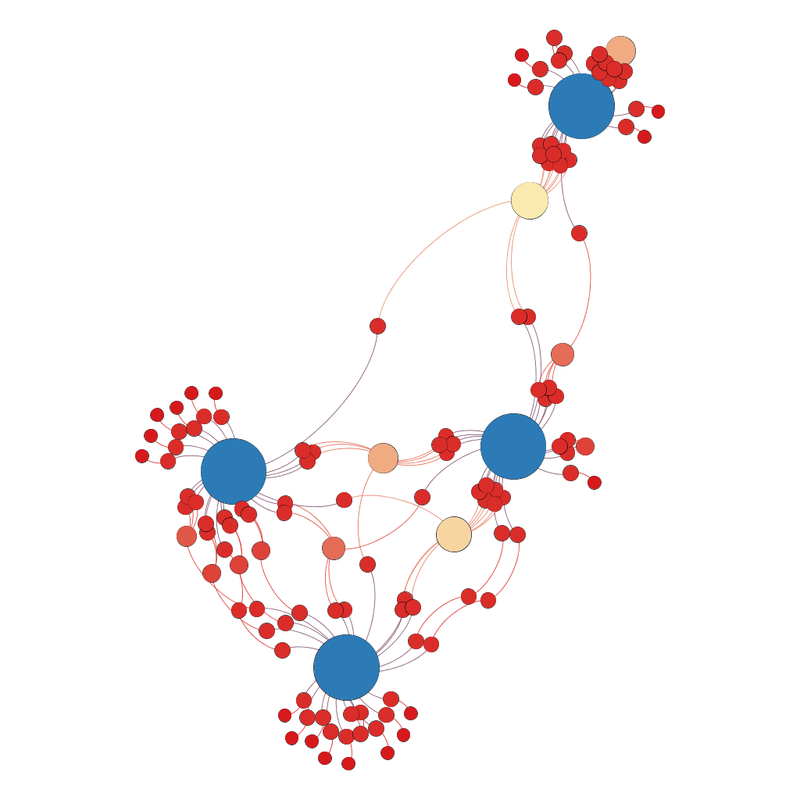
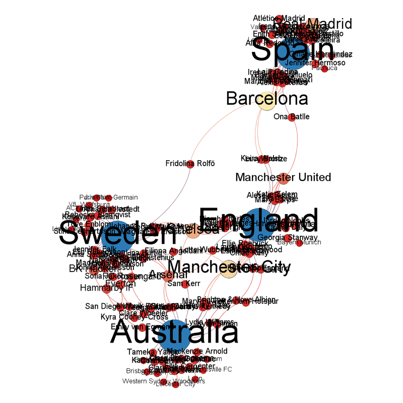
It's now sort of squished diamond shape, with most of the weight in the Australia, England and Sweden cluster at the bottom of the diamond. Spain are the team sticking out at the top. Sticking out is normally a bad sign for the next match, but Spain are Spain and are somehow doing well despite a whole lot of problems.
England are the national team closest to the centre, with Chelsea (just about) being the club team closest to the centre.
The club teams with the most representatives are Barcelona with 11 players left representing them, followed by Manchester City with 10 and then Chelsea and Real Madrid with 8.
France going out wiped out the Paris Saint Germain and Lyon players (not totally, but not far short since it reduced them to 1 player left each).
The community view is interesting, given there's 4 teams left and 5 communities.
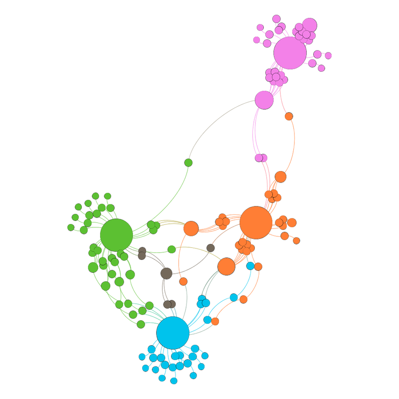
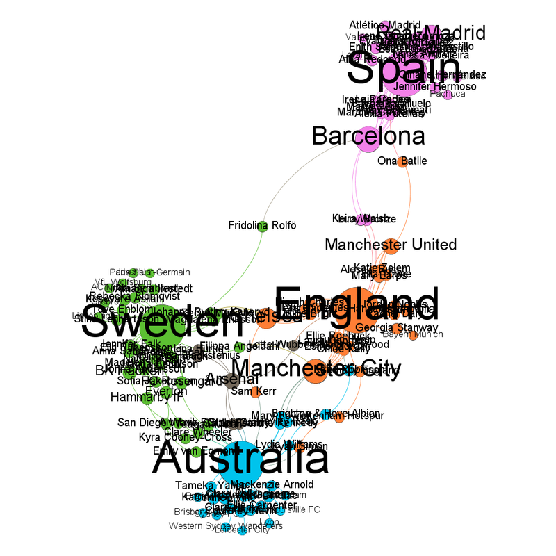
Arsenal are the mysterious 5th community, I think because they link 3 of the teams (Australia, Sweden and England).


As for the diagram's predictions for the semifinals, they are as follows:
Sweden vs Spain - diagram probably says Sweden, football knowledge says Spain. The diagram has been mysteriously right about Sweden so far but I don't think it can continue.
England vs Australia - knowledge (esp. since Australia are at home) says "dunno", diagram says England just.
No comments:
Post a Comment