Wednesday, 17 July 2024

Saints Ahoy - Visualisations up to Game 8

I warned you that real life had happened so I'm now catching up. 

The next match analysed for this project was Saints away to Catalan Dragons on the 6th of April. 

The match ended with what the Saints website described as a narrow away loss - https://www.saintsrlfc.com/2024/04/06/saints-suffer-narrow-loss-away-at-catalans/ 

What it did do was bring up 50 point-scoring moments for Saints (so 6.25 scoring moments per match). There is no pattern as to when Saints score (or at least not yet). Colourful bar chart of which Saints players score and when.  There is no pattern as to time but it is noticeable that there are a lot of unconverted tries. While there is no pattern, the lack of conversions starting to show (you'd expect a differently coloured bit next to each other or on top of each other, there aren't many of those). This is a problem and will be a problem come the play-offs, presuming we make it. 
Which Saints players are present when they score? Only three players are present for all scoring moments and it is a pretty smooth diagonal down to the ones not present often. Whitely, Welsby and Lomax were present for all 50 point-scoring moments. The next most present are Makinson and Dodd. 
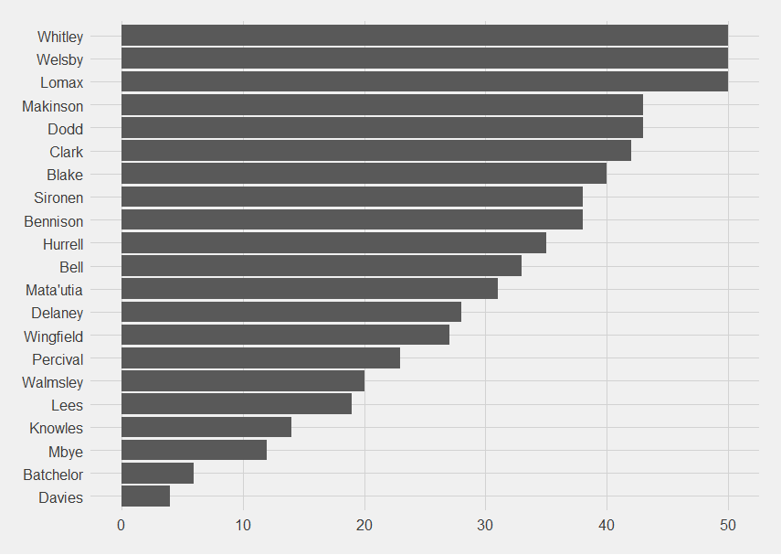
Present least often are Mbye (12), Batchelor (6) and Davies (4). Davies is because he was out injured (and then sent out to Swinton to get match fit [https://www.sthelensstar.co.uk/sport/23520688.paul-wellens-gives-konrad-hurrell-update-praise-ben-davies/]). Mbye's is because he only plays when Daryl Clarke can't or needs spell on the bench. 

I'm not sharing the dendrogram because it's officially too complicated to interpret. 

The matrix diagram looks like this. There is a central darker patch of players that play together often when Saints score.  It gets paler as you move out, with an extra pale swatch on the top and far left. Paler squares are for players who do not play together when Saints score. These are starting to form some interesting patterns: 
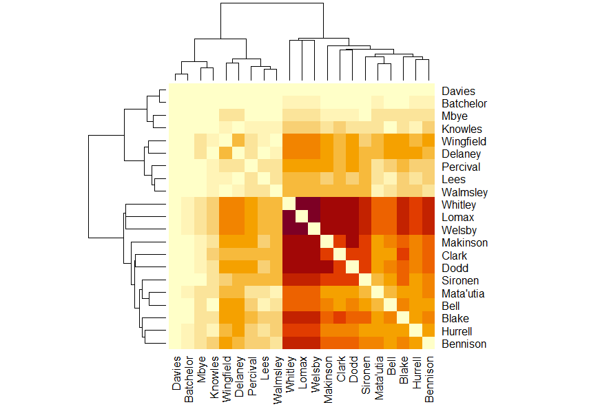
Bell, Lees, Knowles 
Hurrell, Lees, Knowles 
Mata'utia, Walmsley 
Sironen, Wingfield 
Dodd, Lees 
Makinson, Lees, Knowles 

Some of these I can explain as forwards who don't play together often. Makinson and Lees and Knowles, and Dodd and Lees, I can't explain. 

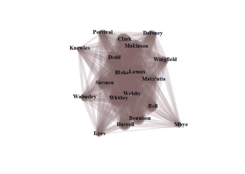
There are 19 players in the network graph, like there was last time (https://fulltimesportsfan.wordpress.com/2024/06/03/saints-ahoy-visualisations-from-game-7-and-the-season-to-date/). It's tilted about 90 degrees anti-clockwise and now looks like a slightly nobbily tilted square. The central chunk are Sironen, Blake, Lomax, Matautia, Welsby and Whitely.  Then there is another chunk on top; Dodd, Clark and Makinson.  There are another chunk at the bottom; Hurrell, Bennison and Bell.  Outside these, starting from top left are Knowles, Percival, Delaney, Wingfield, Mbye, Lees and Walmsley. The central chunk are Sironen, Blake, Lomax, Matautia, Welsby and Whitely. The chunk on top are Dodd, Clark and Makinson. The chunk on the bottom are Hurrell, Bennison and Bell Outside (from top left) = Knowles, Percival (I presume because of injury and suspension), Delaney, Wingfield, Mbye, Lees and Walmsley 
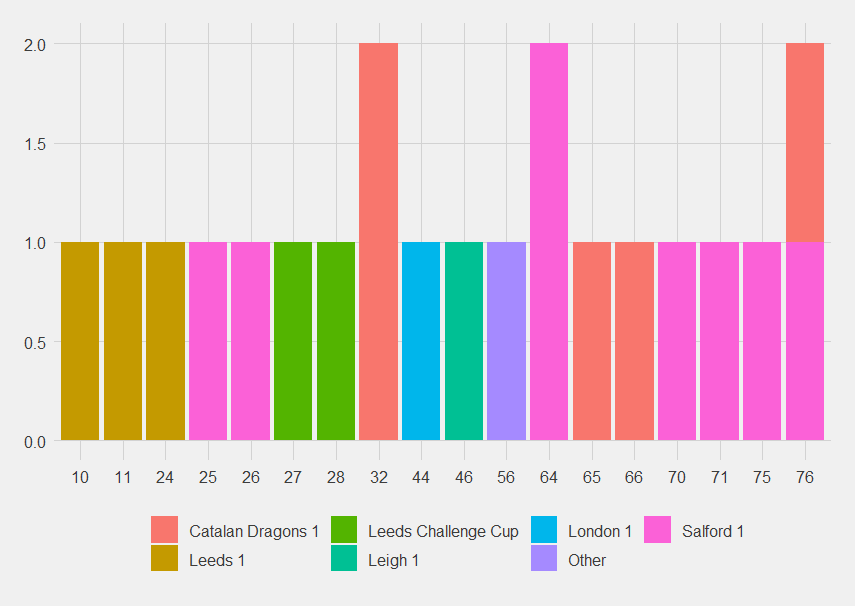
In the 8 games, Saints have conceded 21 point-scoring moments. 

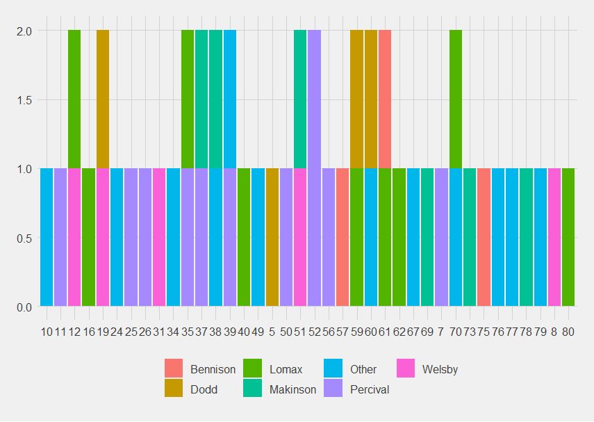
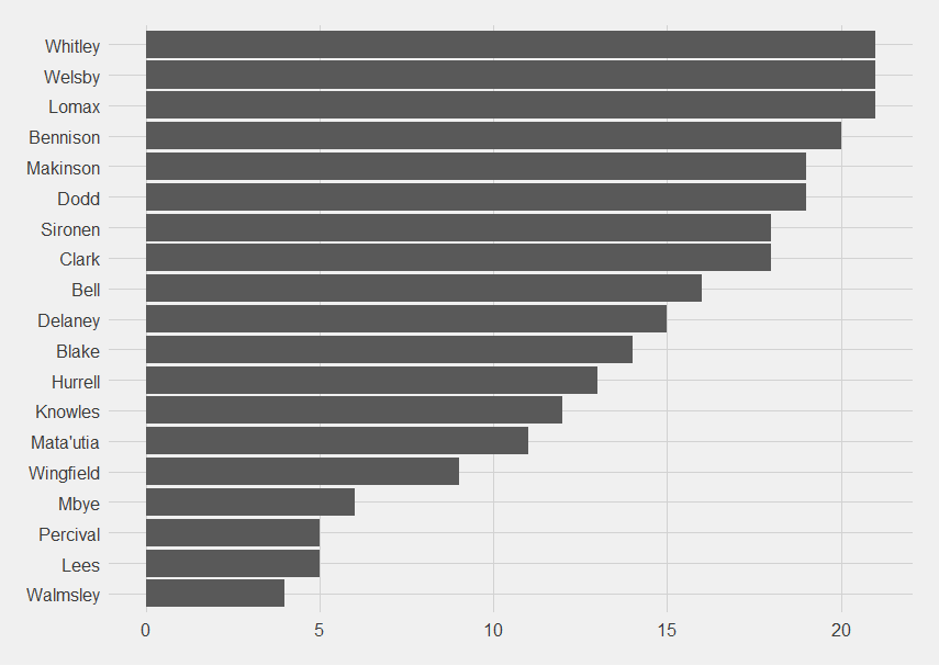
 Most interestingly, they have conceded at minute 76 to two different teams. Bar chart showing when Saints concede.  The point of interest is minute 76, the only point where they have conceded to different teams, Catalan Dragons and Salford. The three players most present when Saints score are also most present when they concede, then Bennison, then Makinson and Dodd. Bennison much higher on the "when Saints concede" chart than on the "when Saints score chart". Whitley, Welsby and Lomax are present for all 21 concession moments, then Bennison for 20, then Makinson and Dodd for 19.  Walmsley, Lees and Percival are present for the least; 4, 5 and 5 respectively. The players present for the least concession moments are Walmsley, Lees and Percival, which is probably due to the number of minutes those three players have played. 
If we look at the concession matrix, it looks like this: Players present together when Saints concede.  In this one, the dark patch for present together most often is in the middle but the next most often together is in the bottom right corner, with less often together in the top left. The players whose crossing points are paler than expected, which suggests they don't play together when Saints concede are: 
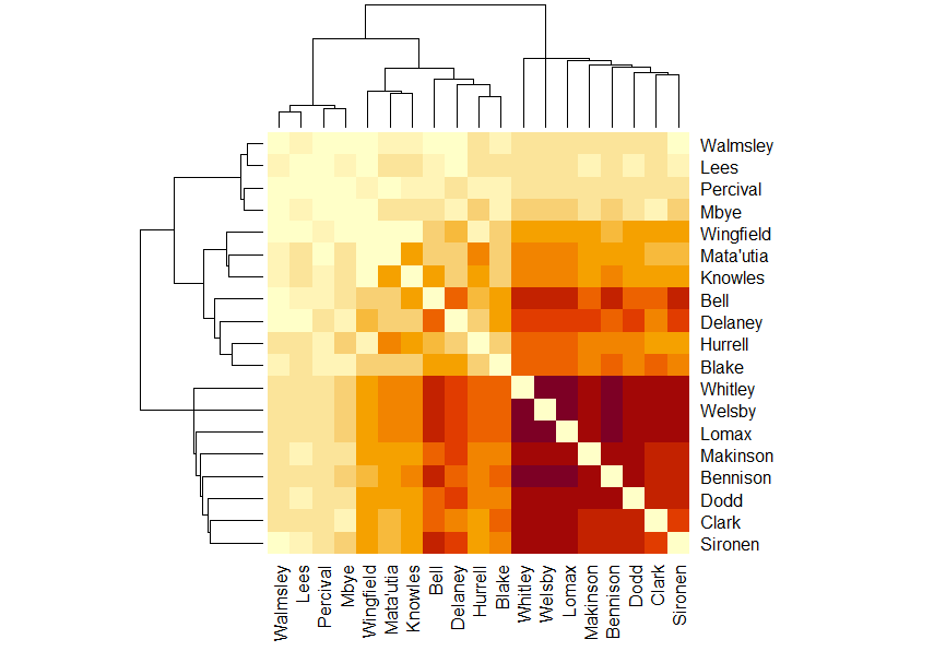
Clark and Mbye (which makes sense because they are both hookers) 
Dodd and Lees 
Makinson and Lees 
Blake, Percival and Mbye 
Hurrell and Wingfield 
Delaney and Mbye 
Knowles and Wingfield 
Mata'utia and Wingfield 

The Wingfield paler bits are probably because he was playing with them before he got injured (https://www.sthelensstar.co.uk/sport/24313416.saints-heart-broken-jake-wingfields-shoulder-injury/)

The network graph for when Saints concede It is much more diffuse than the when Saints score network graph.  There are 15 players in the graph.  The central chunk, clockwise from top (in a sort of diamond shape) are Hurrell, Dodd, Welsby, Clark, Bell, Makinson, Sironen, around a central trio of Lomax, Whitley, and BennisonOutside are Matautia, Knowles, Blake, Wingfield, Delaney. There are 15 players in the network graph. The central chunk, clockwise from top (in a sort of diamond) are Hurrell, Dodd, Welsby, Clark, Bell, Makinson, Sironen, around a central trio of Lomax, Whitley, and Bennison. Outside are Matautia, Knowles, Blake, Wingfield, Delaney 
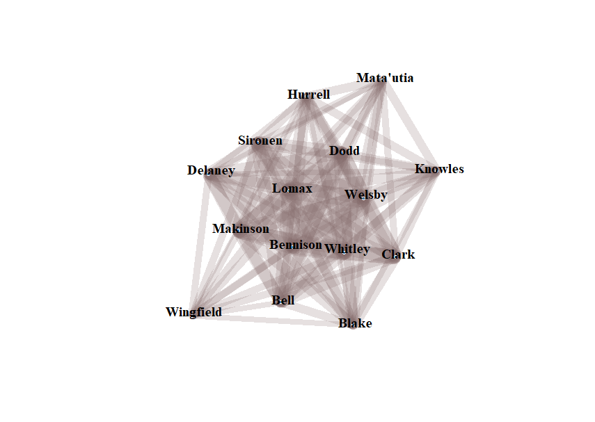
Again, I think the injury is why Wingfield is out there.
Friday, 12 July 2024

Euro 2024 Final Network Diagram

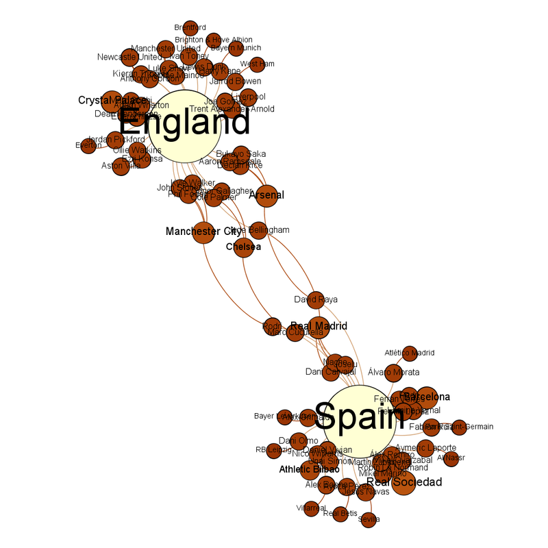
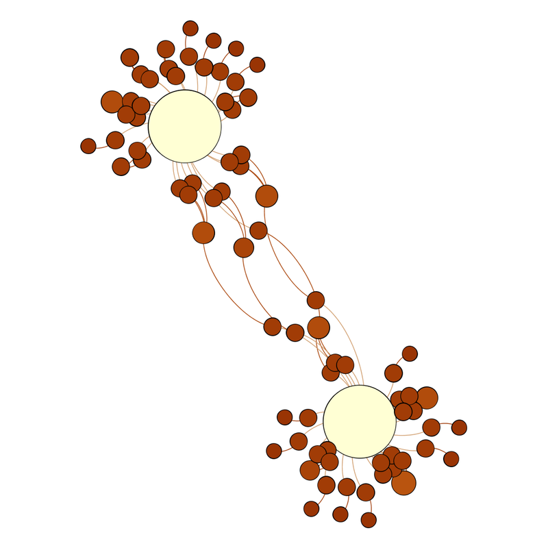
Looks like this: Two evenly spaced white circles, surrounded by smaller brown circles.  Some brown circles join them in the middle. The labelled version looks like this: Labelled version of the above figure.  England are the white circle at the top and Spain are the white circle at the bottom.  All the other info is below. The thing that really leaps out at me, having done this since Euro 2012 is how much more interconnected the final two teams are. 

In 2012, only one club team, Manchester City, would have had someone on the winning team no matter what. 
In 2024, four teams can say that, Manchester City again, along with Real Madrid, Chelsea and Arsenal. 

Chelsea are the club team closest to the centre. 

Five club teams share the position of "most players left in", Real Madrid, Arsenal, Barcelona, Manchester City and Crystal Palace all have 4 players left in. Crystal Palace is the one that surprises me the most and suggests they have a much better academy system than I suspected. 

As England have got to the final with me not watching, I will continue not to watch lest I am a jinx. It's an odd situation where I have no preferred team, although both teams have a couple of players I really like.

Monday, 8 July 2024

Euro 2024 Network Diagram - It looks like the semifinals could get interesting

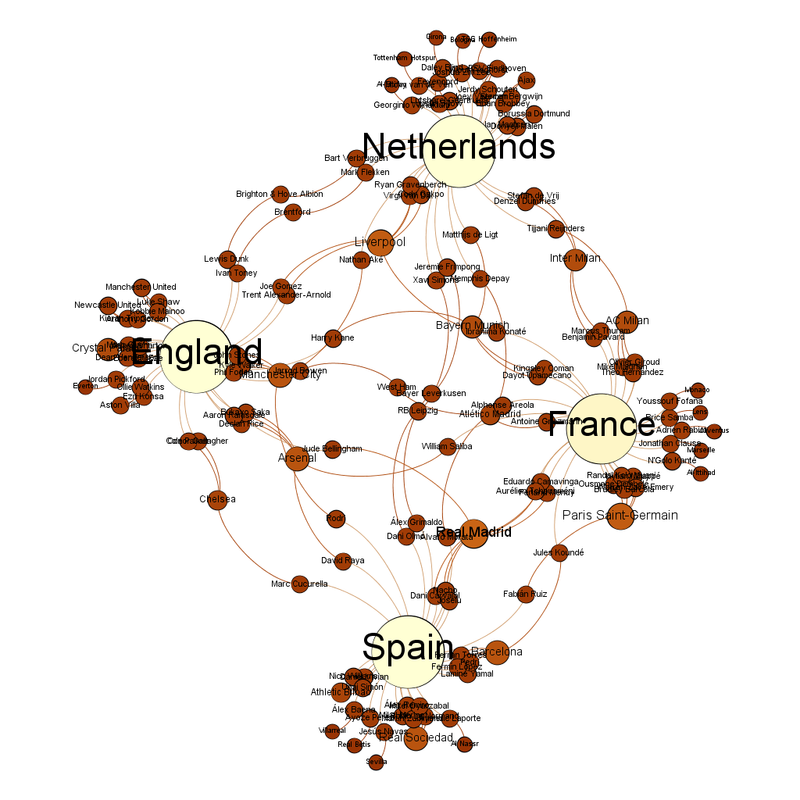
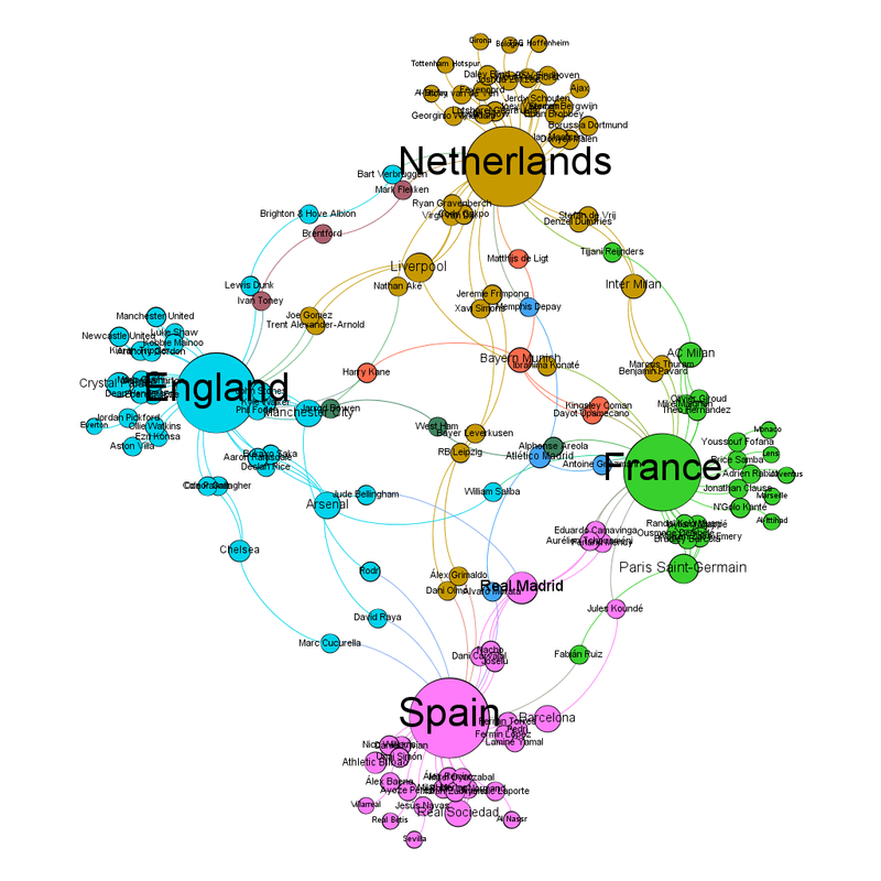
I said Spain vs Germany would be close (https://fulltimesportsfan.wordpress.com/2024/07/04/euro-2024-network-diagram-quarterfinals/). And I think the semifinals are going to be even closer. Normally at this stage, there might be an outlier, but this time everyone is evenly spaced. The network graph looks like a compass, with the four teams sitting at the cardinal points. Same diagram but labelled.  If it is a compass, then the Netherland sit at North, France at East, Spain at South and England at West. The community view has got complicated, because the 4 teams make eight communities. Netherlands are the dirty yellow colour, France are green, Spain are pink and England are blue.  The other communities are West Ham in a sort of dark green, Bayern Munich who are an orangey pink, Brentford who are a mauve-ish purple and Atletico Madrid who are a slightly darker blue that is hard to tell apart from England blue (sorry about that) The four countries are their own communities but four teams are also their own communities. They are West Ham in a sort of dark green, Bayern Munich who are an orangey pink, Brentford who are a mauve-ish purple and Atletico Madrid who are a slightly darker blue that is hard to tell apart from England blue (sorry about that). 

The club team closest to the centre are West Ham, Bayer Leverkusen or RB Leipzig. 

There's a real mix of teams with the most representatives still in, but Real Madrid have the most. This is what the list looks like: 
Real Madrid = 7 
Liverpool, Paris Saint-Germain = 6 
Barcelona, Arsenal, Real Sociedad, Manchester City = 5 

I'm not even going to try to predict the semifinals from this.

Thursday, 4 July 2024

Euro 2024 Network Diagrams - Quarterfinals

Okay, so Austria are out, as I suspected they would be. 

For the second Euros in a row, a team they beat in the group stage has gone further than them. But at least it took this absolute stunner of a save for Turkey to beat Austria - https://x.com/EURO2024/status/1808266570327634063 

Of the clear predictions, the diagram was 4/4, and the diagram was part of why I wasn't surprised by Italy or Austria's losses. (I have a series of theories about why the UK press always underestimates Turkey, they are all rude.) 

So, what does the diagram look like now? As expected, the outlying teams all lost, so there's now only the central core teams left. 

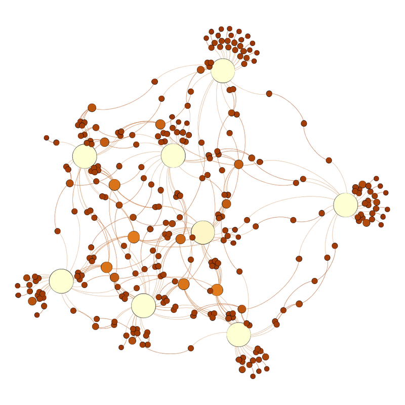
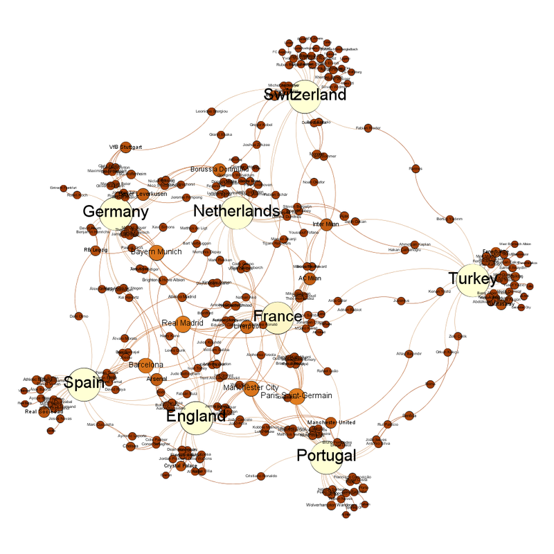
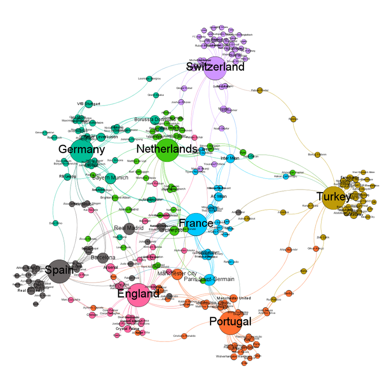
Looking at the unlabelled diagram, the central clump is now not as clumped, and one team sticks out to the right.  Network diagram.  While the central clump of teams remains, it is now left shifted, with one team standing slightly separately to the right.Labelled, it looks like this: Labelled version of the figure above.  Around the outside, clockwise, Switzerland are at 12, then Turkey at 3, Portugal at sort of half 5, then England at half 6 and Spain at 7.  Germany are at half 9.  France and the Netherlands are the two teams in the centre of the clockface, with France right in the centre.  Turkey are the team that stick out slightly. France are the team closest to the centre, while AC Milan are the club team closest to the centre. 

The club teams with the most representatives left are Real Madrid and Paris Saint-Germain with 10, Bayern Munich, Barcelona and Manchester City with 9, then Borussia Dortmund and Liverpool with 7 (stop giggling back there about that linkage). 

Inter Milan have been significantly reduced, not just because of Italy going out but also because they had several players in other teams that have been eliminated. 

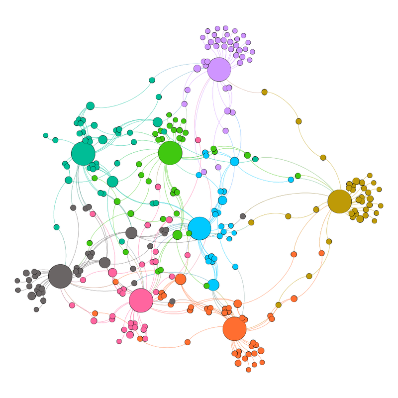
All the teams are their own community in the community views. Around the outside, clockwise, Switzerland are mauve at 12, then Turkey olive green at 3, Portugal are orange at sort of half 5, then England in pink at half 6 and Spain in grey at 7.  Germany are at half 9 and are sort of turqoise-green.  France (bubblegum blue) and the Netherlands (green) are the two teams in the centre of the clockface, with France right in the centre.  Turkey are the team that stick out slightly. Unlabelled community view diagram, because it looks pretty. 

I can understand why Inter Milan are French in the community view, what with Italy going out, but Manchester City and Manchester United being Portuguese intrigues me. 

Predictions from this (and the reason why I'm writing this while watching the election coverage so it's out before tomorrow): 
Spain vs Germany - Diagram says Germany, just 
Portugal vs France - Diagram says France 
England vs Switzerland - too close to call 
Netherlands vs Turkey - Diagram says Netherlands (this one is the one I think could be an upset. This Turkey team have a vibe.)