It was an odd year, because none of the 14 are actively bad. I would say 9-14 suffered from not doing anything interesting with their premises. I would actively recommend films 1-3 to everyone, 4-5 to some people and 6-8 if you're feeling in the mood for that particular genre of film.
As usual, I am also naming a film I saw for the first time last year but that was not released in the last year. In May I was in Brussels for work and was lucky enough to meet up with nwhyte who blogs at From The Heart of Europe. He recommended the Comic Art Museum (https://www.comicscenter.net/en/home), which was completely worth it.
There I saw 'Gertie the Dinosaur'. I am linking to the Wikipedia page because there is a full-length version of it on there - https://en.wikipedia.org/wiki/Gertie_the_Dinosaur
She's just so charmingly silly.
For films released this year, I am applying my usual 4 criteria:
a – did the film do what it set out to do?
b – did it use its resources to its best ability? A £250,000 film is not going to have as good explosions as a £25,000,000 film, or it shouldn’t, and if it does, there’s something wrong with the £25,000,000 film. Basically, it's a technical merit score relative to budget.
c – Intellectual satisfaction – does the film’s plot pull some really stupid move at the last moment? Does the plot rely on characters being more stupid than they are?
d – Does this work as a whole? Did it work for me? I am aware that this is the most subjective of subjective criteria!
(As a note, film 13 is that low down because I could see the leading actress's wig tape. You are a Hollywood film, you can afford someone to check that.)
1 - Flow
It's another one of Zilbalodis's nightmare Edens. And it's so good. It's horrific and beautiful and wonderful, and I nearly shouted "Capybara, get out of there" twice in the cinema.
2 - Mickey 17
I want to put a content warning on this - it is disgusting and horrid in parts. It needs to be for the story to work.
It is a satire on modern consumerism and politics and rather obvious - we are in a time that requires obvious. On the other hand, it has the Creepers, Nasha and young Pattinson once again showing that he can act.
3 - Superman
You want to know when I fell for this version of Superman? Because I can tell you. "He's not even a good dog, but he's out there alone and he's probably scared."
That's my vision of Superman too.
I was always going to enjoy it because James Gunn writes stories that work for me but I didn't expect to enjoy it so much. I enjoyed liking Superman and Lois, and Perry. I did not expect to love Mr. Terrific as much as I did.
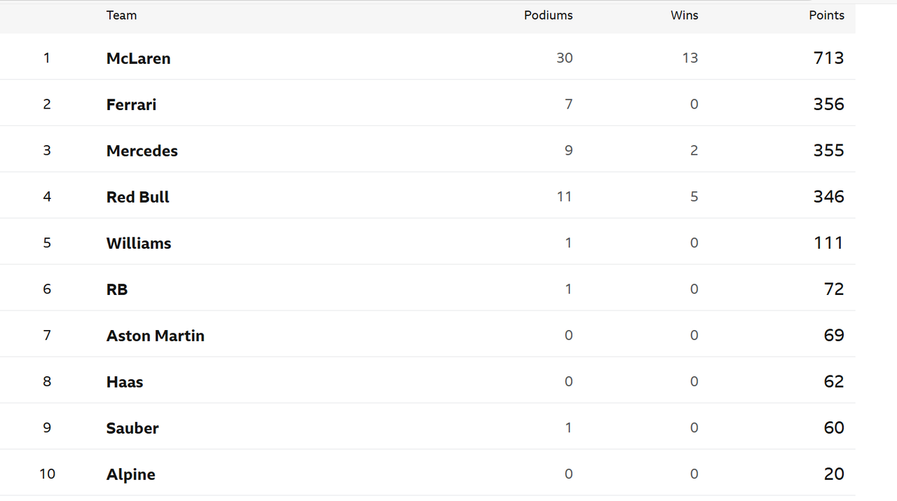
4 - F1
I am the target audience for this. And I loved it. I suspect that if you were not the target audience, you would find this was insipid.
On the other hand, being an F1 nerd means I spotted all the things they got wrong. Like every single one of the stunts Sonny Hayes pulls is already against the rules, and in at least two cases, I watched the race where the rule was created.
5 - Roofman
I saw Roofman with D. It is not the heavy-on-the-comedy comedy drama the adverts promised. It is much better. It's about a weak man, trying to do his best, in a less than ideal world.
Channing Tatum is very good in it. Kirsten Dunst is even better.
6 - Nosferatu
Not even kidding when I said this was the most frustrating film in 2025.
The music, scenery, cinematography and Aaron Taylor Johnson are all outstanding.
The script, the leads, and the use of both sinister Gypsies and fridged women in the year of our Lord 2025 are not.
The direction seems to think there are five different films. They do not interlock well.
7 - Predator: Badlands
Not quite sure what to feel about Predator being an action comedy rather than a horror. But it was enjoyable fighting and explosions nonsense when I needed it.
There's a lot to be said about how it explicitly positions the androids as robots not their own beings despite Thia and Tessa. Then again, I was worried about Bud so I think the film did what it intended to. Plus, you know, the universal truth - mothers are worse!
8 - The Phoenician Scheme
Arguments can be made that this ought to be a couple of positions higher, but I don't think a series of really nicely mounted set pieces can count as a good film, and it does coast on Mia Threapleton, Michael Cera and Benicio Del Toro's charisma and talent.
9 - Thunderbolts/New Avengers
Am I being a bit mean, given I liked it? Possibly. Am I marking it down because I was once again Kurylenko-blocked by a Marvel film? Yes.
On the other hand, this was very much like rice cakes. I like rice cakes. They fill a gap. But they're not the basis of a solid diet.
10 - Mission Impossible: Final Reckoning
Not its fault that it didn't live up to Dead Reckoning. But it really didn't. And one glorious returning character does not make up for that.