Saturday, 22 February 2025

Withdrawals from the 2024 Tour de France

I was going to say that there were relatively few withdrawals, and then stage 12 happened (https://www.rouleur.cc/blogs/the-rouleur-journal/from-covid-to-crashes-how-stage-12-of-the-tour-de-france). From a viz perspective, it's interesting because you can see stage 11 and 12 happening to the peleton in the picture. Kaplan Meier diagram of all the riders in the peleton.  The line is flat until stage 11, then becomes a diagonal downward slope (about 3 percent per day) until day 17, then it flattens out again until day 21 (the last day/stage). 

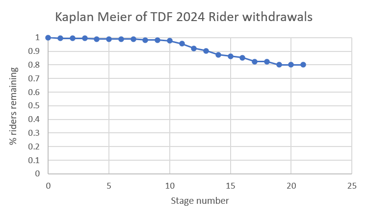
Or, you can't half tell which week had the mountain stages. 

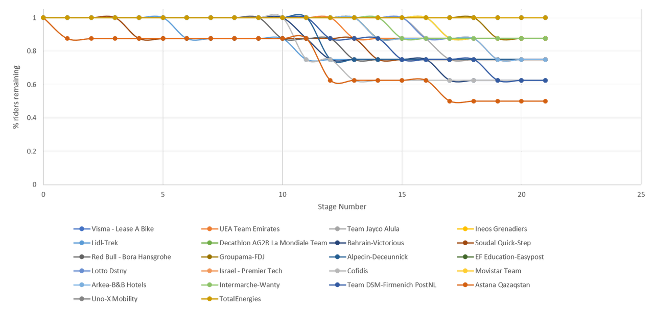
You can also see the race happening to Astana (the red-orange line) in the Kaplan Meier split out by teams. Kaplan Meier curve split out by teams.  It is very busy.  The red-orange line is Astana because I still have no way of using proper team colours.  Their line starts to drop earlier and by the end, only half of their team remains.  Other teams also drop but more slowly or not to the same extent. 

The next visualisation is a pie chart of withdrawals by stage. Pie chart showing withdrawals by stage.  Stage 12 (pale green) had the most with 6, but was closely followed by stage 14 (brown-red) and 17 (mid-blue) who had 4 withdrawals and stage 11 (light blue) and 19 (dark green) with 3 each. 

The interesting thing is that while normally there's maybe 2 or 3 stages that stand out for having a lot of withdrawals, in 2024, there were no real standout "evil" stages. 

All withdrawals Pie chart of all withdrawals.  Did not start the stage withdrawals, in blue, are 69% of all withdrawals.  Mid-stage abandonments, in orange, are 26% of all withdrawals.  Over the time limit withdrawals, in grey, are 5% of all withdrawals. 

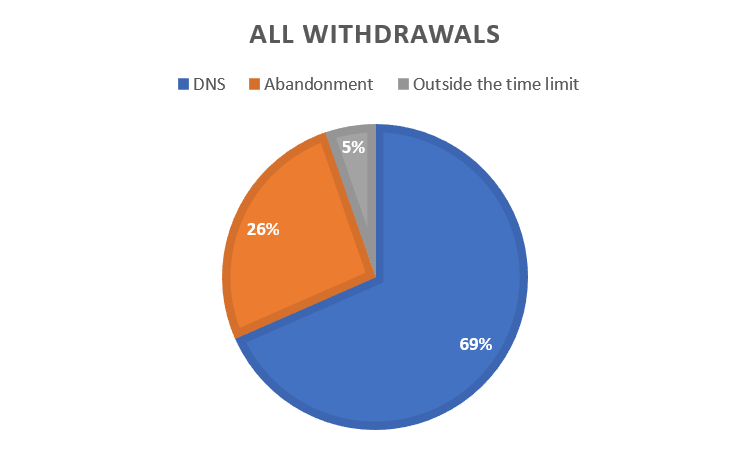
Did not start the stage withdrawals are most of the withdrawals, which is possibly because it takes over night for the riders to realise they are too injured to continue. Adrenaline is a terrible thing.

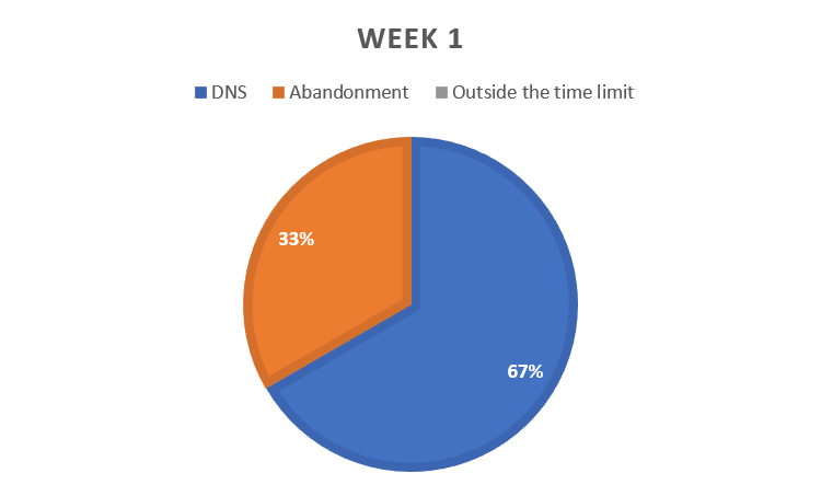
Withdrawals by week by type 

Week 1's withdrawals were all either Did Not Starts or mid-stage Abandonments Pie chart showing the week 1 withdrawals.  Blue, did not start the stage, withdrawals were 67% of all withdrawals in week 1, while orange, mid-stage abandonments were 33%. 

Week 2 featured Did Not Starts, mid-stage Abandonments and some Outside the Time Limit withdrawals. Pie chart showing the week 2 withdrawals.  Blue, did not start the stage, withdrawals were 33% of all withdrawals in week 2, while orange, mid-stage abandonments were 43% and grey, over the time limit withdrawals were 24%. 
Week 3 also features all three kinds of withdrawals. Pie chart showing the week 3 withdrawals.  Blue, did not start the stage, withdrawals were 55% of all withdrawals in week 3, while orange, mid-stage abandonments were 36% and grey, over the time limit withdrawals were 9%. 
Withdrawals by type by week Pie chart of mid-stage abandonments by week.  Week 1, in blue, had 7% of all the mid-stage abandons,  week 2, in orange, had 64% of them and week 3, in grey, had 29% of them. Pie chart of did not start the stage withdrawals by week.  Week 1, in blue, had 13% of all the DNS withdrawals,  week 2, in orange, had 47% of them and week 3, in grey, had 40% of them. Pie chart of all the over the timelimit withdrawals by week.  Week 1 had none, week 2, in orange, had 83% of them and week 3, in grey, had 17% of them. 
That's another set of charts that shows most of the mountain stages were in week 2, because those are the stages where people are most likely to be over the time limit. 

This series was originally intended to see if more riders withdraw in Olympics years (and showed that they don't - https://fulltimesportsfan.wordpress.com/2023/11/18/withdrawals-in-week-3-of-the-2023-tour-de-france-an-overall-round-up-and-confirmation-that-the-olympics-didnt-cause-more-withdrawals/), it's interesting to see that there are two groups of races when you compare the withdrawal Kaplan Meier charts since 2020, and two curve shapes. Kaplan Meier diagrams of all 5 races, 2020, 2021, 2022, 2023 and 2024.  2021 has a different curve shape to the others.  The end points of 2021 and 2020 are at similar points, while 2022, 2023 and 2024 also match. 

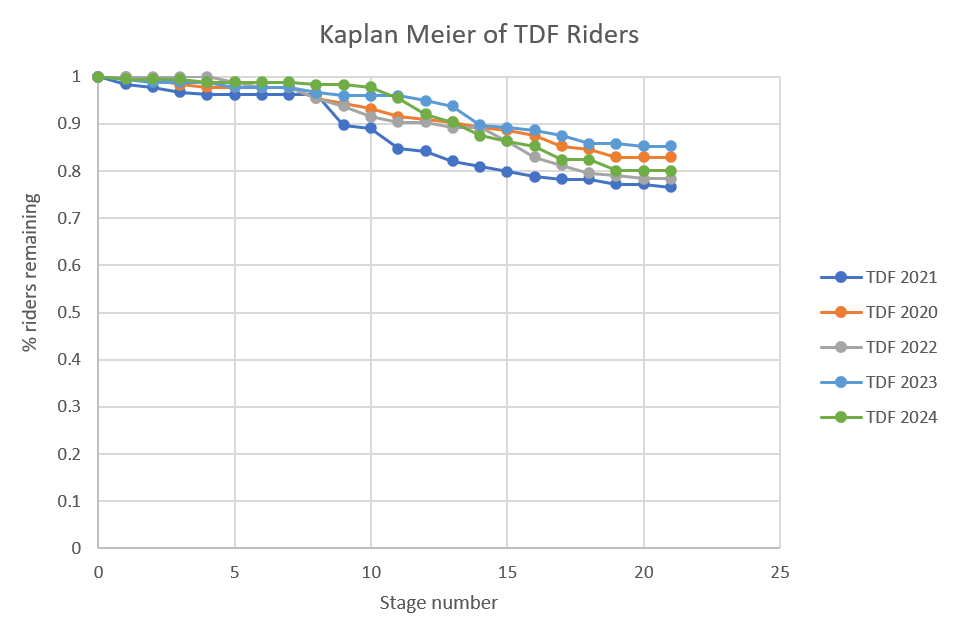
I can maybe explain 2021's shape being different, although the end point isn't significantly different, because of the COVID withdrawals. 2021 was also the last year before the riders reduced in number, which might explain the two clumps. It's easier for a wounded but not out rider to hide in a pack, whether that pack is his own team, or a larger groupetto.

No comments:

Post a Comment