Wednesday, 9 September 2026

Formula 1 2026 - Italian Grand Prix

I would like to pretend I had something more reasonable to say but ... I hate being a Ferrari fan. Why are they always like this?

I don't, in any way, blame either driver for the first corner - that's racing. I blame the team for not coming up with a working strategy for the one remaining car.

The racing was fun while it lasted, but I trust this has finally ended any belief George Russell has that there is driver equality at Mercedes.

Friday, 4 September 2026

Are the scrutineers picking on my driver? - Update after the Dutch Grand Prix

For the purposes of this series, the main thing for the Dutch GP was Hadjar missing it due to injury. Lawson moved up to Red Bull, and Tsunoda was temporarily back in whatever Toro Rosso are called this year (I think it's Racing Bulls, I can't keep up with the constant name changes). 

I didn't think it would affect the actual race data, because hey, that was still just 22 drivers. 

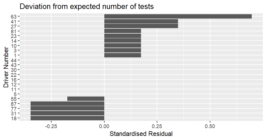
Dutch GP race data itself: Bar chart showing how often cars were scrutinized compared to the expected number at the Dutch Grand Prix.  The values are displayed as a standardised residual.  Car 63 (Russell) was the most over-scrutinized compared to expected, with a value of 0.70, followed by cars 27 (Hulkenberg) and 41 (Lindblad) with a value of 0.35.  Cars 18 (Stroll), 31 (Ocon), 77 (Bottas) and 87 (Bearman) are the most under-scrutinized compared to expected with a value of -0.35.  8 cars were tested exactly as much as expected. Russell was the most scrutinized compared to expected, followed by Hulkenberg and Lindblad, with Stroll, Ocon, Bottas and Bearman the least scrutinized. 

What I don't understand is why Verstappen isn't on the under-scrutinized list given he was out before the end of the first lap, before Bearman who is on that list. 

Most peculiar. 

Any differences weren't statistically significant, with a χ² of 1.38. 

The thing I thought the Hadjar swap out-Tsunoda swap in would affect was the season-to-date ranking. But what I forgot was that, because it's observed vs expected, Tsunoda will still get a value for the one (or more depending on Hadjar's wrist) grand prix he participated in. 

The thing it changes is the χ² critical value, because Tsunoda's appearance increases the degrees of freedom in the data from 21 to 22. The critical χ² value goes up from 32.671 to 33.924. 

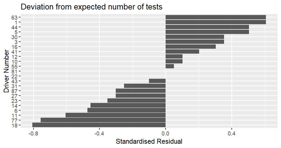
The season to date chart looks like this: Bar chart showing how often cars were scrutinized compared to the expected number for the season to date up to the Dutch Grand Prix.  The values are displayed as a standardised residual.  Cars 1 (Norris) and 63 (Russell) are the most over-scrutinized compared to expected, with a value of 0.61, followed by cars 5 (Bortoleto) and 44 (Hamilton) with a value of 0.50, followed by cars 3 (Verstappen) and 30 (Lawson) with a value of 0.35.  Car 18 is the most under-scrutinized compared to expected with a value of -0.81, followed by car 77 (Bottas) on -0.76 and car 11 (Perez) on -0.61.  2 cars were tested exactly as much as expected, 22 (Tsunoda) and 81 (Piastri). 

At the top, Bortoleto still stands out as not being like the other cars up there. 

At the bottom, it's still the cars that don't finish a lot, with Stroll and the two Cadillacs down there. 

Tsunoda's car has been tested exactly as much as expected after 1 race, and so has Piastri's after 12 races. 

The χ² value continues to go up, it's now 4.03, still nowhere near significant but rising. I think the cars being tested less than expected are the stronger contributors because their standardised residuals have larger values. 

We also didn't have a random check of a top 10 finisher, so the evidence is really piling up that that is a truly random check that only occurs sometimes and the early-season pattern was just a quirk of the numbers.

Sunday, 30 August 2026

Aston Hall

Birmingham, like most of the Industrial Revolution cities, has random remnants of the time before. 

Birmingham in the context of the West Midlands is really interesting because you've got Hereford, Worcester and Lichfield, which were these big, important medieval cities and now they're the small provincial ones lorded over by Birmingham. I think I notice the difference because my part of the North West is all post-Industrial Revolution. 

Aston Hall is one of those remnants - https://www.birminghammuseums.org.uk/aston-hall 

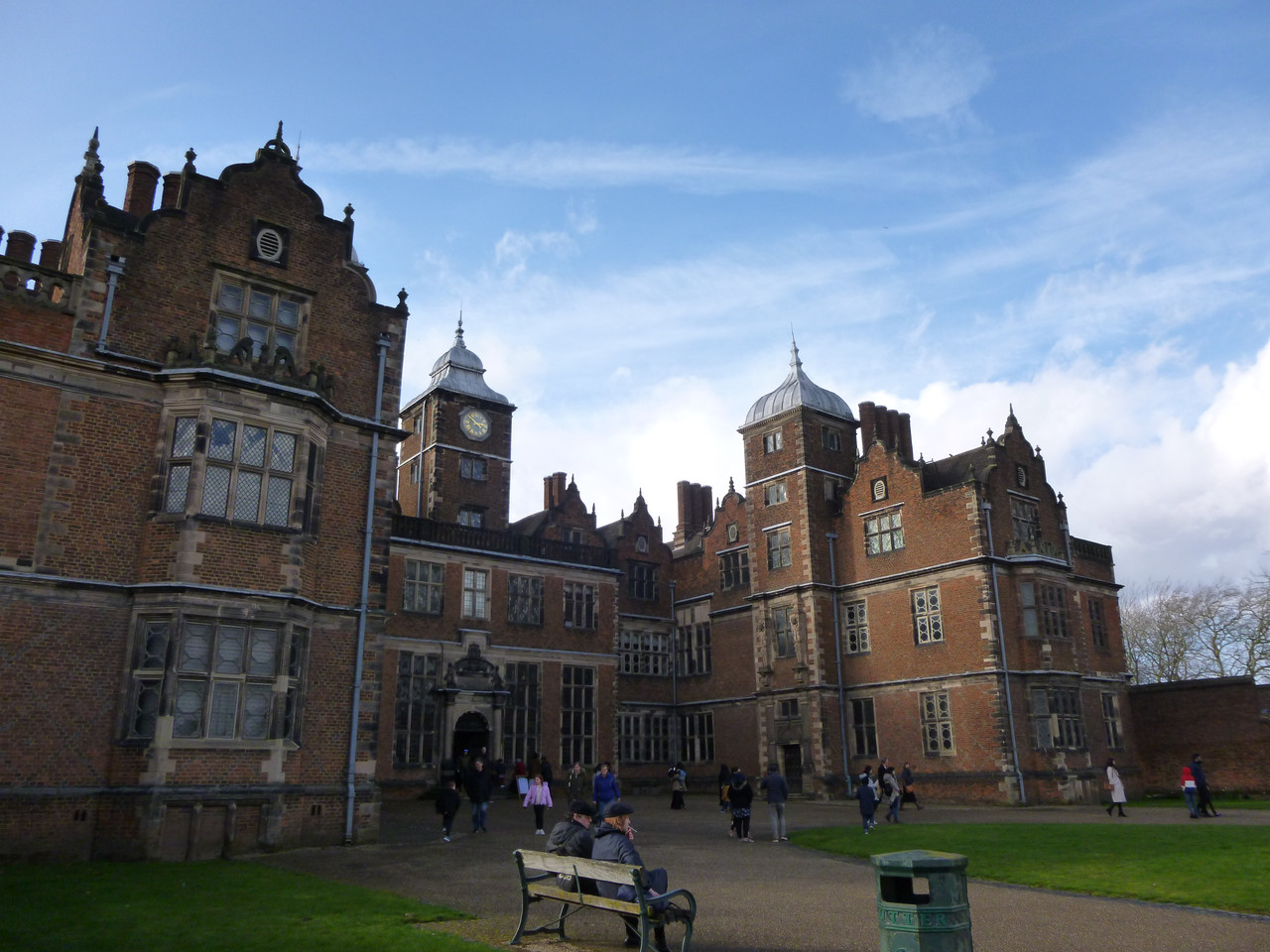
In easy public transport reach of the centre of Birmingham, it counts as a hidden gem. I'd been in Birmingham for 9 years before going (a friend invited me). The front of Aston Hall.  It is a Jacobean red-gold brick house. 

For more information about its history, including that it's the first historic country house bought during that upswell of civic pride in the industrial cities in the late 1800s please read it's Wikipedia article - https://en.wikipedia.org/wiki/Aston_Hall 

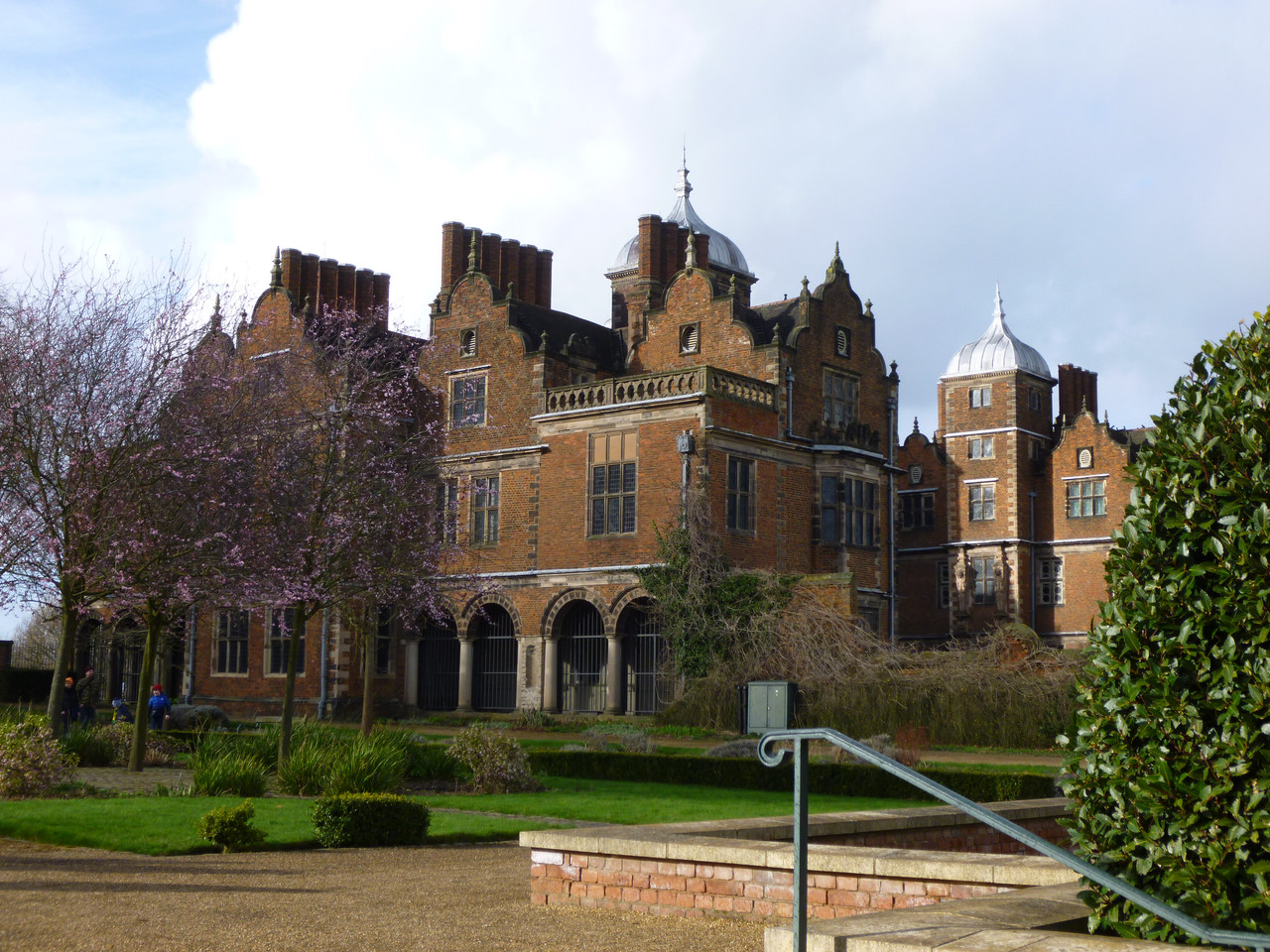
Front and left side of the hall. Photo that you can see the front of the hall and the left hand side.  From this angle you can see the cupola tops of two of the roof sections which you cannot see in the next photo.  The view is from the garden.  You can see a hedge in the right hand side of the photo, and trees with purple leaves on the left. 
Probably my favourite photo, because I like the contrast of the purple leaves on the tree with the brown of the bricks of the hall.

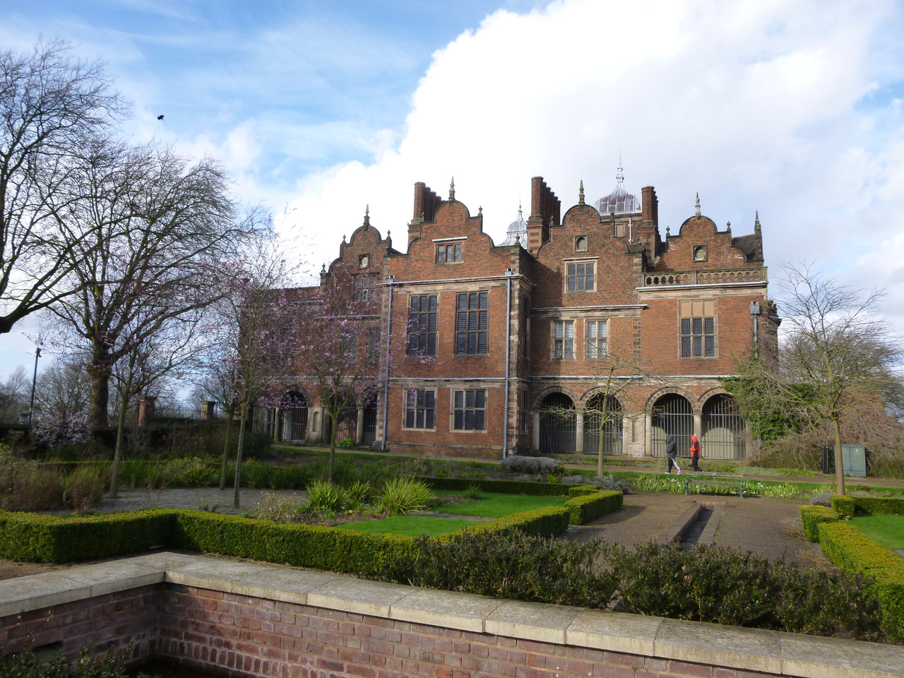
 Another photo of the hall, this time from the left hand side.  This side is also made of bricks.  There are four sort of clover shaped roofs, repeating patterns very much a thing.  In front of the house is a small garden.  The trees are bare because it was March.
 Left side of the hall
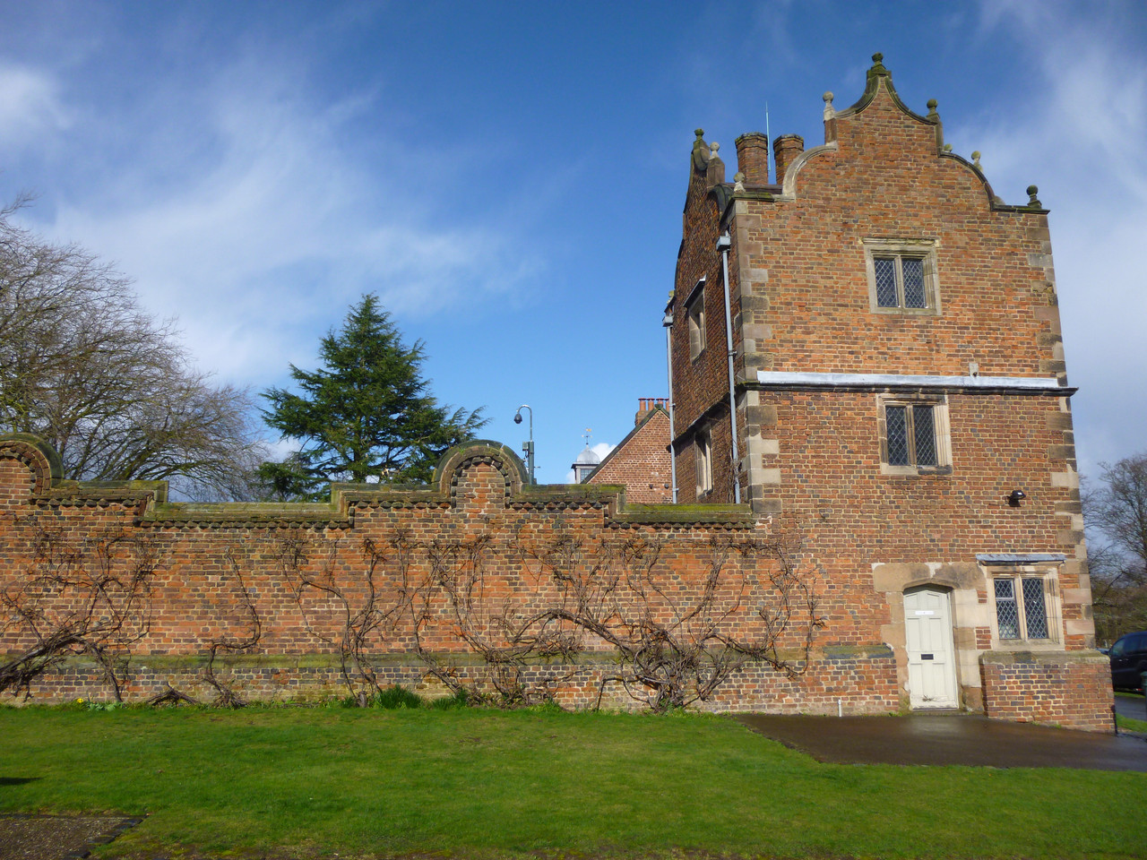
 Right hand side of the hall.  Because this was where the kitchen was, this is much less decorative, just plain bricks with no repeating patterns.
Right side of the hall

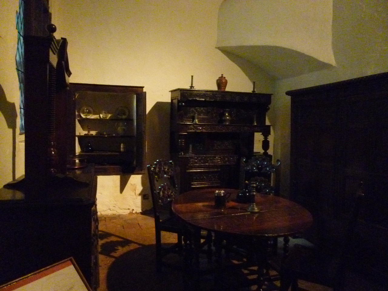
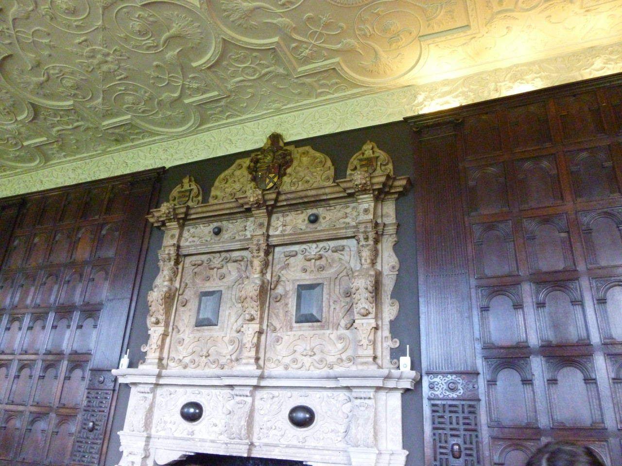
The inside is mostly intact, with a bit of restoration here and there. Photo of the Jacobean furniture in one room of Aston Hall.  It's all very dark wood and heavy. Fancy fireplace Fireplace in one of the long halls.  The panelling around it is dark wood again, the ceiling has designs in white plaster.  The fireplace itself is carved from a white stone - marble? And the ceiling in more detail Photo of a stucco or stucco-style ceiling.  There are putti in the centre of circles, joined by hexagons which also have putti in the middle. 

In one of those "oh, I should have figured that out" moments, Aston Villa took their name from the area, and that's where Aston Hall also is. The Holte End at Villa Park is named for the Holte family that used to own Aston Hall. Which makes sense, because Villa Park is literally across the road from Aston Hall. Shot of the ground of Aston Villa (Villa Park) taken from the park around Aston Hall. 

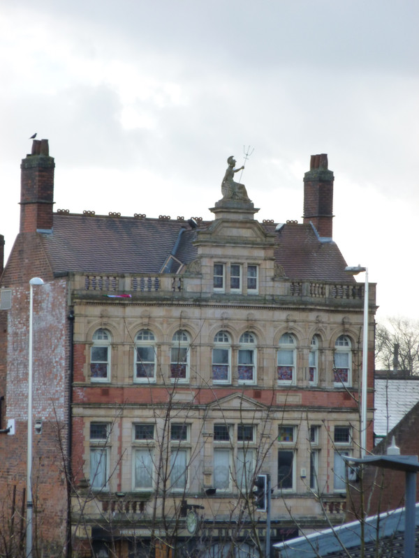
Possibly because I come from an ex-industrial area, I have a soft spot for museums and architecture not associated with the posh or the clerical, which is why the current wave of buildings falling into disuse and ruin is upsetting. Take this as an example from a now-closed pub local to Aston Hall. Top two floors of a disused Victorian pub.  The floor at the bottom of the image has 6 narrow rectangular windows, three either side of a larger bay window.  The floor above has 8 windows across the same span.  The windows are rectangular but the top side has been replaced by a semi-circle.  Then comes the roof and on top of the roof is a statue of what I think is Britannia because she is a woman in a chariot holding a trident. 

I enjoyed the visit of Aston Hall. I'd like to go again, because the friends I went with brought their children and their attention span was understandably shorter than mine so the visit had to get cut short.

Saturday, 29 August 2026

Formula 1 2026 - Dutch Grand Prix

This will be the last Dutch Grand Prix at Zandvoort for the foreseeable future - I am sad for Verstappen and his fans, but let us not pretend that F1 doesn't run on money. Also, despite everyone saying how much better than the usual Zandvoort race this was, the driver on pole position still won. And the race was dull. 

The circuit is too narrow for these cars, and they aren't going to be getting narrower, nor is the circuit going to be made wider. 

I can explain the terrible weather at Zandvoort - a colleague was holidaying just south of there. 

Not sure who was main commentating for BBC, and I'm sure it's first time nerves, but there were so many "no, that's not what that word means" malaprops. Like he obvs. knows his stuff but ... I acknowledge it might be me being a little old lady, especially as he said something that made me know I'm older than him - "it's like a one lap shootout if you've played the games" - some of us remember that being the qualifying rules!! (I did love Jennie Gow trying to relax him when she could.) 

The race itself: 

Verstappen finally got caught by the home race curse (I really will need to do that data viz at some point). That crash looked horrid. Well done Nico Hülkenberg avoiding Bortoleto in the chaos.
This video from F1.com has possibly the most wonderful explanation of how Hülkenberg avoided Bortoleto (certainly the one with the coolest graphics) 

I think the unexpected red flag plus bonus formation lap due to Bearman really threw several teams' strategy, because I can't understand the strategy for Perez or Piastri. Ferrari's bizarre strategy choices (and the drivers disobeying everything) comes as standard. 

As does McLaren screwing up a pitstop - I thought they'd stopped those mistakes! (I do not expect better of Ferrari pitstops) 

I am taking this race as proof I was right and Tsunoda is good and he deserves a seat. And yes, I know that if every driver I wanted to have an F1 seat had one, it would be 40 drivers deep.

Wednesday, 19 August 2026

Are the scrutineers picking on my driver? - Update after the Hungarian Grand Prix

Just in time for the season to restart :) 

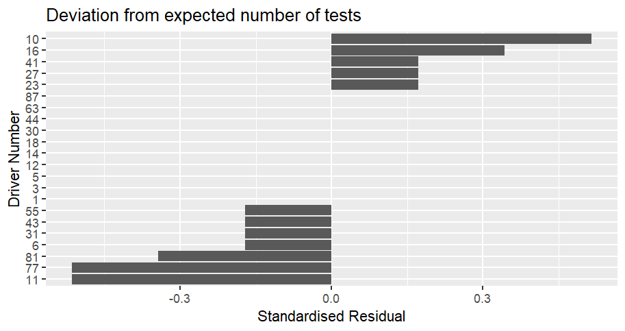
Scrutineering at the Hungarian Grand Prix: Bar chart showing how often cars were scrutinized compared to the expected number at the Hungarian Grand Prix.  The values are displayed as a standardised residual.  Car 10 (Gasly) was the most over-scrutinized compared to expected, with a value of 0.51, followed by car 16 (Leclerc) with a value of 0.34, then 23 (Albon), 27 (Hulkenberg) and 41 (Lindblad) on a value of 0.17.  Cars 11 (Perez) and 77 (Bottas) are the most under-scrutinized compared to expected with a value of -0.51, followed by car 81 (Piastri) with a value of -0.34.  10 cars were tested exactly as much as expected. 

The difference from expected is lower than at the Belgian Grand Prix, with an χ² of 1.22. That's because of the number of cars that were tested as much as expected, 10 out of the 22. 

The three cars least tested compared to expected were the three cars that didn't finish, those of Perez, Bottas and Piastri. 

While Gasly was the most over-tested compared to expected, Hulkenberg gets to celebrate his first points of the season by having the third-highest number of tests relative to expectation. 

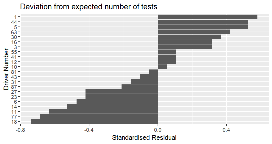
The season to date: Bar chart showing how often cars were scrutinized compared to the expected number for the season to date up to the Hungarian Grand Prix.  The values are displayed as a standardised residual.  Car 1 (Norris) is the most over-scrutinized compared to expected, with a value of 0.58, followed by cars 5 (Bortoleto) and 44 (Hamilton) with a value of 0.53, then 63 (Russell) on a value of 0.42.  Car 18 (Stroll) is the least tested compared to expected with a value of -0.74, followed by 77 (Bottas) with a value of -0.69, and 11 (Perez) with a value of -0.63.  No cars have been tested exactly as much as expected. Even though it doesn't come close to being significant, despite the increasing number of events, the χ² is increasing and is now up to 3.76. 

The top four most over tested are Norris, Bortoleto, Hamilton and Russell. Bortoleto still stands out in that crowd. I know it's probably still the effect of relatively small numbers, but he's not up there based on performance or number of finishes; other drivers have finished more races and still aren't as high up as he is. 

Stroll, Bottas and Perez are the drivers least tested compared to expected and are the bottom three in the championship. There is a relationship between not finishing and not being tested, because some tests are only performed on the cars that finish. The car starting to work moved Norris and Piastri out of the bottom and it will be interesting to see if Aston Martin's improvements do the same for Stroll and Alonso. 

No drivers have been tested exactly as much as expected but Gasly and Piastri come close on +0.053 and - 0.053 respectively. 

At the halfway point of the season we have an increasing χ² value, some movement at the bottom as the cars become more reliable and Bortoleto being over-tested compared to his results (even if the difference isn't statistically significant).

Wednesday, 12 August 2026

Are the scrutineers picking on my driver? - Update after the Belgian Grand Prix

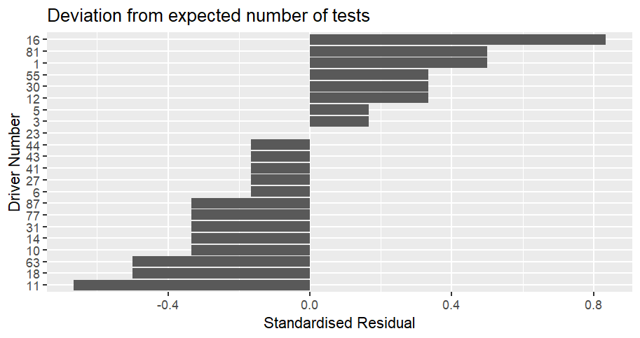
Well I don't know if they're picking on *your* driver but they are picking on mine. Bar chart showing how often cars were scrutinized compared to the expected number at the Belgian Grand Prix.  The values are displayed as a standardised residual.  Car 16 (Leclerc) was the most over-scrutinized compared to expected, with a value of 0.83, followed by cars 1 (Norris) and 81 (Piastri) on 0.50, then 12 (Antonelli), 30 (Lawson) and 55 (Sainz)on 0.33.  Car 11 (Perez) is the most under-scrutinized compared to expected with a value of -0.67, followed by cars 18 (Stroll) and 63 (Russell) with a value of -0.50, then a whole bunch of cars on -0.33.  One car has been tested exactly as much as expected, number 23 (Albon). Look how over-tested Leclerc is compared to the others! 

I am being a little ridiculous, but Leclerc's standardised residual of 0.83 over expected is the third highest single race value after Norris in Barcelona (+1.30), and Lawson at the Austrian Grand Prix (+1.06). 

Entirely as expected, Perez, Stroll and Russell who didn't finish are 3 of the four least tested compared to expected. 

The difference isn't statistically significant (χ² = 3.201), but this time, it's my driver. 

The Belgian Grand Prix checks were slightly different, and there were more of them than usual (36, which is the second highest of the season, the highest being at the Australian Grand Prix which had 37 checks as the expected number but that's also the first Grand Prix of the season). 

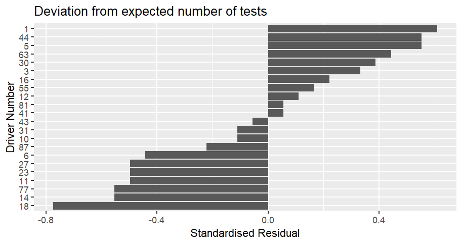
The season to date: Bar chart showing how often cars were scrutinized compared to the expected number for the season up to the Belgian Grand Prix.  The values are displayed as a standardised residual.  Car 1 (Norris) is the most over-scrutinized compared to expected, with a value of 0.61, followed by cars 5 (Bortoleto) and 44 (Hamilton), with a value of 0.55.  Car 18 (Stroll) is the most under-scrutinized compared to expected with a value of -0.77, followed by cars 14 (Alonso) and 77 (Bottas) with a value of -0.55.  No cars have been tested exactly as much as expected. 

The difference are not statistically significant, with an χ² = 3.746. 

Interestingly, the χ² is increasing, and has been for the last 4 races, when, at this point in the season, you'd be expecting it to start going down. 

Possibly this is because of changes in reliability as the teams improve their cars (or try to) during the season. The Aston Martins, Cadillacs, Williams and Audis keep being unreliable and not finishing, while the McLarens seem to have sorted themselves out so are being checked more often and that's disturbing the numbers. 

Norris is now the most over-checked car compared to expected. He's followed by Bortoleto, Hamilton and Russell. One of these drivers is not like the others. 

Not sure why Bortoleto is that high given he's 14th in the standings. On the other hand, he has one of the lowest DNF rates (having only failed to finish 1 race out of the 10 so far). 

Stroll, Alonso, Bottas, Albon and Hulkenberg are the least tested compared to expected. That makes sense given the number of DNFs between them. They are also the bottom 5 in the championship. 

I find it amusing the Audi have one driver in the most over-tested bucket and one in the most undertested. 

No drivers have been tested exactly as many times as expected, but Colapinto, Lindblad and Piastri are almost on 0, being at +0.056 or -0.056. 

The Hungarian Grand Prix results will be the midway point of the season. We'll see if the χ² starts to come back down.

Saturday, 8 August 2026

Jojo Rabbit

There is a reason Jojo Rabbit was my top film of 2020

I'm going to go back to how I described the film in my 2020 film round up: 
"This is a masterwork. There is no aspect of the film that I can't heap heavy praise on - the acting, the writing, the soundtrack, the costume, the acting (I do not care that I am repeating myself). It is a fantastic, human, film that I can't praise enough." 

I'll expand that sort of chronologically. 

1: I can see why Taika Waititi chose to play Hitler. It means there's no chance anyone's going to use clips of him to glorify Hitler. It felt like that was a tightrope that he was very aware of, that the message of the film was that *that* was the terrifying thing, Nazis were average human beings doing terrible things, without glorifying any of them. And I think he mostly threaded that needle (the shot at the end of the Gestapo looking utterly pathetic without the coats for example), with the possible exception of Klenzendorf leaning slightly too close to the legend that the Wehrmacht were alright. 

I can also see why they got the Heil Hitlers out of the way at the start so everyone could get their nervous laughter out early. 

2: Really, threaded that needle, because the Nazis were very terrifying and pathetic at the same time. 

3: Scarlett Johansson did not get the plaudits she deserved. I don't know if this was released during one of the "let's all diss ScarJo" waves but why didn't she get all the plaudits?! 

She has such a difficult role, because she plays a woman who is doing her best in a difficult time, when doing the thing she has chosen to do (and the film makes it clear that it is a choice) could get her killed and the person most likely to report her to the authorities is her own son. 

And she's full of whimsy despite everything, or possibly against everything. 

(Another thing I liked was that the film lets you fill in the gaps. In any way you choose. Is Jojo's father dead, in the army, in the resistance, is there even a father figure in his life or is she just pretending?) 

4: To an extent Yorgi is the most important character because he's who Jojo could have been if he hadn't had the experiences he has during the story. And we know there's no harm in Yorgi, he's just been brainwashed. He still believes the things Jojo can no longer believe. 

And again that loops back to the film's message that the terror is, everyone involved is just another human. See also Jojo's mother shouting at some soldiers to go home to their mothers. 

5: Holy heck, Roman Griffin Davis and Thomasin McKenzie, who were children at the time, had the most difficult roles and nailed them. 

Totally nailed them. 

Excellent work by them (and whoever cast them) 

6: No really, I can't recommend this film enough. It's one of the very few films I would say everyone should watch. It's just marvellous.

Monday, 3 August 2026

Are the scrutineers picking on my driver? - Update after the British Grand Prix

At the start of the season, every second race featured a random check of a top 10 finisher. This pattern stopped about 6 races in, and I wondered if that was because of less than 15 drivers finishing. 

The British Grand Prix gave an opportunity to test this. Barcelona had technically provided one as well, but several of the “finishers” there had actually stopped on track and were only classified because they had completed more than 90% of the race distance. 

There was no check at the British Grand Prix even though there were 19 finishers. That suggests that this inspection is not a mandatory check, but something the Technical Committee can choose to carry out occasionally. 

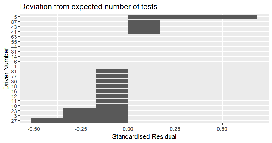
Scrutineering at the British Grand Prix: Bar chart showing how often cars were scrutinized compared to the expected number at the British Grand Prix.  The values are displayed as a standardised residual.  Car 5 (Bortoleto) was the most over-scrutinized compared to expected, with a value of 0.69, followed by cars 41 (Lindblad), 43 (Colapinto) and 87 (Bearman) with a value of 0.17.  Car 27 (Hulkenberg) is the most under-scrutinized compared to expected with a value of -0.51, followed by cars 3 (Verstappen) and 23 (Albon) with a value of -0.34.  Seven cars were tested exactly as many times as expected. While Car 5 (Bortoleto) looks like he's been checked far more the expected tests on first glance, compared to a statistically significant point of 2 standardised residuals, it really isn't. This is supported by the results having an overall χ² of 1.2216, when it would need to be >32.671 to be significant.

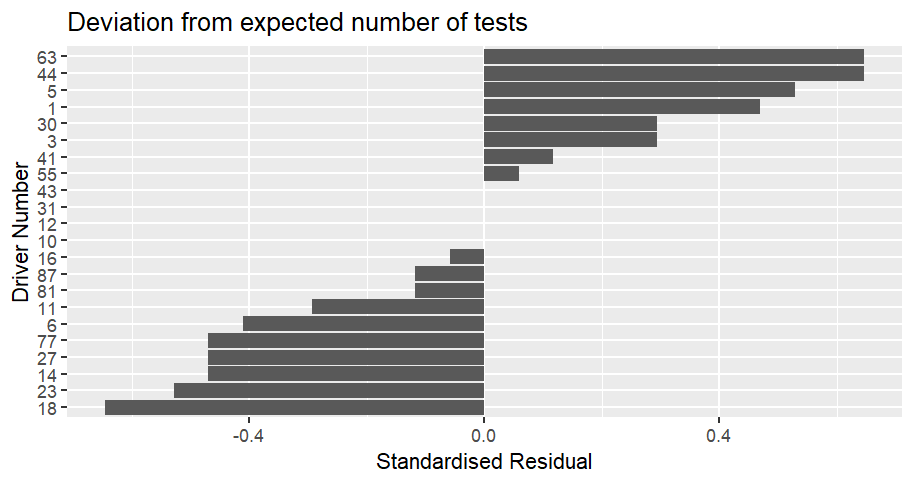
Scrutineering up to the British Grand Prix: Bar chart showing how often cars were scrutinized compared to the expected number for the season up to the British Grand Prix.  The values are displayed as a standardised residual.  Cars 44 (Hamilton) and 63 (Russell) are the most over-scrutinized compared to expected, with a value of 0.65, followed by car 5 (Bortoleto), with value of 0.53.  Car 18 (Stroll) is the most under-scrutinized compared to expected with a value of -0.65, followed by car 23 (Albon) with a value of -0.53.  They are followed by cars 14 (Alonso), 27 (Hulkenberg) and 77 (Bottas) with a value of -0.47.  Four cars have been tested exactly as many times as expected (Gasly, Antonelli, Ocon and Colapinto). 

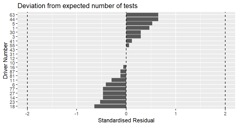
The χ² over the season so far is 3.1607, which is not significant. The same graph as above, but with the standardised residual of 2 marked on it.  This means you can see none of the difference come close to being statistically significant. 

The order is starting to make sense, with Hamilton and Russell who are doing well being the most over-scrutinised, while Stroll, Albon, Alonso, Hulkenberg and Bottas, whose cars keep breaking on them, being the most under-scrutinised. Antonelli has only been tested as many times as expected even though he is doing very well, but the number of events is small enough that that is not implausible.

Saturday, 1 August 2026

Formula 1 2026 - Hungarian Grand Prix

Overall, the race wasn't that interesting - ignoring Verstappen and Hamilton's efforts to provide interest and entertainment, with help from Liam Lawson, who I'm sure wasn't influenced by the team he drives for. I'm not sure if it's because the track is that narrow that even the new regulations can't produce overtakes (plus the tyres going off in unexpected ways).


I'm not saying Aston Martin's season has been pants, but both cars finishing is being treated as a great success. At the same time, with one set of upgrades, they're boosted into the midfield.

Piastri appears to have inherited the terrible Antipodean luck of his manager. Possibly spending too much time in Australia explains why Bottas's brakes catching fire. Seriously, Cadillac, sort that out.

On the other hand, George Russell's luck isn't much better.

Tuesday, 28 July 2026

Withdrawals from the 2026 Tour de France

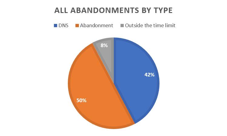
Unlike 2025, this year, riders were cut due to being over the time limit. Pie chart of Tour de France withdrawals by type.  In blue, we have did not start the stage withdrawals, which were 42% of all withdrawals.  In orange is mid-stage abandonments which were 50% of all withdrawals, while over the time limit withdrawals are in grey and make up 8% of the total. 

The two unfortunate riders were Kellen O'Brien and Anthon Charmig. 

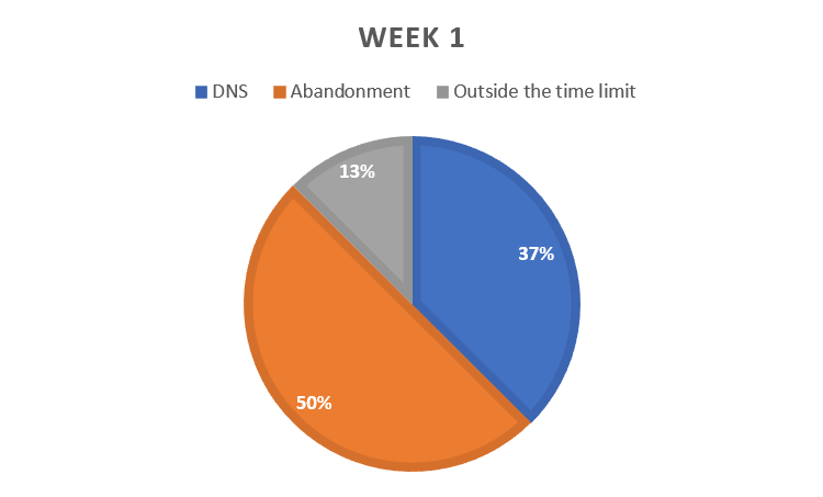
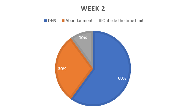
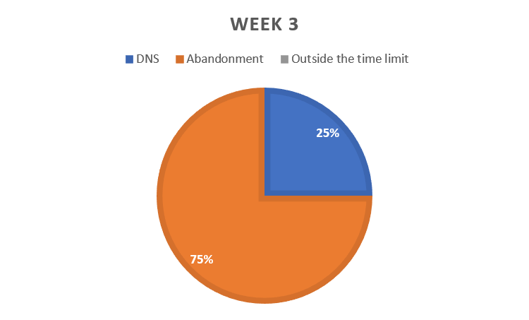
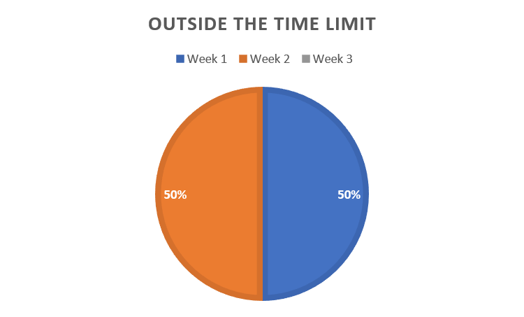
It's interesting to see how the pattern of withdrawals changes over the 3 "weeks" (weeks being used loosely here as always). Pie chart of withdrawals in week 1.  Did Not Start is still in blue and is 37% of all withdrawals.  Abandonments in orange are 50% and over the time limit in grey is 13%. Pie chart of withdrawals in week 2.  Did Not Start is still in blue and is 60% of all withdrawals.  Abandonments in orange are 30% and over the time limit in grey is 10%. Pie chart of withdrawals in week 3.  There are no over the time limit withdrawals.  Did Not Start is still in blue and is 25% of all withdrawals.  Abandonments in orange are 75%. 

In week 1, mid-stage abandonments are the most common, with 50% of all week 1 withdrawals being abandonments. 

In week 2, this switches to being a majority of "did not start" type withdrawals, possibly as the race caught up with people. 

Then, in week 3, it swings back to being mostly mid-stage abandonments, possibly because people have reached the "I'll be damned if I don't get to Paris after all this" mind-set. 

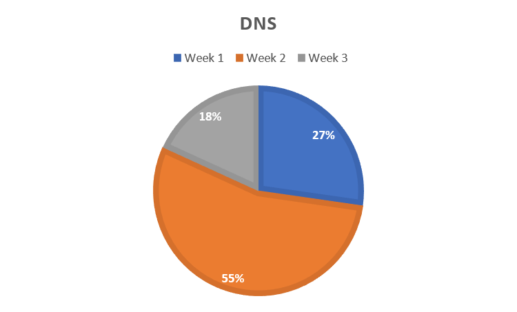
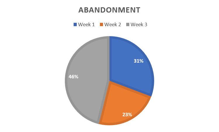
This pattern is repeated if you look at it as "withdrawal type by week". Pie chart of Did not start withdrawals by week.  Week 1 in blue was 27% of all DNS withdrawals, week 2 in orange was 55% and week 3 in grey was 18%. Pie chart of mid-stage abandonments by week.  Week 1 in blue was 31% of all abandonment withdrawals, week 2 in orange was 23% and week 3 in grey was 46%. Pie chart of over the time limit withdrawals by week.  Week 1 in blue was 50% of all of them, week 2 in orange was the other 50% and there were none in week 3. Which stages did the withdrawals happen on? 

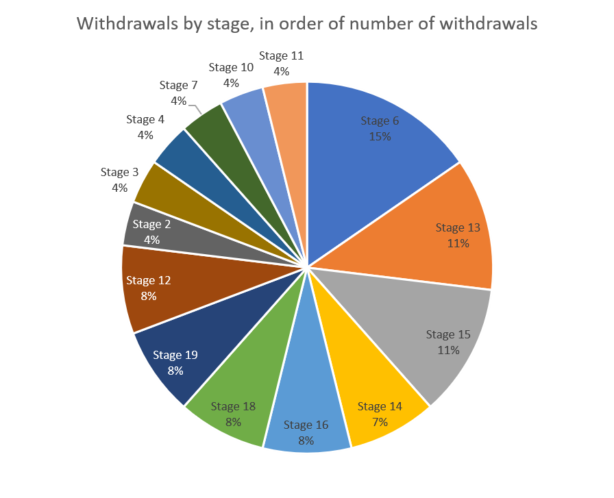
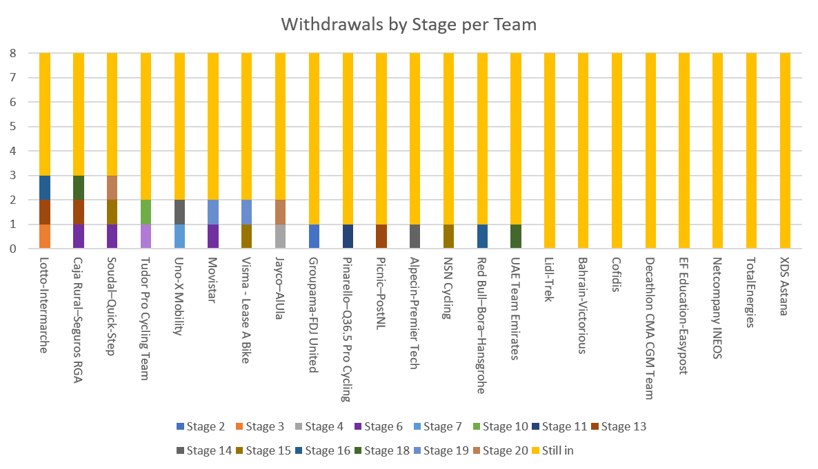
This year, while a couple of the stages did have a few more withdrawals they're reasonably evenly spaced. Pie chart of withdrawals by stage.  Stage 6 had the most with 4, stage 13 and 15 had 3 each. Stage 6, the one with the most withdrawals, unsurprisingly, was the Tourmalet. Stage 15 was the one with Vingegaard's crash, while stage 13 was the one with Gaviria's horrible crash. Bar chart of withdrawals by team.  Each withdrawal is a different colour depending on stage.  Those left in are coloured yellow.  Lotto-Intermarche, Caja Rural-Seguros RGA and Soudal Quick-Step were all down to 5 riders.  Lidl-Trek, Bahrain Victorious, Cofidis, Decathlon, EF Education Easy Post, Ineos, Total Energies and Astana all retained all their riders. 
You are looking at someone smug that she had figured out how to recolour charts in Excel. Because the "still ins" were a drab grey. I prefer a thematic yellow. 

Lotto-Intermarche, Caja Rural-Seguros RGA and Soudal Quick-Step were all down to 5 riders. Lidl-Trek, Bahrain Victorious, Cofidis, Decathlon, EF Education Easy Post, Ineos, Total Energies and Astana all retained all their riders. 

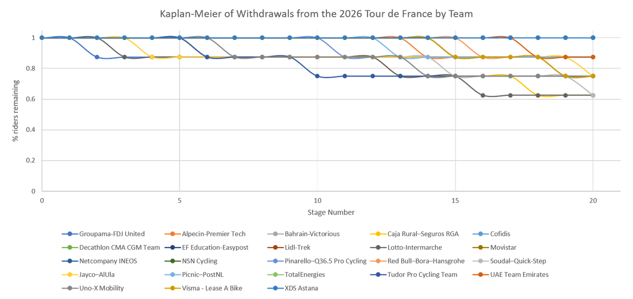
There's no real patterns, to this or in the Kaplan-Meier survival curve split by team. Kaplan-Meier Survival curves by team.  The curves are flowing and none look that steep because no team lost more than one rider per stage. 

If the team names and colours stick for more than 5 minutes, I may recolour this to match team colours, but 23 teams is a lot of colours to keep track of. 

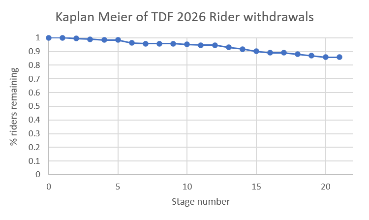
For the Tour as a whole, the Kaplan-Meier looks like this. Kaplan-Meier survival curve of riders in the Tour de France.  The blue line starts at 1 on day 1, has barely dropped by day 5, is down to about 0.95 by day 10, 0.9 by day 15, and finishes at 0.85 on day 20, staying there for day 21. 

My takeaway is that this time there was a long, slow decline, with no sudden drops, not even on the Tourmalet. 

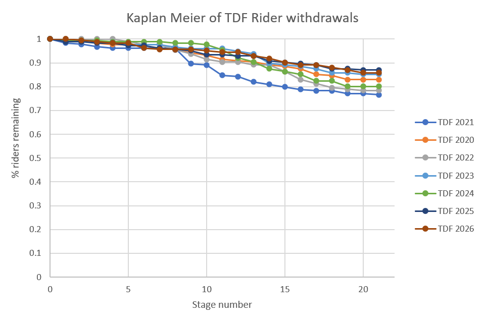
I have been doing this for far too long and so can compare this year's Kaplan-Meier to those of the preceding 6 years. The above Kaplan-Meier compared to those of the previous 6 years.  2021 stands out because while most have a similar shape, it had a huge drop between days 10 and 15. 2026 fits into the same pattern as the others, with only 2021 standing out.

Wednesday, 22 July 2026

Formula 1 2026 - Belgian Grand Prix

 I had a moment of revelation at the start of this grand prix - around about when Leclerc and Hamilton moved past Verstappen and Russell - this Ferrari car isn't bad. It's not as good as the Mercedes, but the Mercedes is a good car, even if it's not as good as *that* rocket ship Mercedes or that Red Bull. See also sort of keeping up with the Mercedes cars after they overtake.


I'm not quite sure what to do with the information.

Mostly because having a good car isn't enough, you need good drivers (we've got that) and a solid strategy team ... which Ferrari haven't got. This time it was Hamilton who was affected by strategy gremlins. Now I am guessing they had to do some quick thinking following the 5 second time penalty but they didn't seem to have communicated the revised plan to their driver which is a really quick way of losing the driver's trust.

Hamilton did seem to be having a day of it; between the penalty and the pit-stop incident and the "not doing what he wanted doing to his front wing" and ... Thankfully the pit crew member appears to be fine.

I am of the camp that think Hamilton got walloped with a penalty where Leclerc didn't because Russell ended up out while Piastri managed to get the car to the finish.

As to other non-Ferrari matters (other than Bottas holding up Leclerc to allow Antonelli to catch him and my tin foil hat insisting it was deliberate), Hadjar and Verstappen appear to be the pairing Red Bull have been looking for for years. Not sure if that's because the way the cars are set up under the current regulations doesn't suit Verstappen as well as previous cars or Hadjar is that good (I tend towards "Hadjar is that good" but I acknowledge my biases). Racing Bull and Alpine seem to be coming along nicely, as do Audi. For Aston Martin, the only way is up. I'm intrigued about their update coming at Hungary.

Saturday, 18 July 2026

World Cup 2026 - Final Network Visualisation

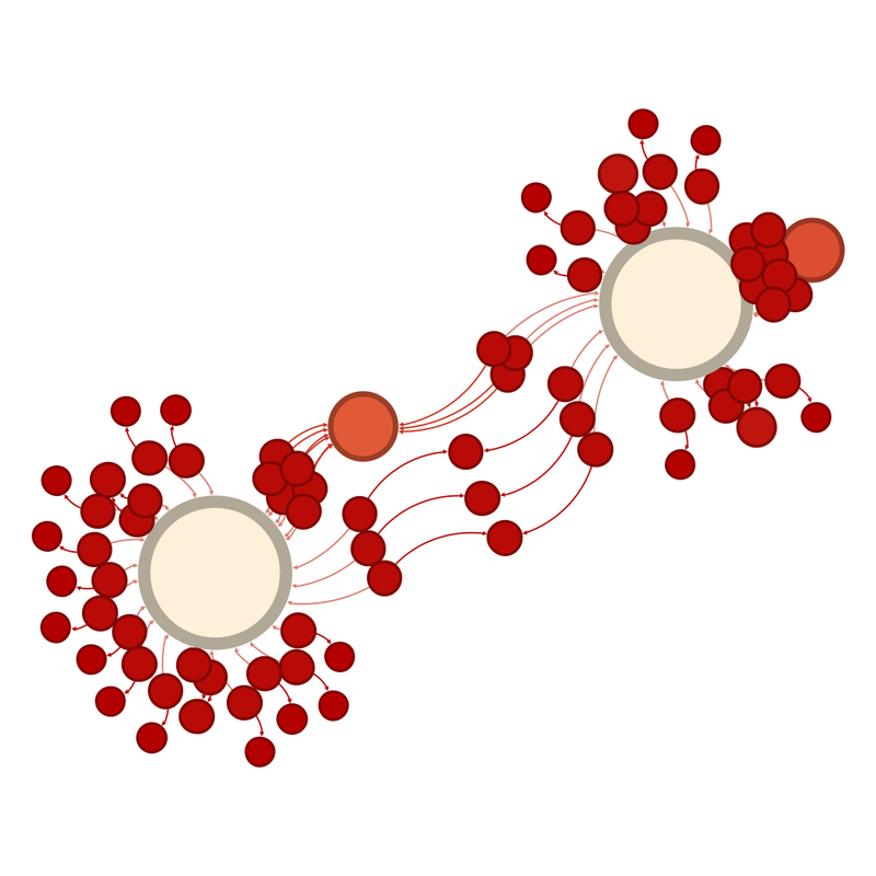
The unlabelled network graph looks like this: Unlabelled network graph of the teams in the final.  Smaller circles representing smaller numbers of interactions are red and the colour moves towards creamy white as the circles get larger.  Because we are down to two teams, the two biggest circles are pretty much equidistant. Even without the labels, you can probably guess the big circles are Spain and Argentina ;) 

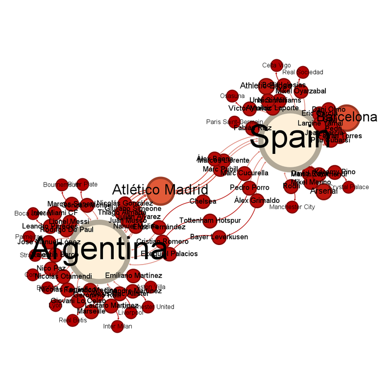
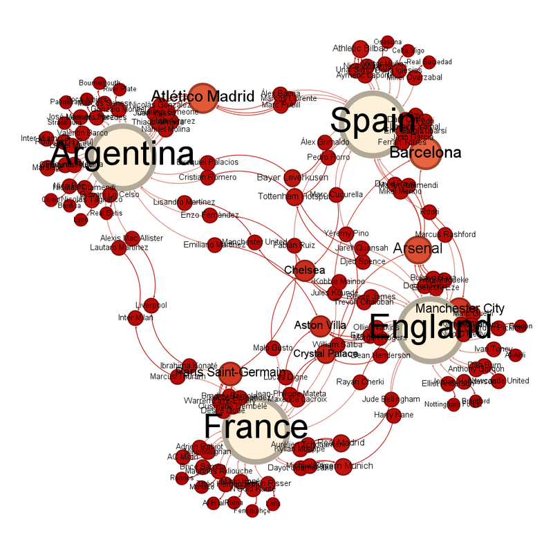
The labelled graph looks like this: Labelled network graph of the teams in the final.  Smaller circles representing smaller numbers of interactions are red and the colour moves towards creamy white as the circles get larger.  The large circle on the left is Argentina, the circle on the right is Spain.  There are large circles for Atlético Madrid and Barcelona. 

It's the battle of the Atlético Madrid players! 

Atlético Madrid have 9 players left, 3 playing for Spain, 6 for Argentina. 

Barcelona have 8, but they all play for Spain. 

Arsenal and Athletic Bilbao are next, with 3 players each. All 6 of those players play for Spain. 

Atlético Madrid, Chelsea, Tottenham Hotspur and Bayer Leverkusen have players on both teams. 

Chelsea, somehow, are the club team closest to the centre of the diagram. 

No prediction at this stage, the two teams are understandably equidistant.

Friday, 17 July 2026

Are the scrutineers picking on my driver? - Update after the Austrian Grand Prix

Some interesting points from the underlying data: The Austrian GP featured the first test where the check said "all classified cars" rather than all cars, or giving the number of the car tested. It was the steering wheel test. I have been assuming that "all cars" meant all cars entered. I think the wording of this check supports that but I want to give that caveat on all this data. 

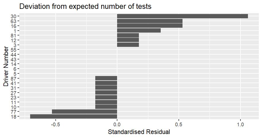
The Austrian GP race scrutineering itself: Bar chart showing how often cars were scrutinized compared to the expected number at the Austrian Grand Prix.  The values are displayed as a standardised residual.  Car 30 (Lawson) is the most over-scrutinized compared to expected, with a value of 1.06.  He is followed by car 16 (Leclerc) and car 63 (Russell) with a value of 0.53.  Car 18 (Stroll) is the most under-scrutinized compared to expected with a value of -0.71.  He is followed by car 77 (Bottas) with a value of -0.53.  Cars 87 (Piastri), 41 (Lindblad), 31 (Ocon), 27 (Hulkenberg), 23 (Albon), 11 (Perez) and 10 (Gasly) are next at -0.18.  6 cars were tested exactly as much as expected (Bortoleto, Hadjar, Alonso, Colapinto, Hamilton and Sainz jnr. 

No, I don't know what Liam Lawson did to the scrutineers. 

Obviously, it's not that extreme, because his standard residual of 1.06 doesn't hit the value of 2 that suggests significance but that's a lot of tests on one car. 

The difference from expected is not statistically significant with an χ² of 2.88. 

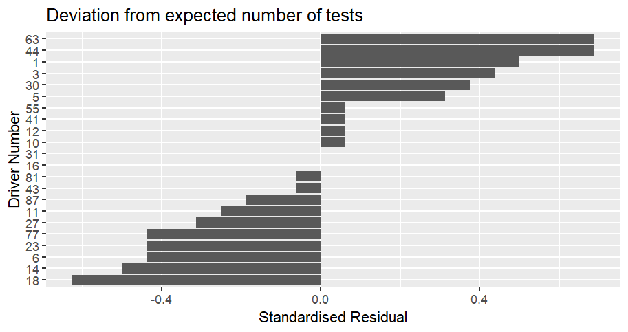
Season to date: Bar chart showing how often cars were scrutinized compared to the expected number for the season to date, up to the Austrian Grand Prix.  The values are displayed as a standardised residual.  Cars 63 (Russell) and 44 (Hamilton) are the most over-scrutinized compared to expected, with a value of 0.69.  Then comes car 1 (Norris) at 0.5.  Cars 18 (Stroll) is the least tested at -0.63, then 14 (Alonso) at -0.5 then 6 (Hadjar), 23 (Albon) and 77 (Bottas) at -0.44.  Cars 16 (Leclerc) and 31 (Ocon) have been tested the expected number of times. 

The difference from expected is not statistically significant with an χ² of 3.06. 

The top 3 most over-scrutinized (Russell, Hamilton and Norris) make some sort of fits with their performance, because they are 3 of the top 5 at this point of the season. 

Similarly, two of the bottom 3 make sense, because the Aston Martins of Stroll and Alonso have not been going long distances so might miss some of the post-race tests, ditto for Bottas and Albon who have retired from half the races and a quarter of the races respectively. Hadjar being so low down still makes no sense, he's only not completed 2 races but all but one of the rest of the races he's been in the top 10. It's getting to the point where I want to triple check all my numbers, he's that low. 

For the British Grand Prix results, I'm going to be looking for that random top 10 finisher check, providing there are at least 15 finishers (which *spoiler* there were). If it doesn't happen, I may have to conclude there is no pattern.

Monday, 13 July 2026

World Cup 2026 - Semifinal Network Visualisation

I have listened to L's editorial guidance and am posting the post with a deadline. Austrian and British Grand Prix scrutineering posts are in the works, as is the first of the weekly Tour de France posts. I am making no promises on timelines because a work project is stealing my time. 

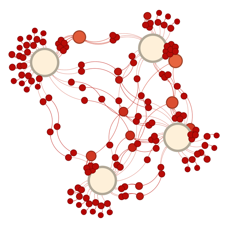
We're down to four teams and the network graph looks like this. Unlabelled network graph of the teams in the quarterfinals.  Smaller circles representing smaller numbers of interactions are red and the colour moves towards creamy white as the circles get larger.  Three of the teams are sort of together in the centre right.  One sticks out slightly to the right. 

The teams are close together, but one sticks out. Labelled network graph of the teams in the quarterfinals.  Smaller circles representing smaller numbers of interactions are red and the colour moves towards creamy white as the circles get larger.  Three of the teams (England, Spain and France) are sort of together in the centre right.  One, Argentina, sticks out slightly to the right. 
Sort of understandably, being as Argentina is on a different continent to the other finalists, they are the team slightly further away from the others. 

The thing I find intriguing is that each national team has one club team close to it, because that club team provides a lot of national team representatives. For Argentina, it is Atlético Madrid (my heart belongs to Diego Simeone), England have Manchester City, France have Paris Saint Germain and Spain have Barcelona. 

It shows the financial strength of European football that the club team with the most players playing for Argentina is Atlético Madrid, not a team closer to home. 

The club teams with the most representatives left are Barcelona with 10, Atlético Madrid with 9 and Arsenal with 8. 

England are just about the team closest to the centre, with Chelsea the club team closest. 

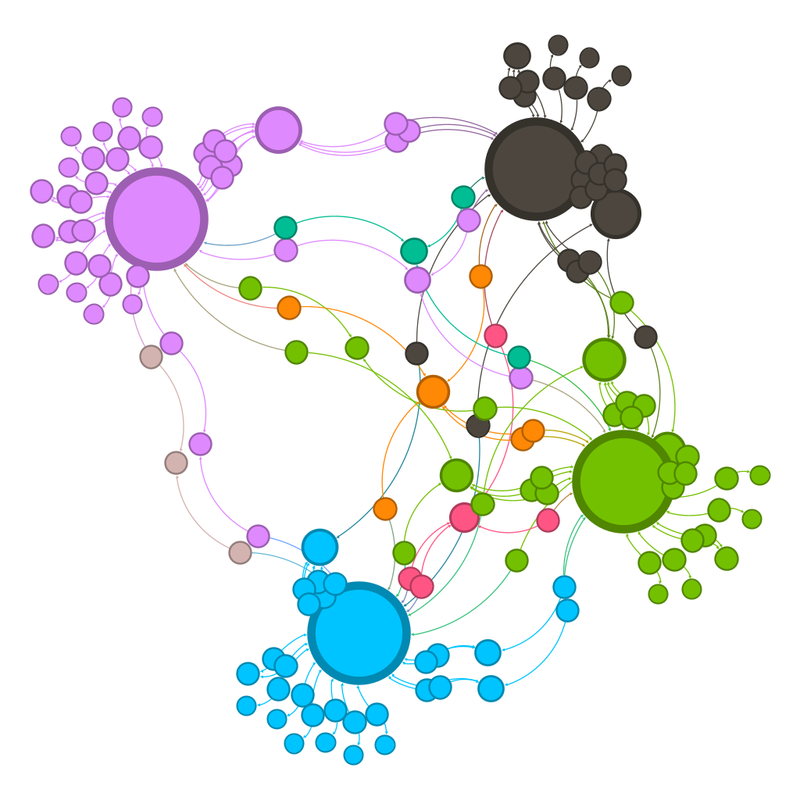
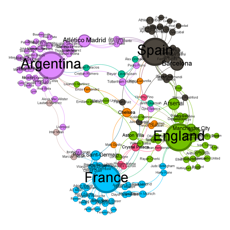
There's something interesting going on in the community view. Although there are only 4 teams left, there are 8 communities. The same diagram as before, but coloured by community.  The eight colours are four large circles, dark grey, lilac, green and light blue.  There are four smaller communities, they are pale brown, orange, pink and darker green. Labelled, it's clear that four of the communities are the nations, and the others are those teams that link more than one country (with some exceptions). The same diagram as before, but coloured by community and labelled.  The eight colours are four large circles, dark grey (Spain), lilac (Argentina), green (England) and light blue (France).  There are four smaller communities, they are pale brown (Inter Milan which links Argentina and France), orange (Chelsea who have at least 1 player in each remaining team), pink (Crystal Palace who link England, France and Spain) and darker green (Bayer Leverkusen who link Argentina, Spain and England). 

The thing that intrigues me is that some teams aren't separate communities even though they link multiple teams. 

I think that happens when most of the players play for one national team, for instance of the five Aston Villa players left, three play for England. 

Chelsea will have a player in the final no matter what combination of teams wins the semifinal matches. 

Making predictions at this point is almost impossible, but the diagram says England and unclear because of how equidistant Spain and France are from the centre.

Saturday, 11 July 2026

Formula 1 2026 - British Grand Prix

 Ferrari only win when I can't pay attention. Barcelona - I was being driven back from a fencing competition. Silverstone - being driven back from a fencing competition. Clearly, the solution to get Ferrari winning more is for me to do more competitions. [Editorial note, the joke is L's]


Ferrari mustn't have been expecting Leclerc to start so well given it meant they had to switch to strategy B by lap 8.

It was a race with several "things I hadn't seen before". An umbrella causing a (virtual) safety car and a brake aero duct failure causing a car to stop being able to steer.

(Technical details sort of here - https://www.formula1.com/en/latest/article/a-car-should-not-break-wolff-laments-antonelli-mechanical-issue-with-italian-denied-epic-battle-for-silverstone-win.5juL2jTds26Hl4foTZIWnk)

That penalty for Antonelli was kicking a man when he was down. This time he wasn't deliberately going beyond track limits.

So happy that Ferrari got a 250th F1 Victory. Harry Benjamin on the BBC commentary was not helping by describing Leclerc as "the man who bleeds scarlet". We Ferrari fans are already unreasonable on the subject of Leclerc.

Wednesday, 8 July 2026

World Cup 2026 - Quarterfinal Network Visualisation

(The Austrian Grand Prix scrutineering post, and the British Grand Prix summary and scrutineering post are coming, I just thought this was a bit more urgent) 

Okay, last's round's predictions were not as good as they could have been. I got Brazil vs Norway right, and was right to suspect England vs Mexico would be close, got France, Argentina and Morocco's results correct, but was way out on Belgium vs United States and got Switzerland vs Colombia wrong (although I said it would be close). I was right that Spain being pulled out of the centre of the diagram by all their Barcelona players made it hard to predict their result from the diagram. 

Also, I didn't predict how close Egypt got to beating Argentina. 

What do the quarterfinal diagrams look like? 

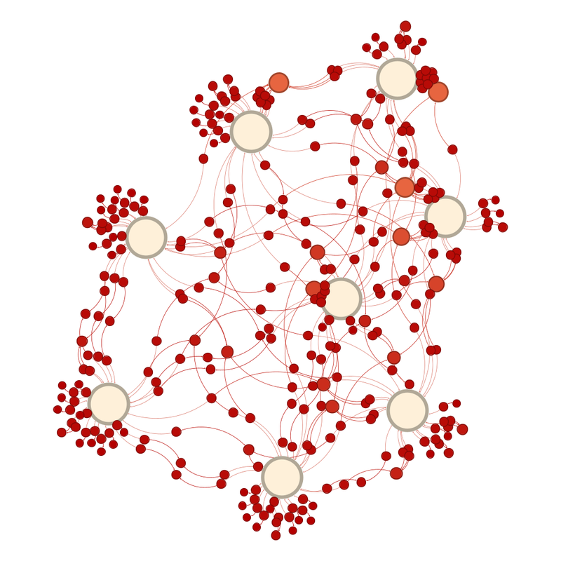
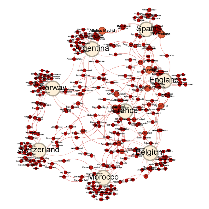
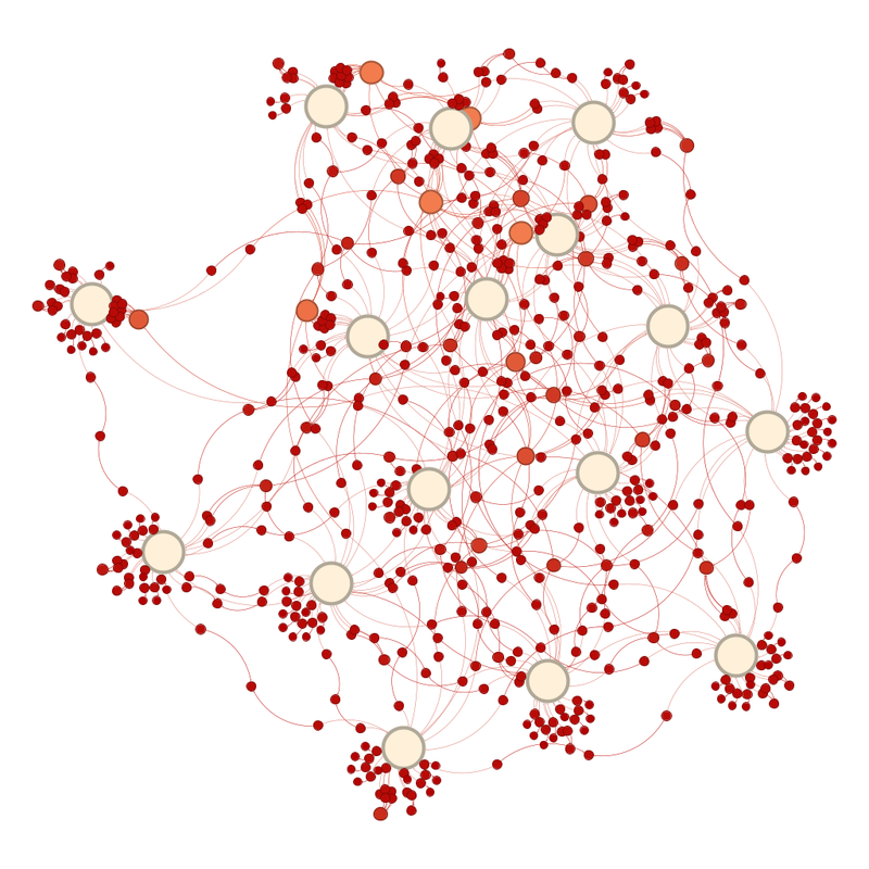
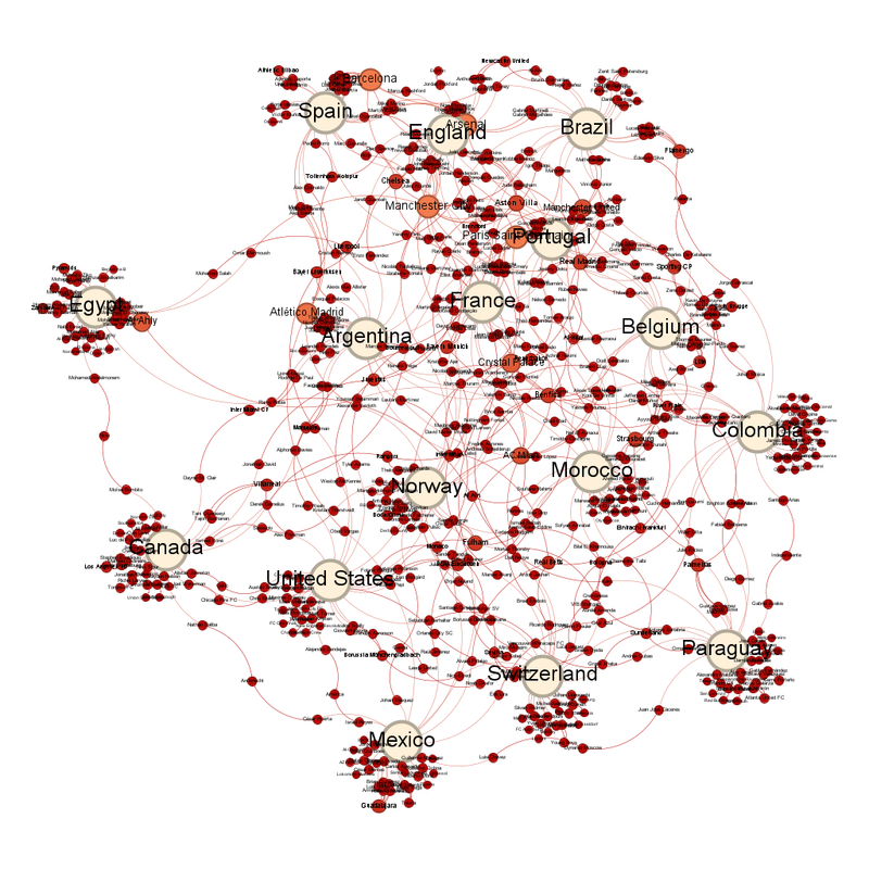
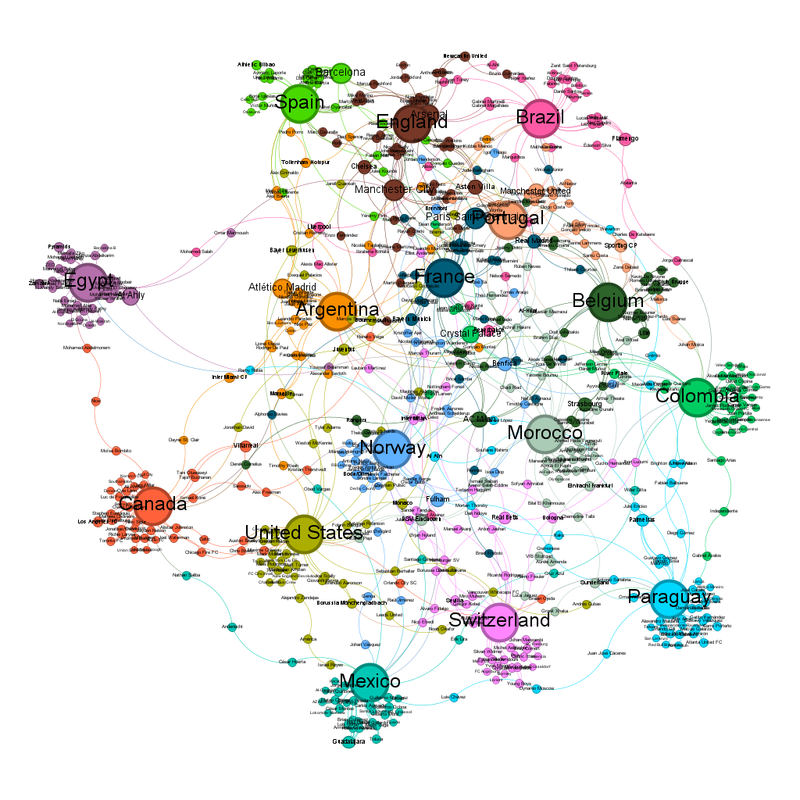
The unlabelled diagram looks like this: Unlabelled network graph of the teams in the quarterfinals.  Smaller circles representing smaller numbers of interactions are red and the colour moves towards creamy white as the circles get larger.  They now looks like a very squiggly circle, or a very wobbly rhomboid, with only one team in the middle. Labelled it looks like this: Labelled network graph of the teams in the quarterfinals.  Smaller circles representing smaller numbers of interactions are red and the colour moves towards creamy white as the circles get larger.  They now looks like a very squiggly circle, or a very wobbly rhomboid, with only one team in the middle.  Spain, at the top of the graph, is where 1 would be on a clock.  Following the clock around, there is England at about 2, Belgium at 5, Morocco at 6, Switzerland at 8, Norway just past 9 and Argentina at 11.  France are in the middle. France are the national team closest to the centre, with Paris Saint-Germain the club team closest. 

The club teams with the most representatives left in are Atlético Madrid, Barcelona and Arsenal with 10. 

The average number of degrees of contact each circle has is 1.364. 

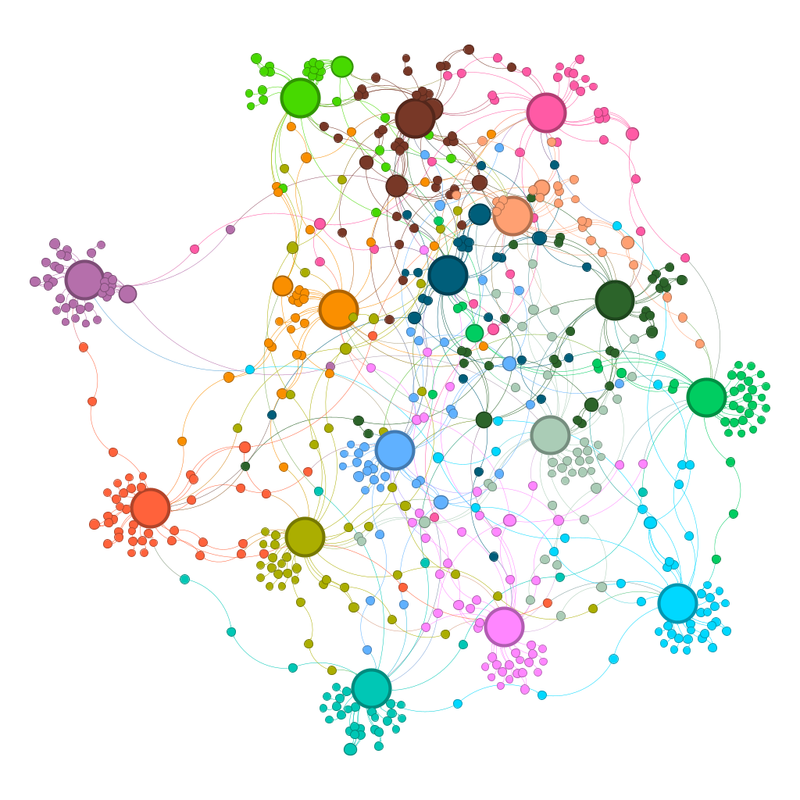
The number of communities is still one per team, so 8. 

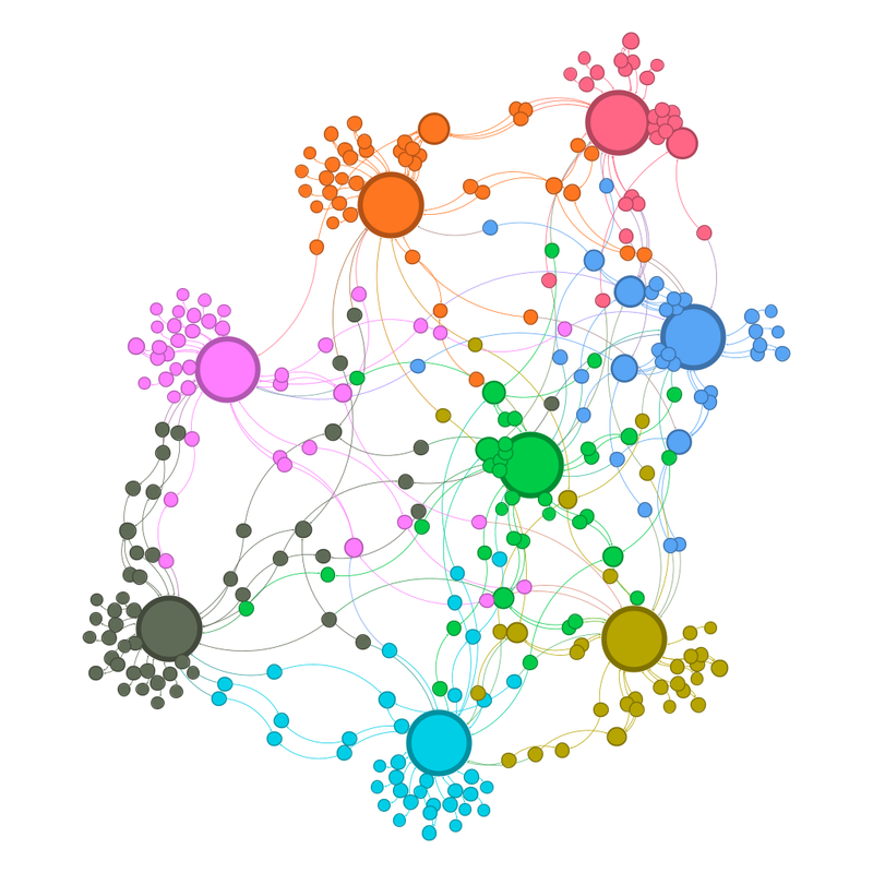
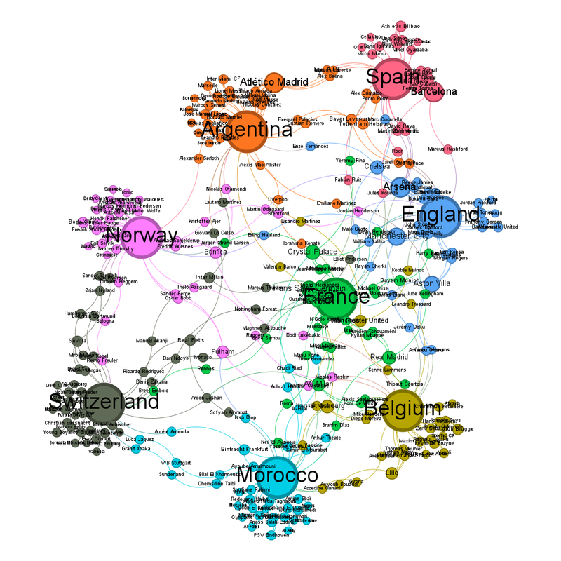
The unlabelled community view looks like this: Community view of the above.  Full description in the labelled version. Labelled, it looks like this: Labelled network graph of the community view of the teams in the quarterfinals.  Smaller circles representing smaller numbers of interactions are red and the colour moves towards creamy white as the circles get larger.  They now looks like a very squiggly circle, or a very wobbly rhomboid, with only one team in the middle.  Spain, at the top of the graph, is where 1 would be on a clock and is orange-pink.  Following the clock around, there is England at about 2 (blue), Belgium at 5 (olive green), Morocco at 6 (sort of turquoise), Switzerland at 8 (grey), Norway just past 9 (pink) and Argentina at 11 (orange).  France are in the middle and green. 
What about my predictions? 

It's much harder at this point, with the teams other than France pretty much equidistant from the centre, and no "gravitational" clump. 

France vs Morocco - Diagram says France 

Spain vs Belgium - Diagram says Belgium, although I think that's because Spain are still pulled out of the centre by all those Barcelona players. On the other hand, anything can happen in knock out football. 

Norway vs England - Norway just (that sound you can hear is L cursing me) 

Argentina vs Switzerland - Diagram says Switzerland. I think that's the Atlético Madrid players pulling Argentina out. Also [Legal team have redacted a paragraph-long rant about exactly how many World Cups the referees are going to give this Argentina team.] Switzerland could do it ... (I feel I need to add a conflict of interest statement, I drew Switzerland in a sweepstake at work.)

Sunday, 5 July 2026

World Cup 2026 - Last 16 Round Network Visualisation

Delayed by fencing, which I enjoyed immensely despite the sprained ankle. 

Second round results: I said Senegal vs Belgium would be a cracker

The whole centre of diagram gravity vs centre of diagram really did come into play in the second round - if you were a team on the left hand side of the diagram you went out. Except Egypt, and they were playing another team from the left hand side. 

Of the matches where there was a clear prediction, gravitational centre ended up being more important, which is useful learning. 

The diagram for the last 16 teams isn't as tightly packed any more, which means that should be less of a thing going forward. Unlabelled network graph of the teams in the last 16.  Smaller circles representing smaller numbers of interactions are red and the colour moves towards creamy white as the circles get larger.  This time, they are reasonably evenly spread out, with only really two sticking out on the left hand side.  (Yes, one of them is Egypt again). 

The labelled version of the graph looks like this: Labelled version of the network graph of the teams in the last 16.  Smaller circles representing smaller numbers of interactions are red and the colour moves towards creamy white as the circles get larger.  Egypt and Canada are the teams sticking out on the left.  Everyone else is almost in a central rectangle. 

The list of club teams with the most representatives has changed - especially Bayern Munich given Germany are out. What we've got instead are a small clump of teams with 12 players left in (and yes, these are the teams that were causing the cluster in blue in the first round and in the top right of the diagram in the second). They are Paris Saint-Germain, Arsenal, Barcelona and Manchester City. Atlético Madrid is the next on 11. 

Norway are the national team closest to the centre, while Inter Milan are the club team closest. 

The average number of degrees each circle is linked to has gone down to 1.377. 

The number of communities in the communities view is now 16, so one per team. Same image as above now coloured by community.  Full explanation in the labelled description. Labelled it looks like this: Labelled version of the above.  Egypt (purple) and Canada (orange), stick out to the left.  Spain (green), England (brown) and Brazil (pink) run across the top).  Colombia (mid-green) and Paraguay (blue) are along the right hand side, with Switzerland (also pink) and Mexico (sort of mint green along the bottom).   About level vertically with Egypt and under the Spain-England-Brazil group are Argentina (also orange), France (dark blue), Portugal (pale orange) and Belgium (dark green).  Between them and the bottom are United States (olive green), Norway (vibrant blue) and Morocco (pale green). 

As to my predictions (which I don't mind making late because you can see the diagrams I'm basing them on): 

France vs Paraguay - France 

Canada vs Morocco - Morocco 

Portugal vs Spain - Diagram says Portugal, reason says Spain; all those Barcelona players pull Spain out of the centre, the same thing that happens to their women's team and always skews the women's diagrams. 

United States vs Belgium - Diagram is not clear, this may be closer than people expect. 

Brazil vs Norway - Diagram says Norway, I don't think that's impossible. 

Mexico vs England - Diagram is also not clear 

Argentina vs Egypt - Argentina 

Switzerland vs Colombia - Diagram says Colombia but could be close!

Thursday, 2 July 2026

Formula 1 2026 - Austrian Grand Prix

 This year I've often said how much the new regulations have improved the action, or at least made it more interesting for spectators. I have to acknowledge that that didn't happen at the Austrian Grand Prix, and the only points of interest were due to the differing tyre strategies of the front runners.


And the many brakes on fire, which I'm presuming was due to the mixture of high temperature and high altitude. I'm not sure what explains Liam Lawson's assumption of fire, unless his cockpit just felt that damn hot!

I am also presuming Red Bull turned the wick up on their engine for their home race, the way Ferrari do for Monza.

The effect the timing of the safety car had on the outcomes of the strategy calls highlights the importance of luck - it's normally Leclerc hit by "safety car 1 lap after it would have been useful for him"; this time it was Antonelli.

The current Ferrari team don't seem to be able to have two good races in a row. As a Ferrari fan, hearing the commentators asking "is the Ferrari strategy clever or just really, really stupid?" is frustrating because the answer is always that it's really, really stupid.

I think Andrew Benson on the BBC radio commentary described it best, the Ferrari strategy is "... hoping for something instead of racing with what's in front of you right now". They are just hoping, not planning for the various possible outcomes or making something happen. It's so frustrating!!!

Sunday, 28 June 2026

World Cup 2026 - Second Round Network Visualisation

This has been written in a hurry between me waking up after the last round of group stage games played overnight and the first of the second round matches this evening. 

Truly, this turn around time is too tight for data visualisations. I worry how this short turnaround time will affect the preparation of the teams. 

Group stage results: 
I am not surprised that two teams from Group A went out, all the teams in that group were on the outside of chart. I am surprised that South Korea were one of the two. (From distance on the diagram, I presumed it would be Czechia and South Africa to go out from that group) 

The diagram didn't have Scotland going out, but I was also not surprised that Haiti weren't the roll over some people thought they would be. 

The weakness of Türkiye and Tunisia was unexpected given how central they were. I don't think anything explains Uruguay's performance other than sometimes, everything goes wrong. 

In terms of my predictions, this is how I did (blue is right, red is wrong): Qatar, Jordan, Iraq, Egypt, Uzbekistan, Iran, Cape Verde (never have I been so happy to be wrong), South Africa, Panama, New Zealand, Curacao, Australia, Czechia, Bosnia and Herzegovina and Saudi Arabia 

15 guesses (because none of group C were obviously sticking out) - 10/15 correct. 

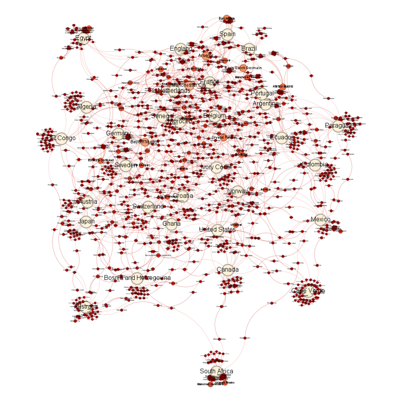
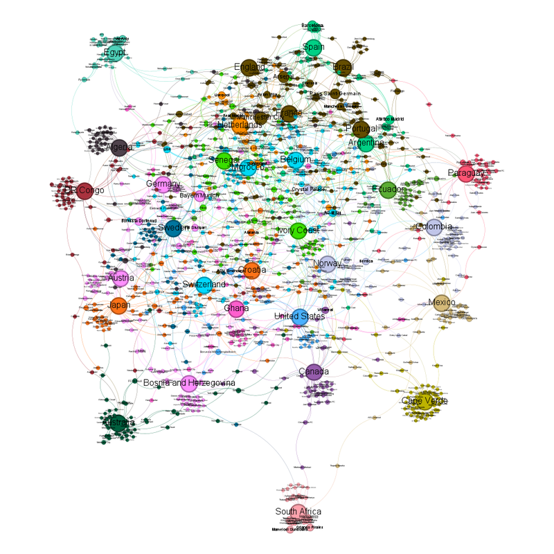
Following the removal of the teams that have gone out, the network diagram now looks like this: Unlabelled network graph of the teams in the second round.  Smaller circles representing smaller numbers of interactions are red and the colour moves towards creamy white as the circles get larger.  It looks like a bouquet.  Even in this unlabelled view, you can see some teams cluster together. Labelled, it looks like this: Labelled version of the above diagram.  The stem of the bouquet is South Africa. 
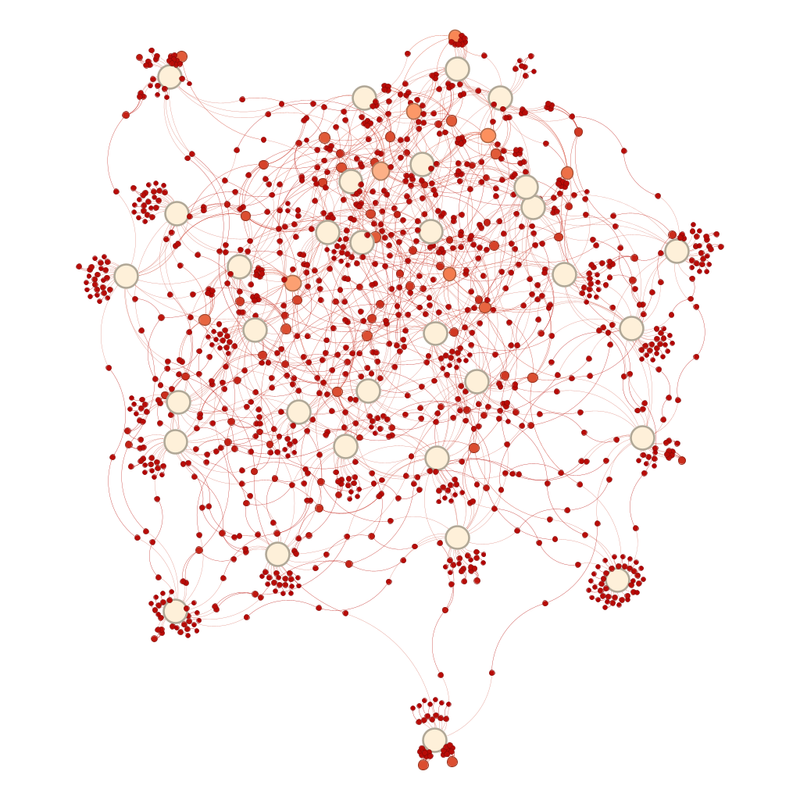
Average degree (number of links between circles) has gone down slightly from 1.427 to 1.416. 

The team closest to the centre are Croatia - although exactly where the centre is has been thrown off by South Africa sticking out by that much. I would guess the centre is actually Cote D'Ivoire. 

The "weight" of the diagram is also thrown off by a lot of teams clustering at the top. 

Union Saint-Gilloise are the club team closest to the centre. 

The club teams with the most representatives still in are Manchester City with 18 players left in, Bayern Munich with 16 and Arsenal with 15. 

A couple of other teams have enough players left in to be seen as large(ish) orange circles. They are Paris Saint-Germain (14 players still in), Barcelona (13) and Crystal Palace (12). 

One of these teams is not like the others. 

What does the community view look like: Unlabelled version of the above diagram coloured by community.  You would expect 32 colours if each team is a separate community.  There are only 22 colours. Labelled it looks like this: Labelled version of the above.  I am going to describe it in detail below. There are 32 teams left, but only 22 communities. 
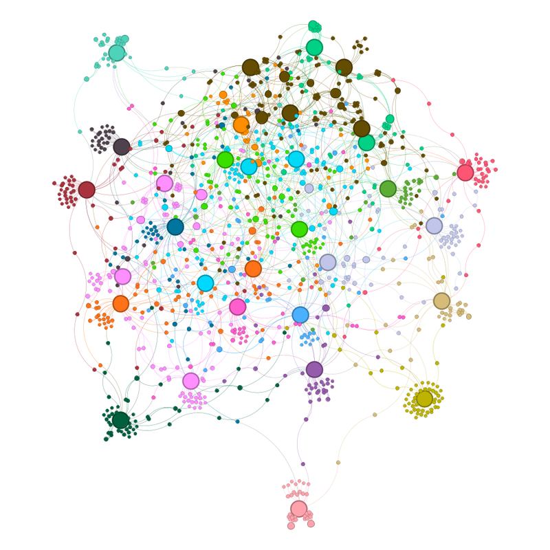
The communities are as follows: 

Group 1 - Teams that are individual communities: 
1) South Africa - Light pink 
2) Australia - dark green 
3) Cape Verde - olive green 
4) Canada - pale(ish) purple 
5) Switzerland - electric bubblegum blue 
6) United States - mid blue 
7) Mexico - pale sandy brown 
8) Ecuador - grass green 
9) Ghana - Pink 
10) DR Congo - red-brown 
11) Algeria - dark grey 
12) Egypt - mint green 
13) Netherlands - serendipitously orange 
14) Paraguay - red-pink 
15) Sweden - sort of pale RAF blue 

Group 2 - two team clusters: 
16) Japan and Croatia - also orange, because I can't figure out how to change colours 
17) Norway and Colombia - pale grey-blue 
18) Ivory Coast and Senegal - bright green 
19) Morocco and Belgium - bright blue, like I said, I don't know how to change colours. 
20) Spain and Argentina - mid green 

Group 3 - large multi-team clusters: 
21) Bosnia and Herzogovina and Austria and Germany - paler pink 
22) Portugal, Brazil, France, England - dark brown. These are being pulled together by club teams that have a lot of representatives (Paris Saint-Germain, Manchester City, Arsenal) 
What does the updated network graph suggest about the second round matches? 

A complication for this round is that South Africa protrudes so far from the main cluster that the geometric centre and the "gravitational" centre no longer match. Several predictions depend on which definition you prefer. 

Germany vs Paraguay - Germany 

France vs Sweden - One of the problems with the tight "Manchester City, Arsenal, Paris Saint-Germain" group that includes France, Portugal, England and Brazil is that it pulls those teams out of the centre of the diagram. That means that going off absolute centre of the diagram, the prediction is Sweden wins but going off the "gravitational" centre of the diagram, it'd be France to win. 

South Africa vs Canada - Canada 

Netherlands vs Morocco - Diagram says Morocco 

Portugal vs Croatia - another split decision: diagram says Croatia, weighted centre says Portugal.  Experience says Croatian witchcraft. 

Spain vs Austria - The rewards for finishing second in a group are getting a match vs Spain rather than a match vs Switzerland for 3rd. Truly, Austria have been stuffed by the draw. 

United States vs Bosnia and Herzegovina - Diagram says US 

Belgium vs Senegal - Diagram says this should be close. Having watched both teams (yeah, not sure why the team whose matches I've seen the most of are Belgium), experience also says this could be a cracker. 

Brazil vs Japan - another one affected by absolute centre vs gravitational centre. 

Ivory Coast vs Norway - Diagram suggests Norway just, but another match that could be a cracker. 

Mexico vs Ecuador - Diagram unclear 

England vs DR Congo - another one affected by absolute centre vs gravitational centre. 

Argentina vs Cape Verde - Oddly, another one affected by the centre issue. 
Most "any given Sunday" of ifs. But if Cape Verde could do it ... 

Australia vs Egypt - Diagram says close 

Switzerland vs Algeria - Diagram says Switzerland 

Colombia vs Ghana - Diagram says Ghana. Another one with the potential to be a cracker. 

Because so many teams are still in, the diagram is still very busy. I am looking forward to several of those matches.