Saturday, 31 May 2025

Formula 1 2025 - Monaco Grand Prix - or "Williams did nothing wrong"

The race itself was pretty much dull as ditch water, even if part of me felt sympathy for Leclerc's "why always me" radio message about the timing of the virtual safety car. Why does it always happen at the worst possible time for him?

But it's Monaco, so nothing other than redesigning the cars so that they are smaller is ever going to make it an interesting race.

And if they're going to add stupid rules, the teams, staffed as they are with over-grown hyper-intelligent schoolboys and girls, are going to bend and spindle those rules any way they can to get one over on the other teams and try to get points.

That's even more true of Williams who are one of the smaller teams (and why I have more sympathy for them than Mercedes or Racing Bulls).

Following an excellent performance in qualifying, they used a race strategy that guaranteed them points, in a sport where points = prize money.

Williams did nothing wrong!

Saturday, 24 May 2025

Saints Ahoy - Game 24 and the 2024 season to date

Game 24 of Saint's 2024 season was their Magic Weekend game. 

I quite like Wikipedia's description of Magic Weekend - "an annual event organised by the Rugby Football League in which an entire round of Super League matches is played over a weekend at a single stadium to promote the sport of rugby league." (https://en.wikipedia.org/wiki/Magic_Weekend

I've been lucky enough to go twice, both in Newcastle. 

The only downside to Magic Weekend is, that in order to sell tickets, Super League tend to have teams play their local rivals. Which means you can end up playing the same team far too often. 

And playing Wigan, again, in a year your team are already not doing well, is far, far too often. 

When Saints then lose, 20-0, to Wigan, that's the pits - https://www.saintsrlfc.com/2024/08/17/saints-beaten-on-derby-day-at-magic-wknd/ 

On the other hand the referees let this sort of thing go: A Saints player in a light blue shirt (it is Matty Lees) is tackled by two Wigan players (in black).  The Wigan player on the right is behind the Saints player and has his forearm around the neck of the Saints player.  This is an illegal manoeuvre. 

Understandably, there can be no diagrams for Saints's point-scoring moments in this game, nor are there any updates to their point scoring moments for the season. 

There is no pattern to when Saints conceded, except maybe a slight suggestion that they concede more in the last 10 minutes (but so does everyone else). Bar chart of when Saints concede up to game 24.  It looks like a row of skyscrapers.  The highest point is minute 76 which features 6 point conceding moments.  There are 3 minutes with 5 point-conceding moments, minutes 11, 32 and 80.  See what I mean by no pattern. 

The "who is present when Saints concede" diagram is so weird that it made me double check that I'd not made some sort of data entry error. Bar chart of who is on the field when Saints concede.  The bar for Waqa Blake is much longer than that of anyone else, up past 100 when the next nearest (Welsby and Lomax) are at around 80. 

It makes sense, just, if you consider that he's about the only player who didn't have an extended injury / suspension break. 

It does make the "Who is present when Saints concede" matrix look intriguingly different. Matrix of who is present when Saints concede up to the end of game 24.  There is a very dark red line about 2/3rds of the way up and left that is the line for Blake.  He is completely separated from the next darkest chunk of 12 players in the bottom right hand corner (Welsby, Clark, Sironen, Mbye, Lees, Whitley, Delaney, Dodd, Lomax, Bell, Percival and Makinson).  Between them is a chunk of slightly paler interchanging forwards and Bennison (Hurrell, Matautia, Bennison, Knowles, Batchelor).  Above the line of Blake are the players who played less often.  They too are in two chunks.  The first slightly darker yellow chunk are next to the line of Blake.  They are Ritson, Davies, Robertson.  The palest section is Walmsley, Burns, Wingfield, Royle, Paasi, Stephens and Vaughan. 

The equivalent network graph is shaped like a fox's face. Network graph of who is present when Saints concede.  It is shaped like the face of a fox.  The central blob of most commonly present players would be the area around the face and cheeks.  Burns on his own forms the pointy chin.  Royle is on his own in the left ear. Walmsley is half way up the right ear and Wingfield is its tip.  This tells me that the other less frequently playing together players have now been eaten up by the central blob. 

As Royle, Walmsley, Wingfield and Burns are the only players sticking out, it tells me that the other players who had previously been in the little "rarely but when they do they play together" sticking out blobs have now been subsumed into the central blob. 

This is true, as they are now at the edges of the central blob (Paasi, Vaughan and Stephens on the left hand side and Bennison, Knowles and Batchelor on the right). 

That change is most interesting, and suggests Saints have had to start leaning on the full squad of players.

Saturday, 17 May 2025

Superman: the new one - some scattergun thoughts about comics, history and culture

 Because L assures me that sometimes my post should be up to date and my film reviews are now running 5-6 years late.


I start with some caveats:
1 - in my comic book days, I was very much a Marvel girl. Make mine Marvel etc. The nearest I got to DC was Batman.

2 - James Gunn is one of those creative types who appears to have a direct line to my soul. He is responsible for an excessive amount of me crying in cinemas; somewhat famously, the time Guardians of the Galaxy made me cry so hard I gave L a migraine.

I have very little skin in this game (Superman) and I know that I will enjoy it anyway.

That being said, it's so nice to see a friendly Superman on screen.

I blame a mixture of Quentin Tarantino and the comics' Dark Age for the dour Supermen we have been having on the big screen recently (this applies to big screen only, the cartoons have been suitable).

Quentin Tarantino because of the whole which of Clark Kent's identities is the "real" one spiel, and everyone wanting to be an auteur like him and ape him in every possible way. (Said with affection for his films)

The Dark Age for that period of comics were everything had to be bleaker than bleak. And fellas, I understand the appeal, because those were the comics of my teenage years too. But they were a short blip in a long lifetime of the Superman character.

Superman is the best of us and happens to be an übermensch, not just an übermensch.

Wednesday, 14 May 2025

Formula 1 2025 - Miami Grand Prix

The title race is really hotting up (https://en.wikipedia.org/wiki/2025_Miami_Grand_Prix)

Shame Ferrari are nowhere near the pointy end for either championship. Instead, the drivers are busy taking potshots at each other and the team -  https://www.bbc.co.uk/sport/formula1/articles/ce8g5xlmxjgo

Boys, you get to do this when you're winning, not when you're languishing in 4th in the Constructors.

Sunday, 11 May 2025

An update on "Haaland or Bug?"

As I'd updated the Shearer+Kane+Salah comparison, it was easy to update the equivalent comparison that includes Erling Haaland. 

In Haaland or Bug, I did say it would be interesting to see what an extra year's data would do to Haaland's curves. And it has done interesting things. 

Part of the problem is his 2023-2024 season would have been spectacular for anyone else, but was only "on standard" for him, so where his curves have been sky-rocketing previously, they've now plateaued, and on the 'extrapolated' curves, that means they're some interesting downward parabola shapes. 

First the Percentage of Games Played 

At the point where everyone had reached 23 years old: Line graph of percentage of games played per season by Shearer, Kane, Salah and Haaland up to the age of 23.  The lines for Shearer (blue) and Kane (orange) are straight lines.  The Shearer line starts at 0 at 16, and goes up to 72-73% at 23.  The Kane line at 18 at 15, and goes up to 85% at 23.  The Salah line (grey) is a downward turning parabola that starts at 0 just before 16, and drops to 75% at 23.  The high point is 80% between 21 and 22.  The Haaland curve starts at 54% at 15, and plateaus off after reaching 80% between 21 and 22. 

In this chart, Kane and Shearer have similarly angled increases (although Shearer's percentage is lower), while Salah has a dipping parabola (he missed a lot of games at the age of 22 which is still affecting his up to 23 curve, although his percentage of games played went up to higher than it was before).  

Haaland's curve is now plateauing, but that's because he has played a high percentage of games for several years, which always leads to concerns (Link to "Much Too Much, Much Too Young" by the Specials 

In the "extrapolated" curves, all the players have downward turning parabolas. Haaland's is the worst because of the limited data, but Salah's has also gone down because of his 2023-2024 injuries (may he be kept from further hamstring problems). 

And Kane and Shearer are now meeting at the same point. This is a line graph of percentage of games played per season, extrapolated to 35 for Shearer, Kane, Salah and Haaland.  The line for Shearer is blue, and starts about 19% at 17, and finishes at 78% at 35 years of age.  The line for Kane (orange) finishes at the same point but starts 35% at 17.  The curve for Salah (grey) starts at the same point as the Kane line, but ends at about 50% at the age of 35.  The curve for Haaland (yellow) is also a downward curving parabola, shifted due to lack of data.  It starts at 54% at 15 and drops to 10% at 35, with a high point of 80% at 22. Next we have goals per game It is still weird curves ahoy, because Kane and Shearer's are still upward-facing banana-shaped. Line charts of goals per game up to the age of 23 for Shearer, Kane, Salah and Haaland.   The Shearer line (blue) is an upward facing parabola, starting at 1.1 at 15 and finishing at 0.9 at 23, with a low point of 1.8 between 19 and 20.  The Kane curve (orange) has a similar shape, starting at 1 at 15, and finishing at 0.9 at 23.  His low point is 0.36 also between 19 and 20.  The Haaland curve (yellow) is a downward facing parabola, starting at less than 0 at 15 (I blame the way EXCEL extrapolates the data) and finishing at 0.9 at 23.  His high point is 1.1 between 20 and 21.  The Salah curve (grey) is also a downward facing parabola starting at -0.25 at 15 and finishing at 0.3 at 23, with a high point of 0.32 just after 21. Haaland's downward facing parabola really is just due to other seasons being ridiculous and this one just being very good. I also find it amusing that three of the lines - Shearer's, Kane's and Haaland's - meet at more or less the same point. I think it's because they've always been out and out strikers, while Salah used to be a winger. 

With the extrapolated chart, it's another serious case of "insufficient data for Haaland" Line graph showing goals per game extrapolated from the present data to 35 for Shearer, Kane, Salah and Haaland.  The Shearer line (blue) is curve, from 0.22 at age 17 to 0.35 at age 25, with a high of about 0.61 about 26/27.  The Salah line (grey) is also a curve, from about 0.7 at age 17 to 0.48 at age 35, with a high point of 0.6 at 29.  The Kane line (orange) is straight because of his truly excellent goal per game at age 30.  It starts at 0.4 at 17, and ends at 0.85 at 35.  The Haaland curve (yellow) is a ridiculously sharp downward facing parabola, starting at 0 at 15 and ending at 0 at 26, with a high point of 1.1 between 20 and 21. 

The curve is only so steep because there is so little data. Kane's is skyrocketing because of his excellent 2023-2024 season. 

And finally, goals per possible game: 

Up to 23 is more banana-shapes, with Salah so much lower because that was when he was definitely still a winger. This is a line graph of percentage of goals per game up to the age of 23 for Shearer, Kane, Salah and Haaland.  The Shearer curve (blue) is curving upwards.  It starts at 0.32 at 15, and finished at 0.65 at 23.  The low point is almost 0 between 18 and 19.  The curve for Kane (orange) is similarly shaped, it starts at 0.4 at 4, then finishes at 0.67 at 23, with a low point at 0.2 at 18.  The curve for Haaland (yellow) is a downward curving parabola, starting at 0 at 15, and ending at 0.7 at 23, with a high point of 0.8 at 23.  The curve for Salah (grey) is a steadily increasing line from less than 0 at 15 (I blame the way EXCEL does curves) to 0.27 at 23. Again, the same three lines - Shearer's, Kane's and Haaland's - meet at more or less the same point. The extrapolated curves look odd for Haaland, because of lack of data again (and relative dropping off of goals per game), and Kane's skyrocket of a 2023-2024 season Line chart of goals per possible game extrapolated up to the age of 35 for Shearer, Kane, Salah and Haaland.  The Shearer line (blue) is a curve, starting at 0 at 17, and ending at 0.3 at 35, with a high point of 0.5 at 28.  The Salah line (grey) is also a curve, starting at 0 at 17 as well, and ending at 0.4 at 35, with a high point of 0.5 at 29.  The Kane line (orange) is almost a straight line, it starts at 0.19 at 17 and ending at 0.78 at 35.  The Haaland curve (yellow) is a ridiculously steep downward facing parabola.  It starts at 0 at 15 and ends at 0 at 27 with a high point of 0.81 at 21. Manchester City, and therefore Haaland's relatively poor 2024-2025 is going to do things to my graphs again next time, isn't it?   (I do think cause and effect are that way round. I think the way Guardiola has City set up, they miss Rhodri a lot more than they miss Haaland when he's not there.)

Saturday, 10 May 2025

The King; his Heir Apparent…and The Pharaoh waiting in the wings – Shearer, Kane and Salah, games and goals per season, updated to the end of the 2023-2024 season

(Yes, I know we're almost at the end of the 2024-2025 season, work with me here) 

One major thing, for the purposes of this update post, did happen since the 2022-2023 version of this post. Harry Kane moved to Bayern Munich. 

This was probably a very good thing for him (something is definitely rotten in the state of Tottenham Hotspur). 

And I've previously included stats from non-Premier League football for Salah, so it's definitely doable method-wise. 

It does mean that it will no longer be as direct a comparison, but I think that's okay. 
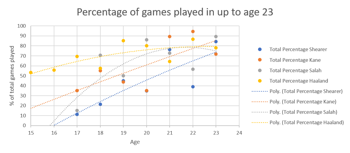
On to the graphs: 

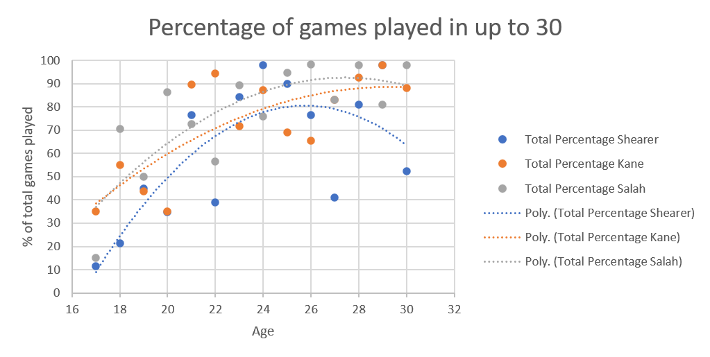
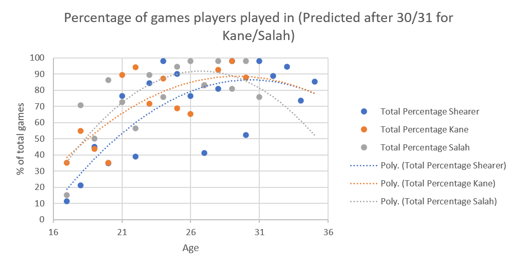
First, we have percentage of games played, up to the point of being 30 for all three players. This comes first because the original question L posed was whether Kane's putatively dodgy ankle would allow him to catch Shearer's Premier League goal tally. 

Looking at up to age 30, Shearer's curve has a serious down curve here, because 30 was when he had his second big injury (carrying that Newcastle team). 

Although Salah and Kane's curves have different shapes, they are now converging on the same point in terms of percentage of games they played at 30. Whether this is changes in how coaches use players, resting them more often now to allow more games overall, I don't know. Line graph of percentage of games played per season by Shearer, Kane and Salah up to the age of 30.  The line for Alan Shearer is blue.  It is a parabola that starts at just over 10% per year at the age of 17 and ends about 64% at the age of 30.  The curves for Kane (orange) and Salah (grey) have very similar start and end points, at 35% percent at 17, and finishing just under 90% at 30.  The shapes are different though with the Salah curve going higher. 
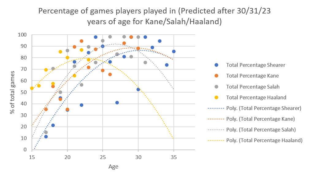
Using the "extrapolated till age 35" data, the curves look like this: This is a line graph of percentage of games played per season, extrapolated to 35 for Shearer, Kane and Salah.  The line for Shearer is blue, and starts about 19% at 17, and finishes at 78% at 35 years of age.  The line for Kane (orange) finishes at the same point but starts 35% at 17.  The curve for Salah (grey) starts at the same point as the Kane line, but ends at about 50% at the age of 35. 

It's Salah's curve that shows the greatest drop here (because at 31 he had an injury that kept him out of several games [Hamstring tears are no one's friend), while Shearer and Kane's curves converge to similar points. 
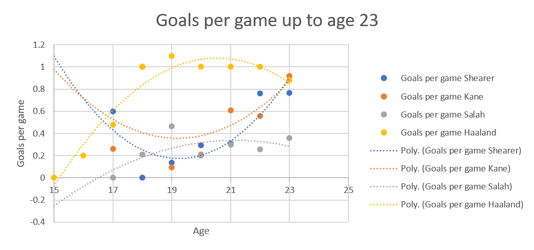
Now Goals per game 

Using the data up to everyone reaching 30 Line graph of goals per game up to 30 for Shearer, Kane and Salah.  The line for Shearer (blue) is a parabola curving from about 0.15 at 17 years of age to 0.4 at 30, with the highest point coming at about 0.62 at 24.  The lines for Kane (orange) and Salah (grey) are pretty much straight lines.  The Kane line runs from 0.4 at 17 to 0.8 at 30.  The Salah line runs from about 0.8 at 17 to about 0.6 at 30. 
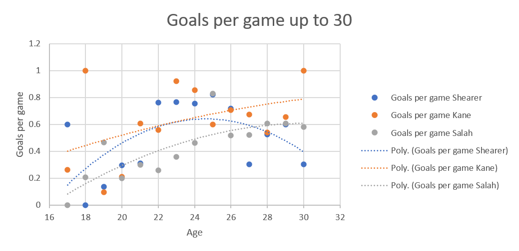
Again, Shearer is the odd one out because of his injury, although to me, the interesting thing is how similar the shape of the curves are for Kane and Salah. The curve also makes it clear that, although Salah is indeed a very awesome striker, Kane is the one who is more of an out and out goal getter. Plus, the entirely ridiculous stat that Kane had a goal per game in 2023-2024. 

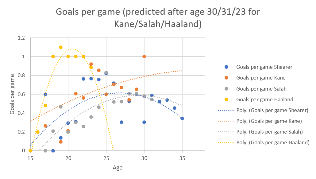
Using the extrapolated data, Kane stands out: Line graph showing goals per game extrapolated from the present data to 35 for Shearer, Kane and Salah.  The Shearer line (blue) is curve, from 0.22 at age 17 to 0.35 at age 25, with a high of about 0.61 about 26/27.  The Salah line (grey) is also a curve, from about 0.7 at age 17 to 0.48 at age 35, with a high point of 0.6 at 29.  The Kane line (orange) is straight because of his truly excellent goal per game at age 30.  It starts at 0.4 at 17, and ends at 0.85 at 35. 
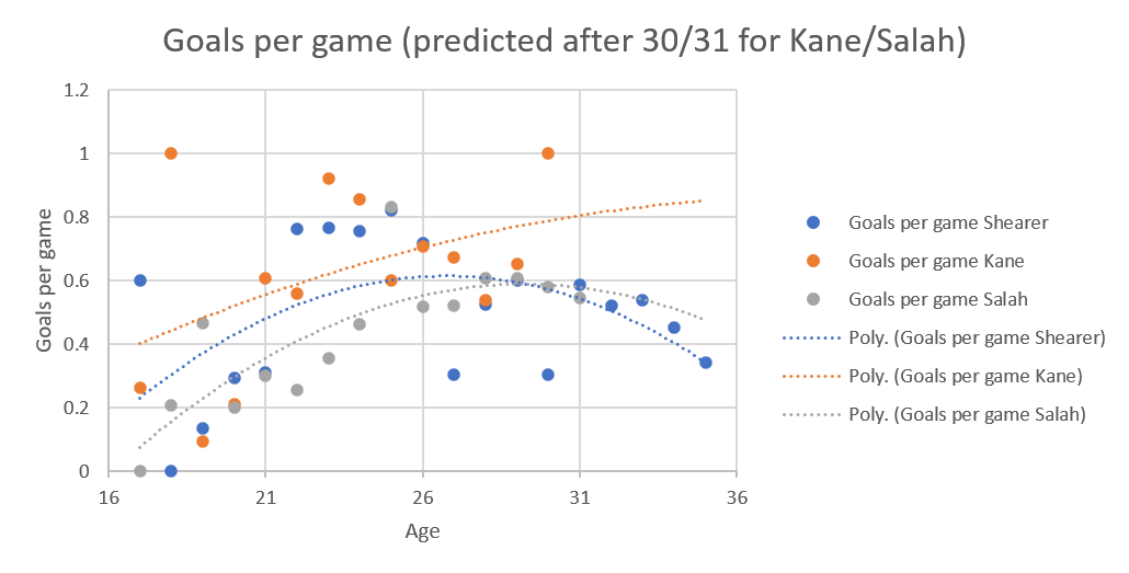
Kane's curve ends much higher than the other two, possible because of that ridiculous 2023-2024 season, with Salah's curve going down because of his injury in 2023-2024. 

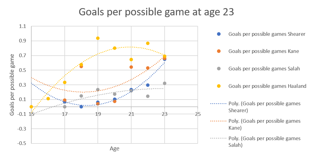
Finally, we have the goals per possible game, which would normally perk Shearer's stats up because he had fewer opportunities to have games to score goals in, but, as I said, his injury in the year he was 30 meant his curve really does parabola downwards in this graph. Line chart of goals per possible game up to the age of 30 for Shearer, Kane and Salah.  The Shearer line (blue) is a curve.  It starts at 0 at 18, and ends at 0.3 at 30. The high point about 0.5 at 25.  Kane (orange) and Salah (grey) are straight lines, still going up at 30.  The Kane line starts at 0.19 at 17, and ends at 0.7 at 30.  The Salah line starts at 0 at 17, and ends at 0.59 at 30. 

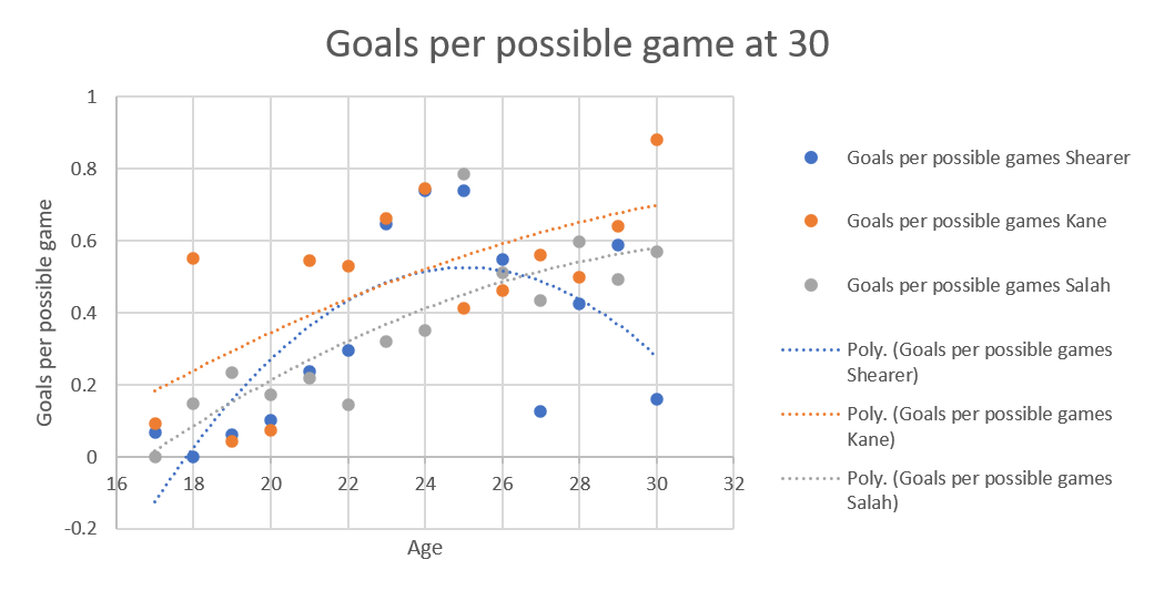
The other two curves, again have the same shape, but Kane is higher again. 
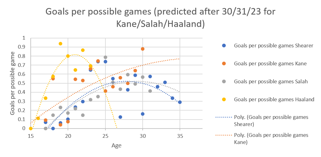
On the extrapolated till 35 goals per possible game Line chart of goals per possible game extrapolated up to the age of 35 for Shearer, Kane and Salah.  The Shearer line (blue) is a curve, starting at 0 at 17, and ending at 0.3 at 35, with a high point of 0.5 at 28.  The Salah line (grey) is also a curve, starting at 0 at 17 as well, and ending at 0.4 at 35, with a high point of 0.5 at 29.  The Kane line (orange) is almost a straight line, it starts at 0.19 at 17 and ending at 0.78 at 35. 
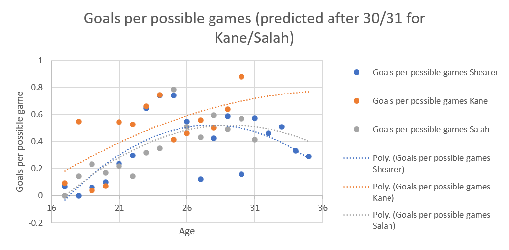
Shearer and Salah have similar trajectories, possibly because they both had bad years around 30/31 with injuries, while Kane's curve has gone shooting off at the top because of his excellent 2023-2024.

Saturday, 3 May 2025

Withdrawals in the Women's Tour de France 2024

For those who don't know, maths is not my subject. I enjoy statistics and it's the only thing that stopped me failing A-Level maths, because it makes sense. 

So when so many members of the Tashkent City Women Professional Cycling Team and the Human Powered Health Team withdrew in different stages of the race that the lines in the Kaplan Meier graphs go into the negative, the maths part of my brain is screaming because you can't have negative survival rates, and the statistician in me says either those teams were awful or something appalling happened. Kaplan Meier survival curves split by teams.  Two lines go negative.  One is an oakleaf green which stands for Tashkent City Women Professional Cycling Team.  It goes into the negative at stage 1, then flips again into the positive at stage 4.  The brown line that flips into the negative at stage 8 is the Human Powered Health team. When the green line for Tashkent then goes positive again because the amount of riders they lost in another stage versus the amount that remained, I become reasonably convinced of my "awful or appalling happened" thesis. 

It turns out there's something more interesting going on with the Tashkent City Women Professional Cycling Team. 

They are a Continental Tour team who gamed the system to get a women's Tour de France invite, because that was their aim (https://www.rouleur.cc/blogs/the-rouleur-journal/200-euro-salaries-inexperienced-youngsters-and-gaming-the-system-tashkent-city-justify-their-place-at-the-tour-de-france-femmes). And that's before we point out that most of them were teenagers, in a sport that acknowledges it's hard to finish the race that young (https://www.cyclingnews.com/news/people-can-think-what-they-want-tashkent-city-women-respond-to-criticism-after-four-riders-abandon-tour-de-france-femmes/

I'd also like to raise a toast to Yanina Kuskova, the one Tashkent City rider to finish. She's now riding for Euskadi. 

This race did seem to have a lot of withdrawals. Bar chart of withdrawals in the 2024 TDFF.  Tashkent City finished with only 1 rider.  Arkea, FDJ Suez and Uno-X all finished with all their riders. 

It appears that stages 4, 7 and 8 were diabolical. Pie chart.  Three stages, 4, 7 and 8, contain three quarters of the withdrawals. 
The all-rider Kaplan Meier chart also bears this out. Kaplan Meier chart of all withdrawals from the TDFF 2024.  It drops to 0.975 after one stage, and stays that way till stage 3, then drops to 0.9 by stage 4.  It continues to drop, but more slowly, to 0.85 at stage 6.  It then drops to 0.77 at stage 7 and 0.7 at stage 8. Over the years I've been doing this for both the men's and women's Tour de France, this is is the lowest percentage of finishers. 


Stage 7 was again general evil, building up to the Alpe d'Huez. 

 Stage 8 was the Alpe d'Huez itself. Meet the Alpe - https://en.wikipedia.org/wiki/Alpe_d%27Huez#Cycle_racing 

Interestingly, despite that, none of the withdrawals were due to racers finishing outside the time limit, they were either mid-stage abandons, or did not start the stage withdrawals. Pie chart of withdrawals by type.  Orange, withdrawals due to mid-stage abandonments, are 72% of all withdrawals, while did not start the stage abandonments were 28% of all withdrawals.